Medical & Healthcare
 Cybersecurity
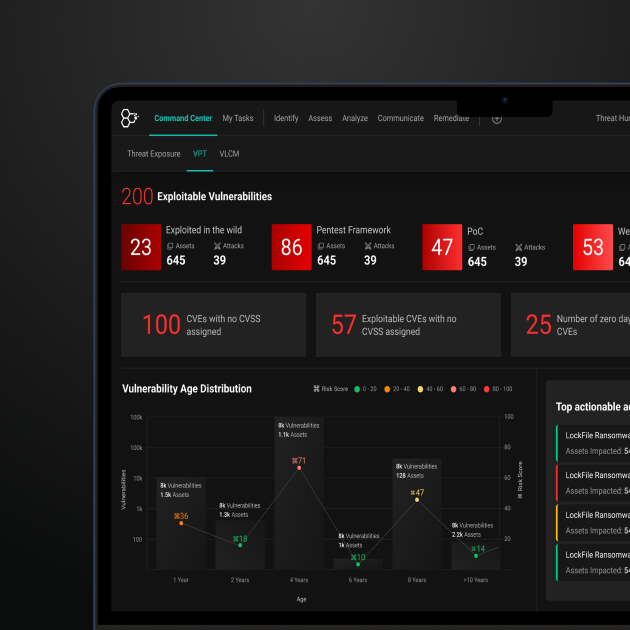
 Travel & Hospitality
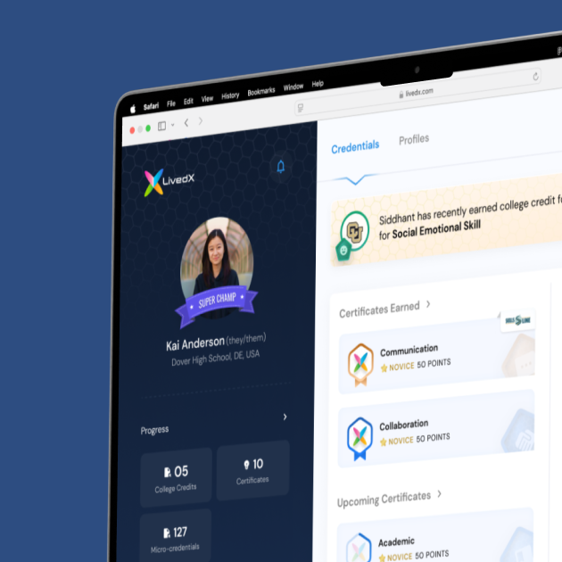
 Edtech
 Enterprise
 Non-Profit
 Fintech
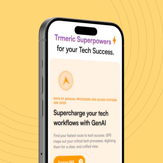
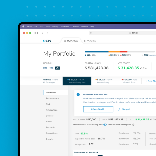
 Agritech
 Retail & Real Estate
 Design for AI
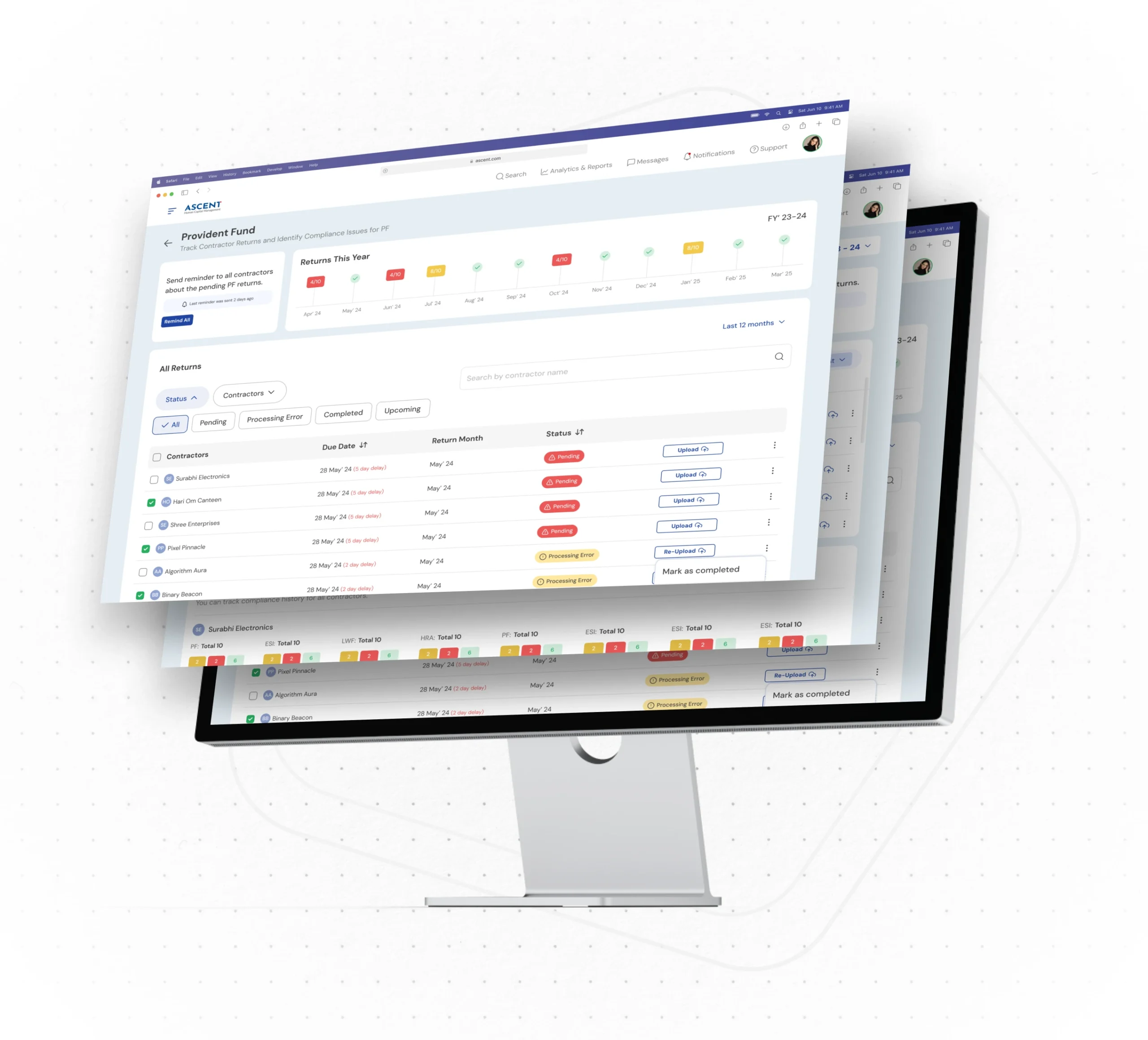
UI/UX Redesign Brought Simplicity to an Extensive HRMS Solution, for Ascent
Created a simplified design system that’s easily accessible and user-friendly, thus leading to 45% growth in monthly active users.


Ascent is a high-performing HRMS software that allows small-to-large businesses in manufacturing, retail, construction, healthcare and other sectors to manage payroll, attendance, and other HR services.
However, the system’s old functionality was hampering its usability and product growth.
The challenge here was to create a simplified design system that’s easily accessible and helps users (employees) to do their jobs better, being stress-free.
Objective of Design
For an enterprise application with 100s of screens, developing pages from scratch involves high costs and plenty of dev time. We aimed to identify a solution that would reduce repetitive work, increase efficiency of development, and meet qualitative expectations. Our design objective here was:
- To create a Human Resource Management System which understood the need of a humane element and translated that into design.
- A software is available when it’s needed.
- Helps employees do their job better with less anxiety.
Our Process

Pain Points
- Old and heavily used software.
- Tons of features and deep underlying functionality.
- Heavy software with over 300 screens.

Discovery
- Our conversations with the workforce found it devoid of process, with the key aspect that made communities tick – the human touch.
- The need for a design system arose from the realization that it took precious dev time for them to build pages for new modules from scratch, leading to increased costs, efforts and also, a decline in quality.

Implementation
- To create a design system that acts as a repository of visual assets, accessible any time new pages need to be developed.
- Enable a drag & drop facility for visual elements on pages saving time and effort for developers, as well as reducing heavy costs.
Outcomes
Outcomes
Design Style Guide that powered the Front End Style Guide:
- A universal style guide for the platform.
- Modular and Scalable.
- Gave the front-end an all-in-one toolkit.
Front-End Style Guide that powered the developers:
- Design guide led to developers creating their own front-end style guide.
- This reduced the development time considerably, whenever a new feature or product was developed.
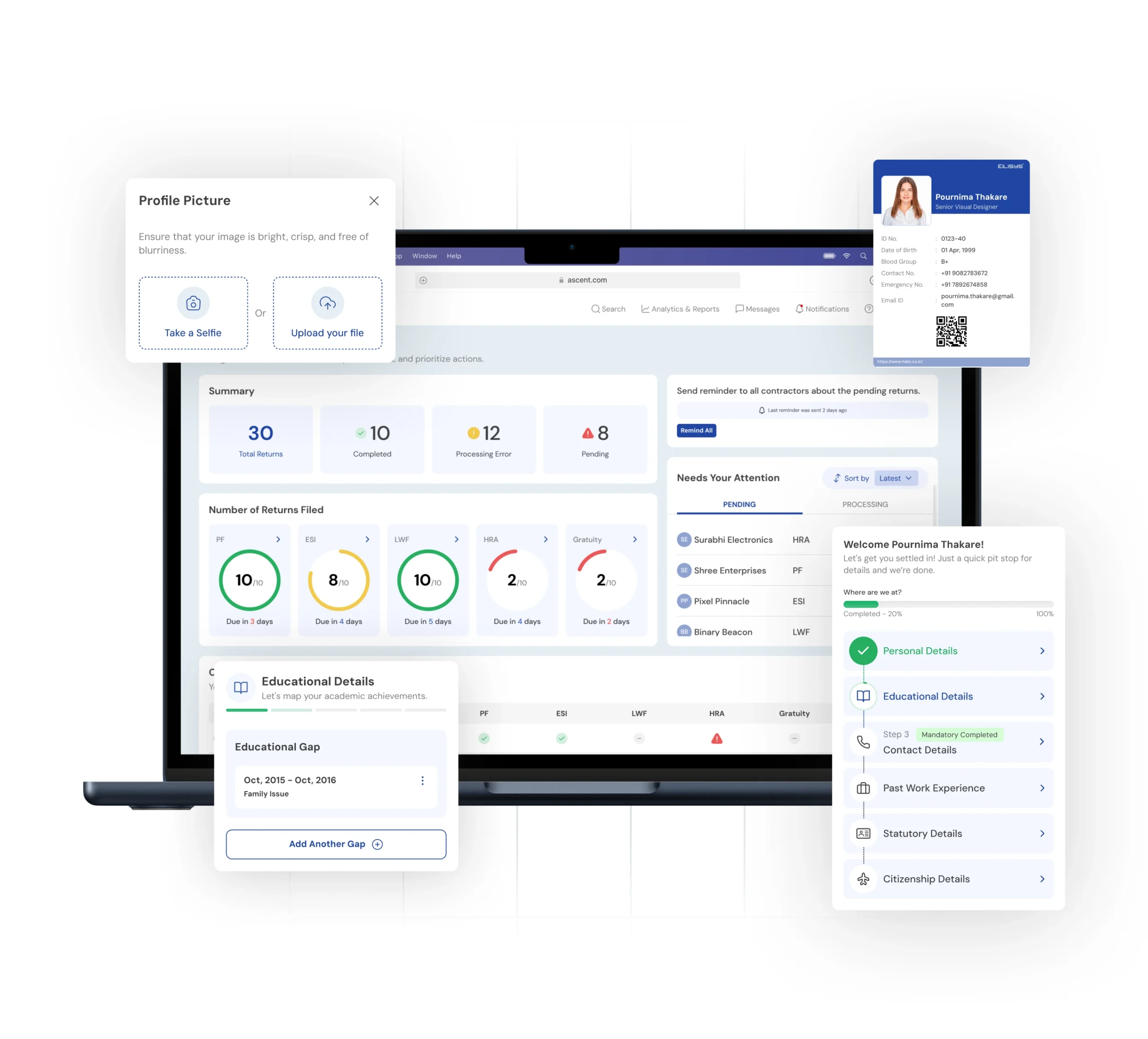
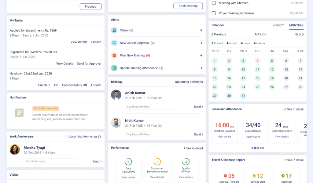
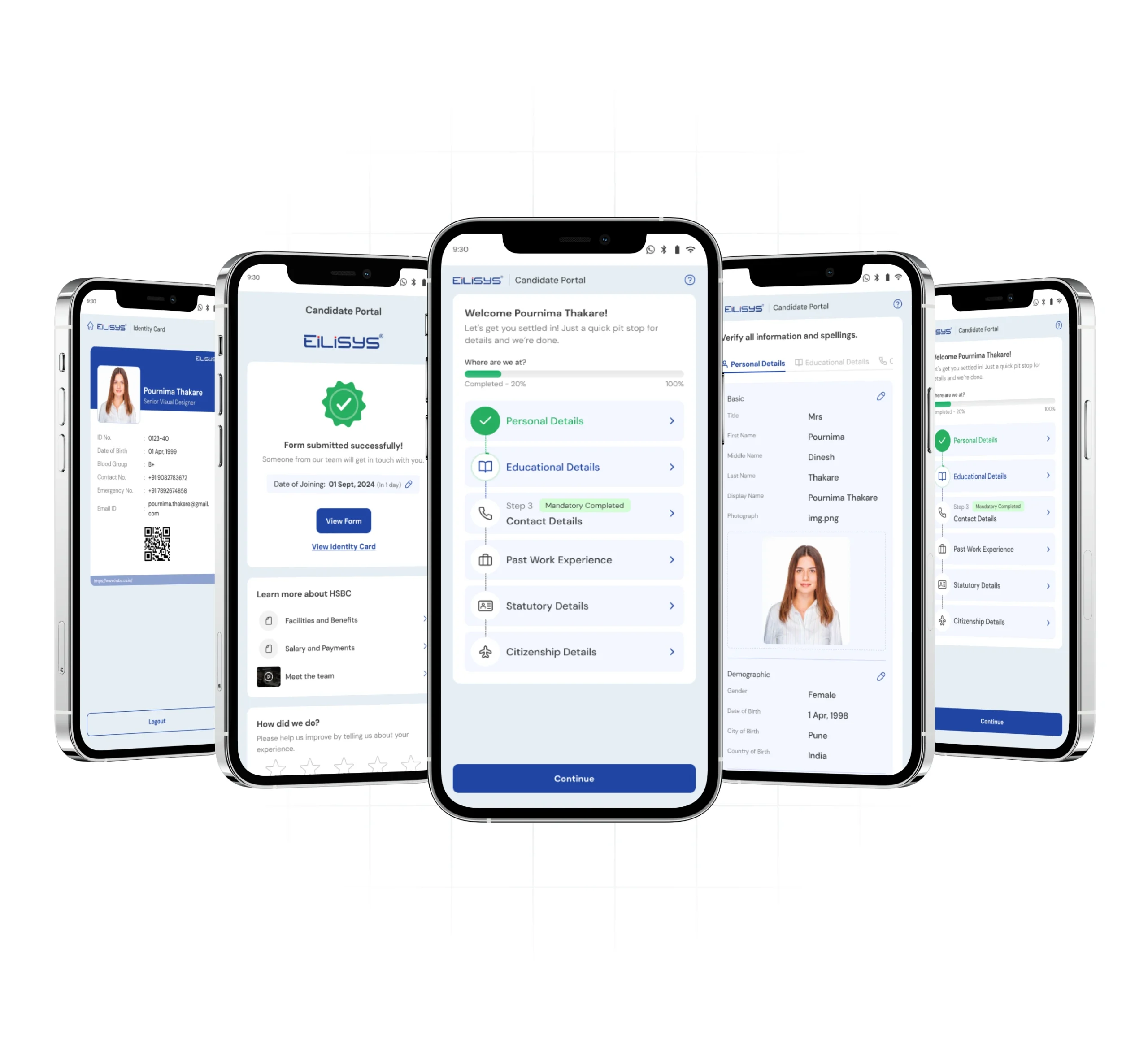
A Simplified Design Solution to an Extensive HRMS System with a Structured Style Guide
A Simplified Design Solution to an Extensive HRMS System with a Structured Style Guide
- Once the style guide was set, the process of developing new features and products on the platform was streamlined. We created wireframes, which once approved, were handed over to the dev team.
- Because of the front-end and design style guides, developers knew what to pick and where to pick from. Creating these applications used to take 6 months earlier– which now took merely 2-3 weeks.
- We designed a Human Resource Management System with an 80-20 approach allowing us to bring the most important and most used things up-front. A user-centric approach helped us add features that improved salability.
- Design solution was used to simplify tasks, by drastically reducing the number of screens. Our insights helped in understanding user intentions for creating new features, enabling faster and more informed decision making.
- Our interface design was aimed towards improving the user friendliness of the system, making it look aesthetically appealing.
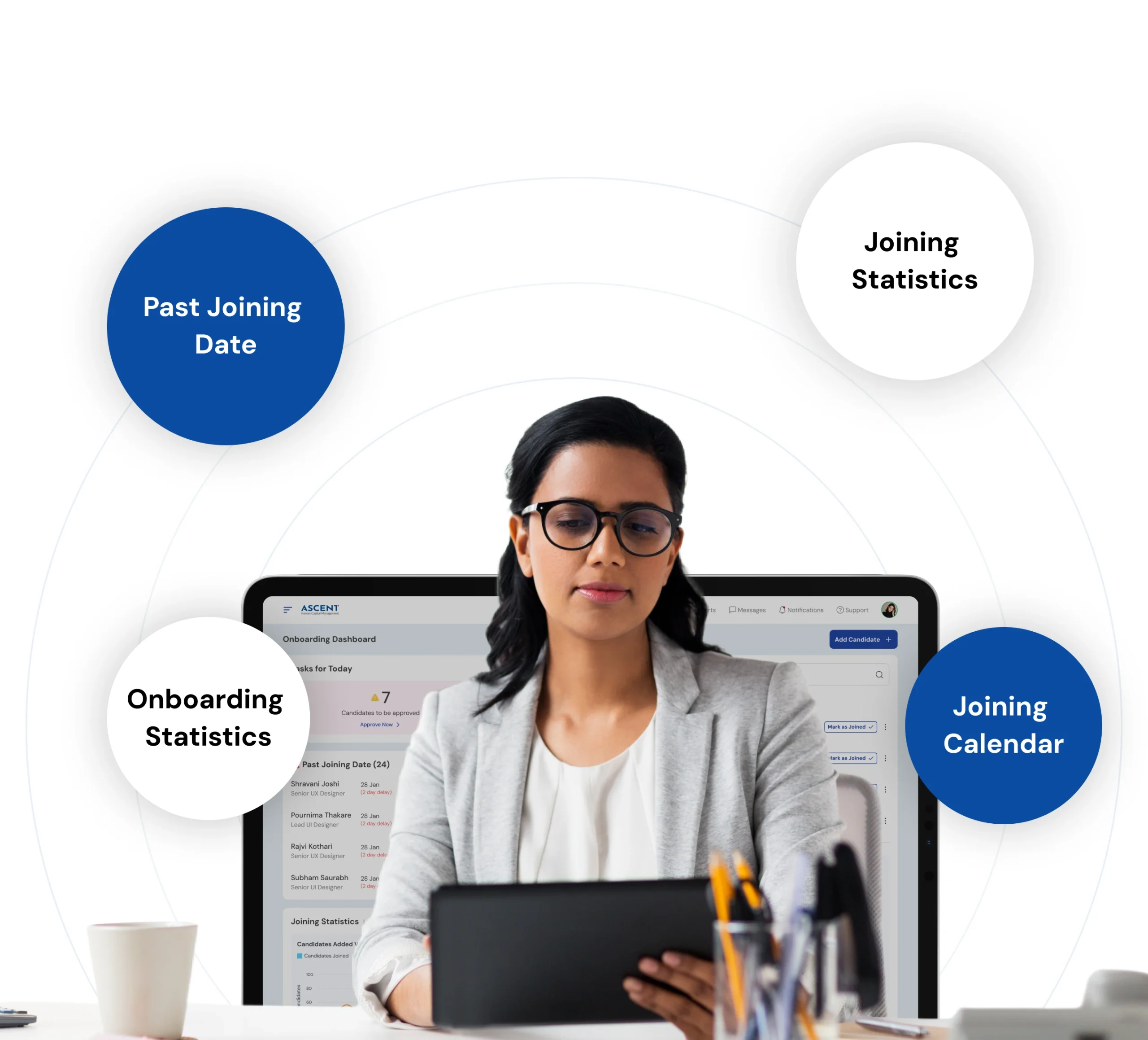
Impact
Business Impact
- The new design solution helped in faster customer acquisition and also gained new customer orders for more modules.
- This also helped in setting a big competitive edge against Indian and international players, leading to a better brand perception both on customer and employer side.
User Impact
- Quicker, more accurate task completion by the users. The design solution also enabled user flexibility and control through modular design.
- Reduced cost of on-boarding with 45% growth in monthly active users. Better usage for 250+ customers and 60,000 employees.
Let’s explore your project.
Book a free slot or share your email.
Or just share your email
We’ll reach out.
Other CASE STUDIES