Medical & Healthcare
 Cybersecurity
 Travel & Hospitality
 Edtech
 Enterprise
 Non-Profit
 Fintech
 Agritech
 Retail & Real Estate
 Design for AI
What’s the Next Big Thing for RedBus?
Our team attempted to fill in the gaps, in terms of its interface and user experience design; for offering a more enhanced and assisted experience for the users throughout their journey.
2017
RedBus is India’s largest online bus ticketing platform that has transformed bus travel in the country by bringing ease and convenience to millions of Indians who travel using buses. Founded in 2006, it has millions of users across multiple countries.
However there are a few aspects which are missing in terms of its interface and user experience design. We observed that redbus abandons its users mid-way; it feels as if there’s an abrupt end of service where redbus could’ve assisted their users throughout the travel experience.
06
Creative Brains
11
Hours
50 +
Coffee Cups
100 %
Nonstop Music
Taking Redbus to the Next Level Through Detailed UI/UX Process and Methodology
The intent of this project was considering redBus in the following aspects:
- How do we serve our users better?
- What parts of the CX journey can we actually start catering to?
- How can redBus become a go app for bus travel?
To offer complete support in all the stages of the user’s journey, our internal team attempted this UI/UX design to take redBus to the next level.
(This project was attempted in 2017 when redBus’s UI/UX design was different from the one we’re using today).
- Looking at the Whole CX Journey and Identifying Gaps
Bus travel includes ticket booking, pre-journey, in-journey and post journey. However, redbus’s contribution was only ticket booking and pre-journey, which felt like an abrupt end of the service.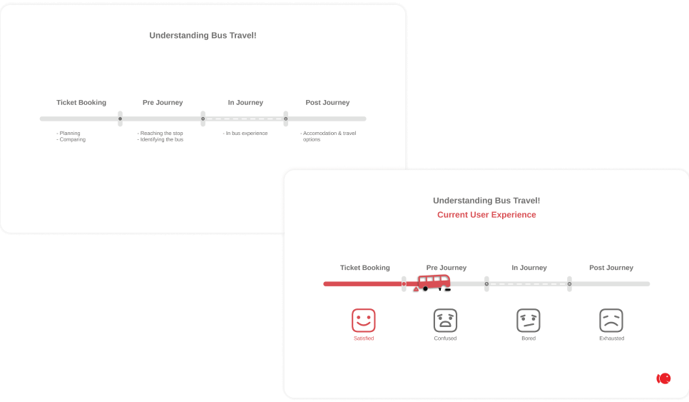
This made the travelers feel confused before the travel, bored during the travel and exhausted post journey. The travelers were of all age groups, right from 18 years old college students to 61 years old senior citizens; with varying user goals. - Insights that would Delight
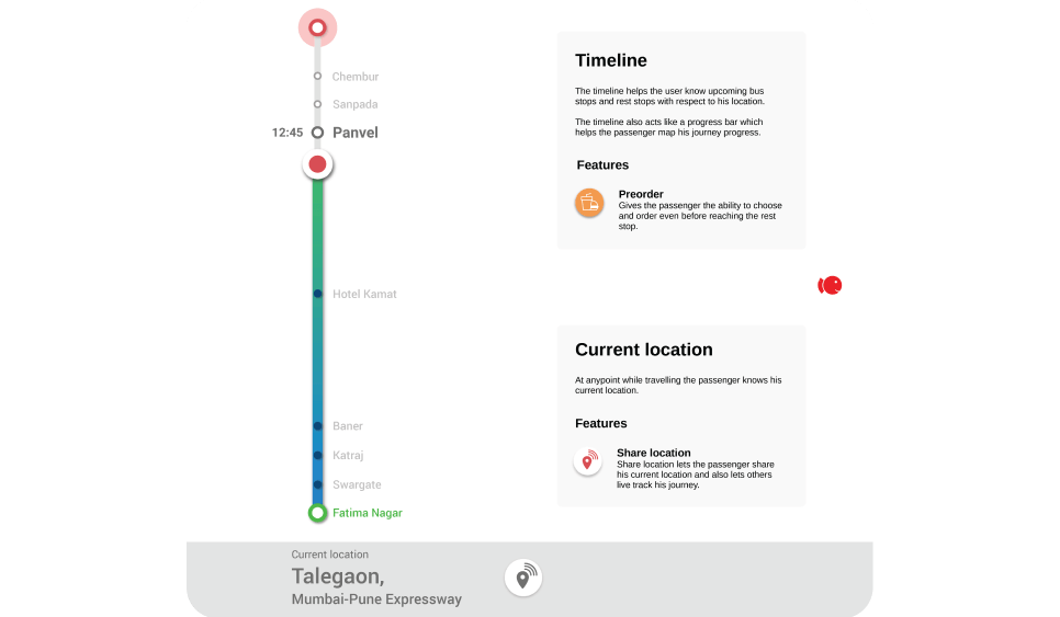
Pre-Journey– From preparing for the journey to finding their seats in the bus; there were three aspects involved in this phase- reminding the users about their trip, helping them reach their boarding points and guiding them in identifying their bus.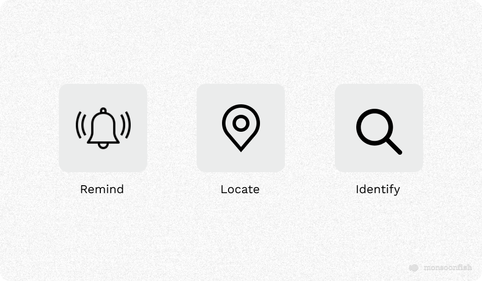
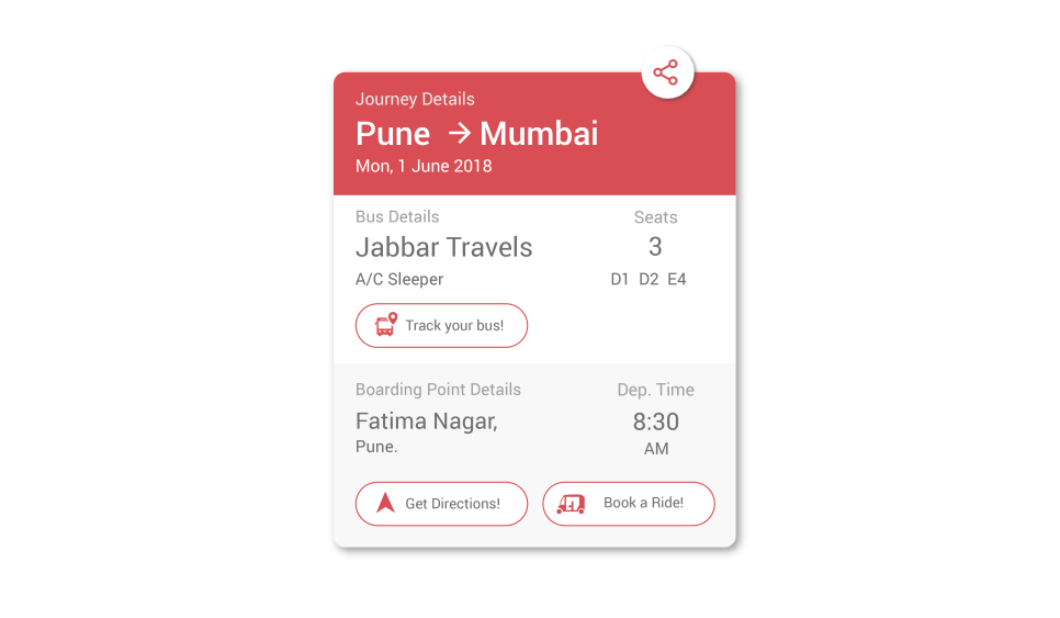
Ticketing– The information has been arranged in a hierarchy and related information has been chunked together. A ‘Share’ feature has also been added where the traveler can easily share their ticket with the concerned person, if needed.
 In-journey– While traveling the passengers are completely clueless about their location, the next rest stop or even time left to reach their destination. Also, while in a bus it’s difficult to do any activity which leads to boredom. Hence, the interface provides a solution consisting of- assistance, information and entertainment.
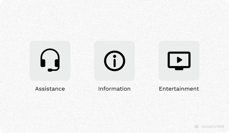
An additional feature of ‘’Pre-order’ has been added which gives the passenger the ability to choose and order even before reaching the rest stop. Furthermore, features like ‘Time-left’ to complete their journey and ‘Share the location’ with your friends/relatives has been.
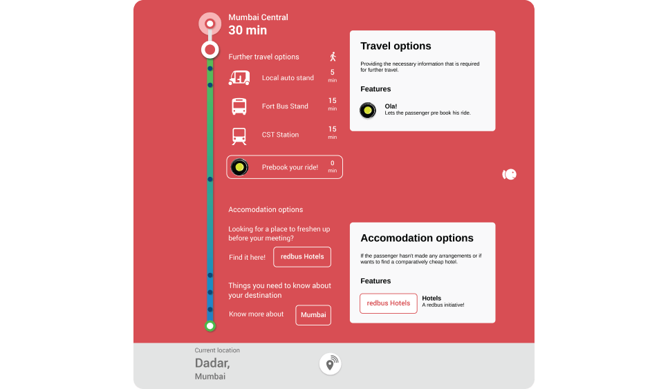
Post-journey– On reaching their destination passengers have a hard time figuring out further travel options or accommodation, especially when it’s a completely new place as communicating with locals is difficult.
With a user-centric approach, travel options like Ola ride and hotel booking features have been added to assist the traveler throughout his/her journey.
- Integrating New Features into the App
In pre-journey, identifying your bus through your phone camera solves the problem caused due to underdeveloped bus stations.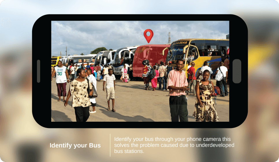
The in-journey features help in user engagement by displaying pop-ups with short information while crossing borders or historical sites.
The post journey features provide suggestions, precautions and information about the place before the person reaches that place and doesn’t end with the bus journey.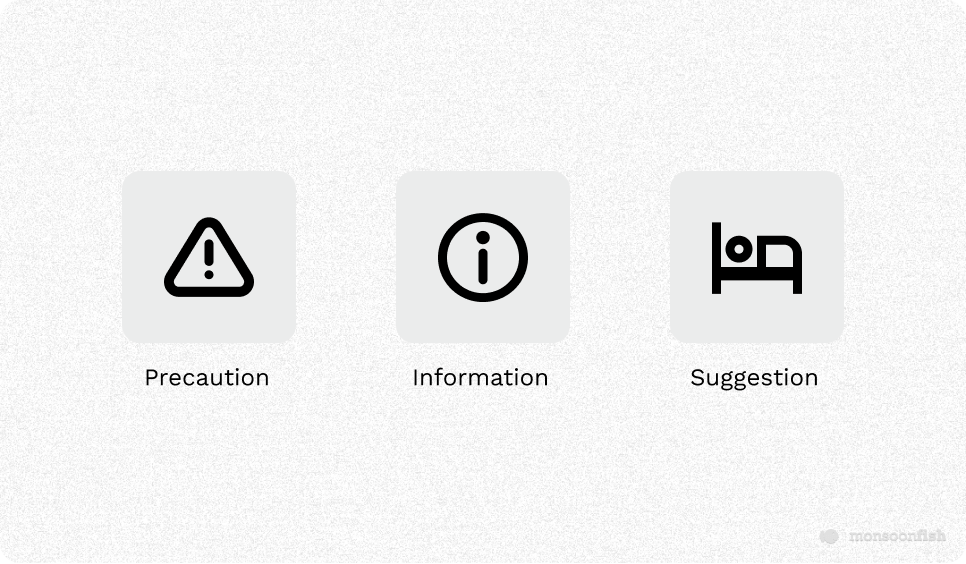
- We then prioritized features depending on their necessities, created paper prototypes; maintaining visual hierarchy and interactions.
Testing
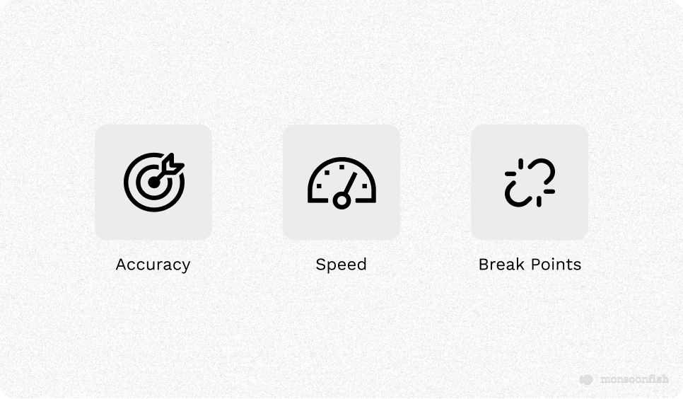
The tests were conducted with 10 users to validate these features and ideas in terms of user experience. Since the users were not in the actual travel situation, they were asked to imagine themselves in the situation while completing a set of tasks.
Their performance based on accuracy and speed helped us decide if the added features were successful. The testing resulted in users finding the app delightful to use and the added features were very useful.
The Next Big Thing: Take-Away
Redbus is at the top of its game because of the powerful ticket booking system so our aim for this user experience design attempt was to consider the complete user journey as well as varying user goals, for taking redBus to the next level!
Team Monsoonfish always looks forward to attempting redesigns for digital products by deep diving into its functionality, understanding user goals and crafting solutions to enhance its usability for better engagement.
Click here to check how we redesigned Swiggy’s user experience!