


Late one evening, Rahul was scrolling through his mobile phone when a loud emergency notification pinged on his screen. It was from the local government, warning about an incoming severe storm that was expected to hit his city within the next few hours. His heart raced. He immediately opened the government’s official emergency response website, hoping to find crucial updates like evacuation routes, safety guidelines, and shelter locations.
But when the page loaded, he was faced with a disorganized mess—multiple tabs, dense paragraphs, scattered images, and no clear instructions. He frantically searched for information, his eyes darting around the page trying to make sense of what was important. Links for safety measures were buried under heaps of text, and the storm warning itself was tucked at the bottom of the page, almost hidden beneath a sea of irrelevant news. Every second felt like a lifetime. He was getting more stressed and frustrated, and the lack of clarity only made it harder to think clearly.
Panicked, Rahul quickly closed the tab and turned to search for another website. This time, he opened the city’s disaster management portal, and instantly, he noticed the difference.
The webpage design was crisp, organized, and visually straightforward. A bold red banner at the top left of the screen immediately drew his attention: “Severe Storm Warning: Evacuate Immediately.” Below it, the page was designed with clear, simple sections. The first block contained a map of evacuation routes, easily accessible with a single click. Right below that was a concise list of safety measures—“Stay inside, away from windows, and use the basement as a shelter.” And at the bottom left, in big, legible letters, there was a prominent “Find Nearest Shelter” button that took him to a searchable directory of local shelters.
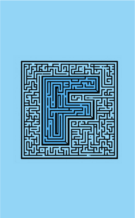
Rahul’s eyes naturally followed the F-Scan Pattern. His focus first went to the top left, reading the most important warning. Then, his eyes moved to the right where the key action steps and maps were laid out in a digestible manner. Finally, his gaze traveled down the left side where he found the emergency shelters clearly outlined. Every piece of information he needed was placed in the exact spots his eyes instinctively went. Within seconds, he had all the information he needed to act quickly.
Rahul grabbed his emergency kit, double-checked his house, and evacuated to the nearest shelter.
Websites designed with the F-Scan Pattern in mind help users find what they need quickly and without stress. By placing the most important information—warnings, urgent actions, and resources—at the beginning and end of the user’s natural scanning path, designers can ensure that people can react fast in high-pressure situations. Whether it’s an emergency alert, health updates, or any urgent message, aligning a website’s layout with the F-Scan Pattern can make all the difference in guiding users through their next steps.