Expert team, exceptional design, exponential growth.

Enquire Now
journal

Miller's Law

Use chunking to organize content into smaller clusters, making it easier for users to process, understand, and remember.

Miller’s Law

A  young architect named Rhia was excited to launch her new interior design firm in her hometown. Her first big project was to renovate a local library, transforming it into a modern, welcoming space.

Eager to impress, Rhia presented her ideas to the library committee using an elaborate blueprint filled with intricate details—every section meticulously labeled with colors, furniture options, lighting plans, and decor themes. She was confident they’d love it.

But as Rhia spoke, she noticed confused faces. Committee members kept flipping through the plans, struggling to keep up with the flood of information. Some looked overwhelmed, while others asked her to repeat details she had already covered.

Feeling disappointed, Rhia sought advice from her mentor, Ms. Kapoor, a seasoned architect. He smiled and said, “Priya, people can only absorb so much at once. Instead of showing them everything at once, break it down into smaller sections. Make it easier for them to understand step by step.”

Taking her mentor’s advice, Rhia simplified her presentation. She divided the library into three key zones—Reading, Research, and Relaxation. Within each, she highlighted just a few essential features. The next time she presented, the committee members were engaged, nodding along and asking thoughtful questions. They easily grasped her vision, and the project moved forward smoothly.

Rhia learned that when information is presented in smaller, digestible chunks, people find it easier to process, remember, and act upon.

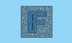
Miller’s Law tells us that an average person can hold around seven items in their working memory at a time. By breaking down information into smaller, meaningful clusters, we can help users process and retain details more effectively. Whether designing a user experience, planning a project, or presenting ideas, organizing information in chunks leads to better understanding and decision-making. Less confusion means more clarity and action.

Next Read

swiper-prev swiper-next
card-image

Hicks Law

Decision-making slows as the number of choices increases, but simplifying options can speed it up effectively.

card-image

Aesthetic Usability Effect

Visually appealing designs are perceived as easier to use and more effective, even if they’re not necessarily more usable.

card-image

Fitts’ Law

The time it takes to take action on a target is inversely proportional to the distance to the target and directly proportional to the size of the target.

card-image

Peak end rule

People tend to remember experiences based on their most thrilling moment and how they conclude, rather than every detail in between.

card-image

Doherty Threshold

Users perceive a system’s response as instantaneous if it’s within 400 milliseconds (ms).

card-image

Hofstadter’s Law

Our perception of time often exceeds the actual time it takes to complete a task.

card-image

F Scan Pattern

The way users tend to read web pages, with more attention is usually in a F pattern.

card-image

System Status Visibility

Immediate and clear communication between a user and a system, ensuring real-time updates on actions and responses.

card-image

Gaze Cueing

A psychological phenomenon where people tend to follow the gaze of others.

card-image

Tesler’s law

The simpler it seems on the surface, the more complicated it is in the background.

card-image

Goal Gradient Effect

People exert more effort to reach a goal as they get closer to it.

card-image

Parkinson’s Law

Tasks often take longer if you have more time to do them.

card-image

Postel’s Law

Design should be adaptable to user behavior and flexible, while remaining precise in delivering information.

card-image

Weber’s Law

If something is really big or loud, you need a big change to notice it. If it’s small or quiet, even a tiny change can be noticed.

card-image

Serial Position Effect

People have better recall of items presented at the beginning and end of a list, with those in the middle often being less memorable.

card-image

Jakob’s Law

People feel more at ease with things that are familiar to them.

card-image

Von Restorff Effect

Also known as the ‘Isolation Effect’ or ‘Illusionism’, suggests that items that stand out or are distinct from others are more likely to be remembered

card-image

Zeigarnik Effect

People tend to remember incomplete or interrupted tasks more than completed ones.

card-image

Pareto Principle

Also known as the 80/20 rule, suggests that roughly 80% of effects come from 20% of causes

CATEGORIES

Design Creates Experiences that Facilitate Product Goals.

With over 20 years of experience, our UI/UX design studio crafts experiences that align with user expectations, helping brands achieve their business vision. We offer practical UX design services to enhance your digital product.

20 +

Years in Design

200 +

Satisfied Clients

500 +

Successful Projects

40 +

Designers On-board

Take a Look at Our Journal
Image

Discover why human creativity, judgment & empathy are the real edge in an AI-driven world of work.

Image

Discover the top 10 product design trends for 2025 shaping UX, innovation, and user engagement. Stay ahead with insights on the future of design.

Image

Discover the top 10 product design trends for 2025 shaping UX, innovation, and user engagement. Stay ahead with insights on the future of design.

There’s a Lot Happening Behind the Scenes in Our Lab!

GPay’s Shared Wallet streamlines group expenses with centralized payments, real-time updates, and contextual notes. It enhances transparency and usability, opening new possibilities for expense management.

Image

Myntra’s Venie revolutionizes shopping with AI-driven video guidance, real-time insights, and two-way conversations. Replacing Maya, it boosts engagement and usability while unlocking new revenue opportunities.

Image

This project attempted to identify the gaps in this food delivery app and propose UI/UX design ideas to expand Swiggy in different ways for the users to use it for more than just a food delivery app, in turn setting it apart from its competitors.

Image