Expert team, exceptional design, exponential growth.

Enquire Now
journal

Doherty Threshold

Users perceive a system’s response as instantaneous if it’s within 400 milliseconds (ms).

Doherty Threshold

When a young entrepreneur named Arjun launched a food delivery app called QuickBite, his goal was clear —to provide the fastest and most convenient way for customers to order meals from their favorite restaurants.

Excited about his app’s sleek design and wide restaurant options, Arjun expected it to be an instant hit. But soon after launch, he started receiving complaints—customers were abandoning their orders midway, and restaurant partners were reporting fewer orders than expected.

Curious to understand what was going wrong, Arjun decided to try the app himself. He tapped to browse menus, selected items, and proceeded to checkout—only to find himself staring at a spinning loader for several seconds before moving to the next step. Even though the app eventually completed the order, the wait felt longer than it should, making him impatient and frustrated.

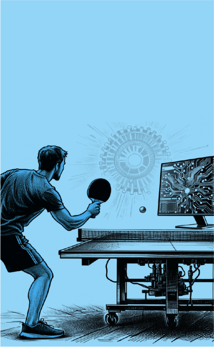
Determined to fix the issue, Arjun consulted a UX expert, who explained, “People expect instant feedback when they interact with technology. If your app takes too long to respond, they lose patience and interest. Ideally, actions should process within 400 milliseconds—or match their pace—to keep them engaged.”

Putting this expert insight into action,  Arjun worked with his development team to optimize the app’s performance. They streamlined server responses, added subtle loading animations, and provided instant feedback such as confirmation messages and visual cues when actions were being processed.

The results were immediate. Users now felt like the app was responding instantly, making it easier and more enjoyable to order food. Along with the customer satisfaction score, the order completion rates also improved, and QuickBite became the go-to food delivery app in town.

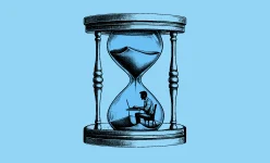
When systems respond at the speed users expect, they feel in control and engaged. Even the smallest delays can impact their experience.

The Doherty Threshold states that for users to feel like a system is responding instantly, it should provide feedback within 400 milliseconds of their action. Any delay beyond this makes the system feel slow and frustrating. Whether designing a website or app, ensuring fast responses—or keeping users engaged with visual feedback—enhances their experience and encourages continued interaction. Speed isn’t just a feature; it’s an expectation.

Next Read

swiper-prev swiper-next
card-image

Hicks Law

Decision-making slows as the number of choices increases, but simplifying options can speed it up effectively.

card-image

Miller’s Law

Use chunking to organize content into smaller clusters, making it easier for users to process, understand, and remember.

card-image

Aesthetic Usability Effect

Visually appealing designs are perceived as easier to use and more effective, even if they’re not necessarily more usable.

card-image

Fitts’ Law

The time it takes to take action on a target is inversely proportional to the distance to the target and directly proportional to the size of the target.

card-image

Peak end rule

People tend to remember experiences based on their most thrilling moment and how they conclude, rather than every detail in between.

card-image

Hofstadter’s Law

Our perception of time often exceeds the actual time it takes to complete a task.

card-image

F Scan Pattern

The way users tend to read web pages, with more attention is usually in a F pattern.

card-image

System Status Visibility

Immediate and clear communication between a user and a system, ensuring real-time updates on actions and responses.

card-image

Gaze Cueing

A psychological phenomenon where people tend to follow the gaze of others.

card-image

Tesler’s law

The simpler it seems on the surface, the more complicated it is in the background.

card-image

Goal Gradient Effect

People exert more effort to reach a goal as they get closer to it.

card-image

Parkinson’s Law

Tasks often take longer if you have more time to do them.

card-image

Postel’s Law

Design should be adaptable to user behavior and flexible, while remaining precise in delivering information.

card-image

Weber’s Law

If something is really big or loud, you need a big change to notice it. If it’s small or quiet, even a tiny change can be noticed.

card-image

Serial Position Effect

People have better recall of items presented at the beginning and end of a list, with those in the middle often being less memorable.

card-image

Jakob’s Law

People feel more at ease with things that are familiar to them.

card-image

Von Restorff Effect

Also known as the ‘Isolation Effect’ or ‘Illusionism’, suggests that items that stand out or are distinct from others are more likely to be remembered

card-image

Zeigarnik Effect

People tend to remember incomplete or interrupted tasks more than completed ones.

card-image

Pareto Principle

Also known as the 80/20 rule, suggests that roughly 80% of effects come from 20% of causes

CATEGORIES

Design Creates Experiences that Facilitate Product Goals.

With over 20 years of experience, our UI/UX design studio crafts experiences that align with user expectations, helping brands achieve their business vision. We offer practical UX design services to enhance your digital product.

20 +

Years in Design

200 +

Satisfied Clients

500 +

Successful Projects

40 +

Designers On-board

Take a Look at Our Journal
Image

Discover why human creativity, judgment & empathy are the real edge in an AI-driven world of work.

Image

Discover the top 10 product design trends for 2025 shaping UX, innovation, and user engagement. Stay ahead with insights on the future of design.

Image

Discover the top 10 product design trends for 2025 shaping UX, innovation, and user engagement. Stay ahead with insights on the future of design.

There’s a Lot Happening Behind the Scenes in Our Lab!

GPay’s Shared Wallet streamlines group expenses with centralized payments, real-time updates, and contextual notes. It enhances transparency and usability, opening new possibilities for expense management.

Image

Myntra’s Venie revolutionizes shopping with AI-driven video guidance, real-time insights, and two-way conversations. Replacing Maya, it boosts engagement and usability while unlocking new revenue opportunities.

Image

This project attempted to identify the gaps in this food delivery app and propose UI/UX design ideas to expand Swiggy in different ways for the users to use it for more than just a food delivery app, in turn setting it apart from its competitors.

Image