Banking on (Money and) Better User Experience: Why Bank Websites Need UX Test
It’s time for the banks to listen up! People won’t go to open an account if they don’t fully understand the product and/or can’t get their questions answered with support. So while banks may be working to optimize each individual part of the journey to try to convert customers, the reality is that the entire experience needs to be stitched together for people to feel confident enough to actually convert.

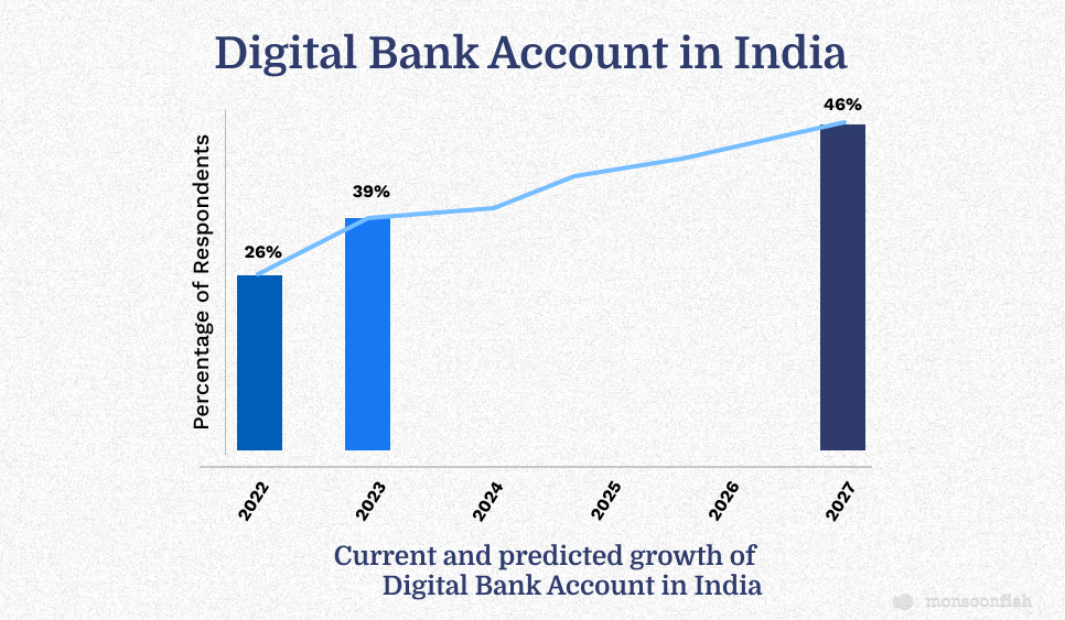
It was found that 26% of respondents in India have a digital bank account, according to a recent global survey of 2,899 conducted by Finder in 2022.While 26% of respondents in India say they have a digital bank account, an additional 12% plan to open one this year, bringing the percentage of people in India with a digital bank account to 39%. These figures are predicted to jump even higher to 46% by the end of 2027.
The number is even higher when it comes to the younger consumers, wherein, almost four out of five millennials are doing their banking online.
It’s no wonder! Digital banking saves time by allowing people to access services wherever and whenever they are and on whatever device. Digital banking’s popularity, already rising for years, soared during the pandemic and hasn’t let up.
And therefore, delighting customers in digital products has become extremely imperative and a prerequisite for banks, and those that do it best have a great opportunity to stand-out from the rest!
How Well are the Big Banks Doing?
In order to gather insights on the digital experience, the study required participants to visit the websites of five banks: Chase, Bank of America, Wells Fargo, Citibank and US Bank. They were then asked to perform three common activities – finding the interest rate for a savings account, applying to open a savings account and seeking customer support.
Following each activity, participants were asked to rate five key aspects of the digital experience: ease of use, ease of understanding, trustworthiness, aesthetics and efficiency. The findings revealed that while most banks are performing well, there is still ample room for improvement.
Room for Improving User Friendliness
Participants praised the visual design of the websites, with some appreciating the use of icons for sub-categories (such as for savings accounts). One participant even commented on how the icons helped them organize their thoughts while searching for information.
However, the lowest-scoring attribute across all five sites was ease of use, with an overall rating of 3.97 out of 5. Efficiency was the next lowest, with a rating of 4.03, followed by trust (4.08), aesthetics (4.40), and comprehension (4.59). These results suggest that there is room for improvement in providing a more frictionless online experience for users.
All of this means that the online experience banks are providing may not be as universally frictionless as it should be.

Banks Get an ‘A’ in Comprehension but …
The findings from the study revealed some positive news, as the attribute that received the highest score was comprehension. This suggests that once people were able to locate the information they were looking for, they found it relatively easy to understand. However, it was also found that users faced challenges when attempting to quickly contact the banks for further information or assistance.
Let’s take a closer look at the results for each of the three activities.
- For the first task of finding the interest rate on a savings account, one participant commented on how quickly and easily they were able to locate the information on one bank’s website.
- However, on another site, users encountered difficulties with navigation, encountered confusing language, or were overwhelmed with too much information.
- When it came to applying to open an account, one bank received high praise from a busy mom who appreciated the quick and efficient process.
- Unfortunately, users of another site reported various bugs and issues with drop-down menus not functioning properly.
- Finally, the third task of assessing customer support proved to be a mixed bag, as some users found it intuitive and easy to use, while others had complaints about the process.
Overall, while the study revealed areas for improvement, there were also some positive aspects identified of the digital experience for these major US banks.
Customers would Ask the Banks: Where’s Chat and Contact Us?
Well, it looks like some major banks are falling behind the times! According to the study, digitally savvy consumers expect a quick and easy way to contact businesses online, but unfortunately, many banks are failing to provide this service.
Users reported difficulty finding support information and were disappointed by the lack of a chat function or an obvious “Contact Us” button. And while some users did seek out chat, they found that it wasn’t available. Oops! One user summed it up perfectly, saying, “Finding a way to get in contact with the bank was more difficult than it needed to be.” Overall, the first task of finding interest rates scored the lowest at 4.03 out of 5, followed by the third task of contacting customer service at 4.28, and finally, the second task of opening an account at 4.34.
It’s time for banks to step up their game and provide the kind of customer service that today’s digital-savvy consumers demand!

Lesson Learnt about Better Digital Customer Journeys
It’s time for the banks to listen up! People won’t go to open an account if they don’t fully understand the product and/or can’t get their questions answered with support. So while banks may be working to optimize each individual part of the journey to try to convert customers, the reality is that the entire experience needs to be stitched together for people to feel confident enough to actually convert.
One additional note: In some cases, experiences showed a curious gap between perceived success of completing a task and actual success.
For example, on one of the sites, 82% of participants thought they obtained all the interest rate information they had set out to find when, in fact, only 65% really did.
Thus, working with some sites may seem simple but the experience itself is causing users to make mistakes and miss important details, without realizing they are wrong. Essentially, banks do recognize the importance of serving customers online and do a good job at it, most of the time.
In an age when digital banking has become a primary channel, however, banks might want to take a look at how they can turn that into “all of the time!”
CATEGORIES

