 Medical & Healthcare
 Cybersecurity
 Travel & Hospitality
 Edtech
 Enterprise
 Non-Profit
 Fintech
 Agritech
 Retail & Real Estate
 Design for AI
Why the Best Products Feel Simple… Until You Need More
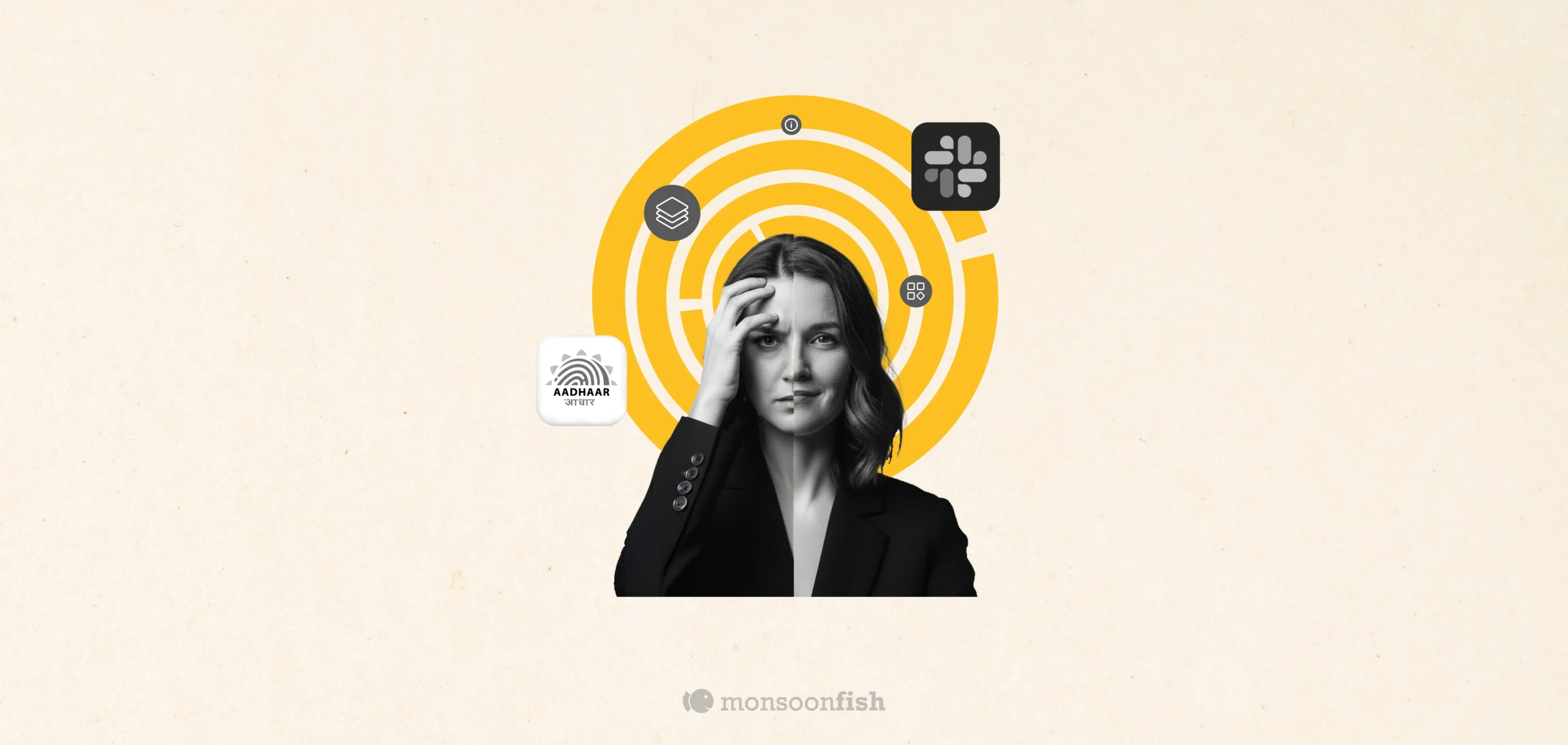
The best products don’t show everything upfront they reveal complexity gradually. From Slack to Aadhaar, this “Onion Peel Design” approach helps users stay focused, confident, and in control. Instead of cutting features, the key is layering them—so users see what they need, exactly when they need it.


Think about the first time you opened Slack. It feels almost too simple. Channels. A couple of DMs. A big friendly search bar. A + button. That’s it. Nothing screams “power tool.” No intimidating menus. No feature parade.
But then you keep using it. A week later, you’re setting reminders, building tiny automations, using shortcuts, starting huddles, organizing workflows without even thinking about it. And the same Slack starts feeling faster—not because the app changed, but because it only revealed depth when you were ready.
We noticed this pattern across two completely different products.
One is used by teams globally, that’s Slack. The other by millions of Indians – UIDAI Aadhar. And strangely, the same metaphor fits both: the onion.
What “Onion Peel Design” Really Means
Most products fail because they try to look powerful on Day 1.
They dump everything upfront—features, links, toggles, options, settings. The intention is good (“let’s give users everything”), but the effect is brutal: people feel lost, slow, and slightly dumb. And when users feel dumb, they quit.
Onion Peel Design is the opposite approach:
- The first layer is clean, calm, and obvious.
- The next layers appear only when the user’s intent becomes clearer.
- Advanced options exist, but they don’t shout.
It’s not “hiding features.” It’s sequencing complexity.
Slack is an Onion. Aadhaar Needed to Become One Too.
We carried that same layering approach into Aadhaar, where the audience isn’t a team, but a nation.
Aadhaar isn’t something people browse for fun. It’s a utility. People come slightly stressed, trying to do one thing: find one answer, one service, and get out. The stakes are real, which makes every extra click feel heavier.
The older experience had a classic “flattened onion” problem: too many links packed together, important actions buried, and flows that felt scary because users weren’t sure what they were about to trigger.
So the redesign had to get the first peel right.
- Put the most common jobs upfront
- Reduce the hunt
- Guide people step-by-step (especially on mobile)
- Keep deeper details available, but not dumped at the start
Because when you put everything on the first screen, it doesn’t feel “powerful.”
It just feels heavy.
The Takeaway: Don’t Cut Features, Re-Layer Them
If your product is starting to feel “busy,” the instinct is usually: remove things. Simplify. Cut features.
But often, the problem isn’t the features. It’s the layering.
Start by asking:
- What’s the first peel—what should a stressed user see in 5 seconds?
- What can wait until the user signals intent?
- What belongs in deeper layers without being hidden?
The best products don’t overwhelm you with capability.
They earn your trust one layer at a time.
CATEGORIES
AI features Users Don’t Trust Yet: Designing for Trust
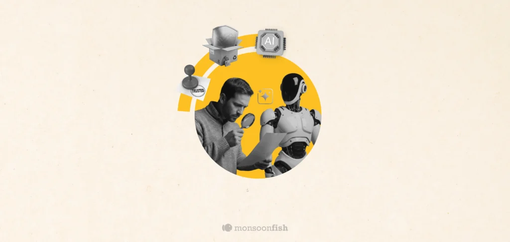
AI features can be powerful, but users still pause before trusting them. Not because they hate AI, but because the experience doesn’t make reliability obvious. This blog explores why trust breaks in AI products and the UX patterns that help users verify outputs, stay in control, and adopt AI with confidence.
Good UX is boring (and that’s the point)
A friend showed me a “cool” app—animations, pulsing buttons, and micro-interactions everywhere. For a minute it looked impressive. By minute three, he was negotiating with it: double tapping, second-guessing saves, hunting for missing filters. That’s when “cool” stops being the goal. Good UX often feels boring because it quietly gets you to the outcome and gets out of your way.
The Practical AI Tool Stack for Content, Design, and Planning

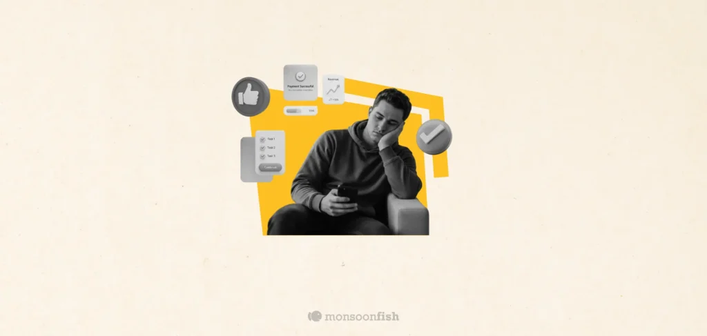
Some products make you ask, “Who approved this?” Not because they’re ugly but because they’re trying to be everything. From silly combos to bloated apps, unnecessary feature bundling adds confusion, breaks trust, and increases risk. Here’s how to spot good bundles vs noise.