Using Data in UX, starter's guide
The purpose of using data in UX is to ensure objectivity in decisions. High-end analysis and statistical tools gives you insights on design accuracy.
It is natural to assume that designers design and users use. Fairly obvious statement, you’ll say. But quite often, designers are trapped into designing for themselves. That forces users to design their own workarounds where possible, or worse, stop using the app or website; giving rise to memes such as this:
This is where using data comes into picture. User research takes prominence: especially at a time when products are being created that cater to every niche and whim of the human mind. And here, generalised beliefs and universal laws may not be enough.
For our purposes, we can think of data as any information point that can be verified. The purpose of such an information point, is in ensuring objectivity to the decisions taken.
For designers, data primarily helps in two aspects:
- Understanding a problem better
- Creating more effective and optimised solutions
Data may not always point you to left or right. Often, where using data helps is in sharpening your judgement. Yes, you still need to have intuition, you have to decide, but data can give you the nudge towards affirmative when earlier it may just have been a half-hearted yes. The confidence you need to explain your decisions, comes from the data that helped influence them.
Ofcourse, talking about a data-informed or even data-driven approach to UX sounds legit, but there are several barriers even if you want to. Project deadlines are always yesterday, teams are more often than not short-staffed for the kind of work required, your client has a specific idea in his head and wants merely an execution. All kinds of practical problems can get in the way. But we as designers, and should always try to do the right thing. It is not difficult to suggest, at times, even persuade your clients to have a second thought.
And then there is other end of the spectrum too. It has been in the marketing world for quite some time, but we also see retrofitting research into a route or concept already undertaken for the task.
Aadhaar:

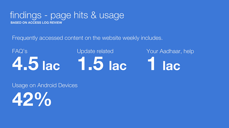
User persona: Helped us cater the site to a large user-base, and also not alienate other stakeholders
13 languages, Billion hits and other data points from first slides: Helped set the approach. Focus on accessibility helped us eliminate options early on, streamlining the process
Android device most used to access: Helped us in choosing font (along w/accessibility), reference design from other apps (material/card design), form fills etc, Adapting material style to the website we were developing.
For eg, event ticketing platform. User interviews, one on one sessions. We were figuring out the origin point of where ppl hear about an event. We found that 7 out of 10 times, we got people who saw it on either friends’ social media, newspaper. Personal origin point. At the same time, Apple was delivering curated news on appstore. They would market an app through dev interview, or informative articles on productivity etc. Suddenly, you feel apple is caring about what apps you should use.
For an event ticketing platform, we created a Digest format for the homepage of the users. What we found in our research was that seven out of ten times, people found out about events from either their friends on social media or the newspaper. We realized that the origin point was personal. At the same time, Apple was delivering a curated news experience on the App Store. They would also market these apps through developer interviews, domain-specific articles (eg. productivity) etc. Suddenly, what the users end up feeling is that Apple is caring about the apps that you should use.
Digest format for Townscript. It was a gamble. Machine learning guy analysing user patterns etc. The digest gets built over time. Repeated users, making it richer and richer. We wanted it to feel like a Page3 from newspaper. Headline screaming for attention. A healthy mix of events and a lifestyle feel to it. It was designed to paint a picture of yours. Experience is unique and personalised. Makes user come back and increase retention.
For event cards across categories, which are a lot actually, we paid attention to how much info should be there in the card. User interviews were conducted based on categories. Distilled around 130+ categories into 8 major categories. What ppl look for in a DJ event is different than food festivals to an exhibition. Each card should show different and varied information. We kept info unique to these cards but still retained consistency.
If the user scrolls digest, it goes back to list. Wow in the first fold and then functional as well.
We realised that people paid a lot of attention to maps. For eg. Movies. People used maps to navigate. When ppl look for events, they immediately search maps and direction to the venue. This behaviour is very apparent for Friday events, impulse events. Map view would play important role in such.
Music gigs one color. Workshop one color. Comedy one colour. Color coded. Helped especially in the map view. We had to ensure something for power users. Advance planners. Marathon trainers et. Professional, business events. To help these guys get to their event, we created calendar view. He can use to view all events and filter them.
Restructured the bargaining model into digital place in JARS. Grocery eCommerce thing. First iteration, we did typical ecomm grocery portal. Stand out from grofers, big basket etc. We did not get the brief initially. For second phase of iteration, we conducted tonnes of user interviews. Supermarkets, kirana shops (Usual Mom & Pop general store). Why people go there and buy shit. Relationship between user and kirana store. Proximity, daily frequency, shopping patterns. We came out with 3–4 user personas we could target. We understood how ppl typically shop in a supermarket. What is the first thing they see and how they stack their trolley.
When we worked with JARS, an online grocery portal, the task was to be different.
The key insight we got from user testing was – There is an immense satisfaction when you bargain. Celebration even if you save a buck. Everyone loves a good deal.
Replicate that feeling on app. Bargaining etc. We came up with concept of community buying. Deals start on a Monday and as the week progresses, if there are more users buying the product, overall cost of product starts dropping. At the end of the week, excess money saved goes to the wallet for future use.
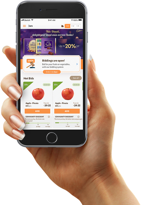
Not all data you get can be used to make decision: We were also replicate physical way of buying product. You go to a vegetable shelf, see vegetable stack, pan down, pan left. Create shelf experience in the UI which bombed. It was too challenging technically, to code. Putting community buying aspects on it proved hard and more importantly, users were very well acquainted with the cart system and we realised it shouldn’t be changed for the sake of change. Resorted back to cart format!
So overall, even if not data-driven, which is to say, using high-end analysis and statistical tools, it is fairly easy to check if you are designing correctly or not. User interviews, stakeholder interviews and overall analytics such as website data, app downloads/installs, page-sessions, all add up to give you insights into which road to take, for the one who knows where to look!
It is natural to assume that designers design and users use. Fairly obvious statement, you’ll say. But quite often, designers are trapped into designing for themselves. That forces users to design their own workarounds where possible, or worse, stop using the app or website; giving rise to memes such as this:
This is where using data comes into picture. User research takes prominence: especially at a time when products are being created that cater to every niche and whim of the human mind. And here, generalised beliefs and universal laws may not be enough.
For our purposes, we can think of data as any information point that can be verified. The purpose of such an information point, is in ensuring objectivity to the decisions taken.
For designers, data primarily helps in two aspects:
- Understanding a problem better
- Creating more effective and optimised solutions
Data may not always point you to left or right. Often, where using data helps is in sharpening your judgement. Yes, you still need to have intuition, you have to decide, but data can give you the nudge towards affirmative when earlier it may just have been a half-hearted yes. The confidence you need to explain your decisions, comes from the data that helped influence them.
Ofcourse, talking about a data-informed or even data-driven approach to UX sounds legit, but there are several barriers even if you want to. Project deadlines are always yesterday, teams are more often than not short-staffed for the kind of work required, your client has a specific idea in his head and wants merely an execution. All kinds of practical problems can get in the way. But we as designers, and should always try to do the right thing. It is not difficult to suggest, at times, even persuade your clients to have a second thought.
And then there is other end of the spectrum too. It has been in the marketing world for quite some time, but we also see retrofitting research into a route or concept already undertaken for the task
User persona: Helped us cater the site to a large user-base, and also not alienate other stakeholders
13 languages, Billion hits and other data points from first slides: Helped set the approach. Focus on accessibility helped us eliminate options early on, streamlining the process
Android device most used to access: Helped us in choosing font (along w/accessibility), reference design from other apps (material/card design), form fills etc, Adapting material style to the website we were developing.
For eg, event ticketing platform. User interviews, one on one sessions. We were figuring out the origin point of where ppl hear about an event. We found that 7 out of 10 times, we got people who saw it on either friends’ social media, newspaper. Personal origin point. At the same time, Apple was delivering curated news on appstore. They would market an app through dev interview, or informative articles on productivity etc. Suddenly, you feel apple is caring about what apps you should use.
For an event ticketing platform, we created a Digest format for the homepage of the users. What we found in our research was that seven out of ten times, people found out about events from either their friends on social media or the newspaper. We realized that the origin point was personal. At the same time, Apple was delivering a curated news experience on the App Store. They would also market these apps through developer interviews, domain-specific articles (eg. productivity) etc. Suddenly, what the users end up feeling is that Apple is caring about the apps that you should use.
Digest format for Townscript. It was a gamble. Machine learning guy analysing user patterns etc. The digest gets built over time. Repeated users, making it richer and richer. We wanted it to feel like a Page3 from newspaper. Headline screaming for attention. A healthy mix of events and a lifestyle feel to it. It was designed to paint a picture of yours. Experience is unique and personalised. Makes user come back and increase retention.
For event cards across categories, which are a lot actually, we paid attention to how much info should be there in the card. User interviews were conducted based on categories. Distilled around 130+ categories into 8 major categories. What ppl look for in a DJ event is different than food festivals to an exhibition. Each card should show different and varied information. We kept info unique to these cards but still retained consistency.
If the user scrolls digest, it goes back to list. Wow in the first fold and then functional as well.
We realised that people paid a lot of attention to maps. For eg. Movies. People used maps to navigate. When ppl look for events, they immediately search maps and direction to the venue. This behaviour is very apparent for Friday events, impulse events. Map view would play important role in such.
Music gigs one color. Workshop one color. Comedy one colour. Color coded. Helped especially in the map view. We had to ensure something for power users. Advance planners. Marathon trainers et. Professional, business events. To help these guys get to their event, we created calendar view. He can use to view all events and filter them.
Restructured the bargaining model into digital place in JARS. Grocery eCommerce thing. First iteration, we did typical ecomm grocery portal. Stand out from grofers, big basket etc. We did not get the brief initially. For second phase of iteration, we conducted tonnes of user interviews. Supermarkets, kirana shops (Usual Mom & Pop general store). Why people go there and buy shit. Relationship between user and kirana store. Proximity, daily frequency, shopping patterns. We came out with 3–4 user personas we could target. We understood how ppl typically shop in a supermarket. What is the first thing they see and how they stack their trolley.
When we worked with JARS, an online grocery portal, the task was to be different.
The key insight we got from user testing was – There is an immense satisfaction when you bargain. Celebration even if you save a buck. Everyone loves a good deal.
Replicate that feeling on app. Bargaining etc. We came up with concept of community buying. Deals start on a Monday and as the week progresses, if there are more users buying the product, overall cost of product starts dropping. At the end of the week, excess money saved goes to the wallet for future use.
Not all data you get can be used to make decision: We were also replicate physical way of buying product. You go to a vegetable shelf, see vegetable stack, pan down, pan left. Create shelf experience in the UI which bombed. It was too challenging technically, to code. Putting community buying aspects on it proved hard and more importantly, users were very well acquainted with the cart system and we realised it shouldn’t be changed for the sake of change. Resorted back to cart format!
So overall, even if not data-driven, which is to say, using high-end analysis and statistical tools, it is fairly easy to check if you are designing correctly or not. User interviews, stakeholder interviews and overall analytics such as website data, app downloads/installs, page-sessions, all add up to give you insights into which road to take, for the one who knows where to look!
CATEGORIES
