Medical & Healthcare
 Cybersecurity
 Travel & Hospitality
 Edtech
 Enterprise
 Non-Profit
 Fintech
 Agritech
 Retail & Real Estate
 Design for AI
The “Who Approved This?” Problem
Some products make you ask, “Who approved this?” Not because they’re ugly but because they’re trying to be everything. From silly combos to bloated apps, unnecessary feature bundling adds confusion, breaks trust, and increases risk. Here’s how to spot good bundles vs noise.
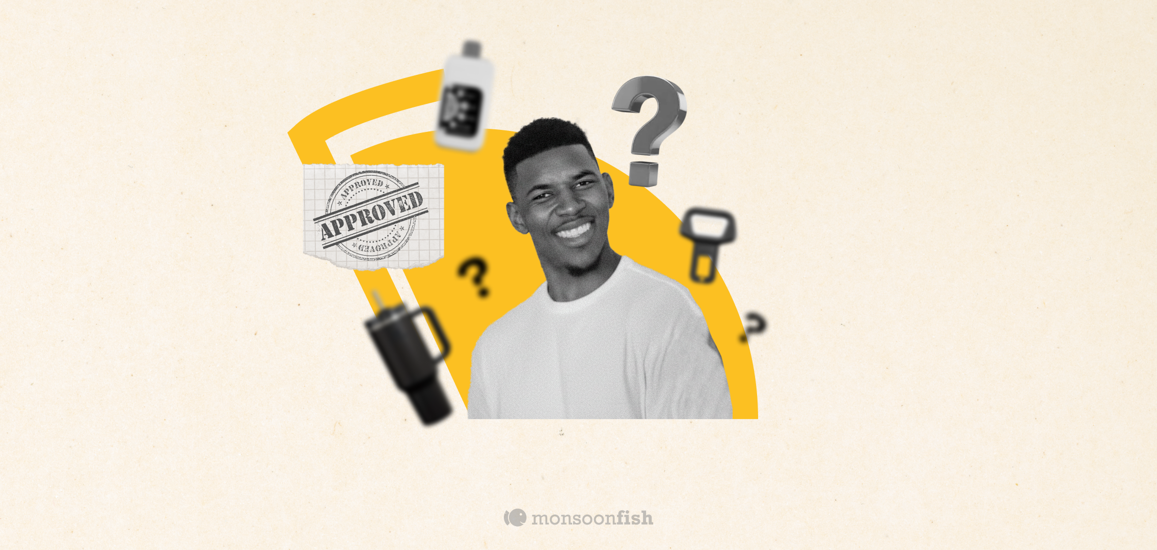


Every once in a while you see a product and your brain goes: “Who approved this?”
Not because it’s ugly. Because it’s trying too hard to be everything.
Let us take you through a few such products:
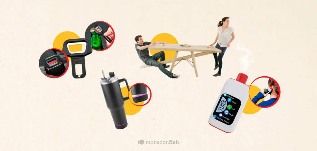
- Seatbelt alarm silencer + bottle opener (two bad ideas, one object)
- A see-saw table (because stability is apparently “optional”)
- A water bottle speaker (water + electronics = bold… not sure in a good way)
- A vape + phone case (congrats, your addiction now has notifications)
These are funny… but they reveal a real product disease: unnecessary feature bundling.
What feature bundling should do (when it’s done right)
Good bundling is actually powerful in UX. It reduces friction because it:
- Cuts steps (user completes the job faster)
- Reduces decision fatigue (fewer “which tool do I use?” moments)
- Keeps context intact (no switching apps, screens, or modes)
- Feels natural (the added feature supports the main job, not distracts from it)
Think of a notes app that adds scan-to-PDF. Or a ride app that adds SOS and share trip status. These aren’t random extras — they’re helpers to the core task.
Good bundling feels like:
“Oh nice, I needed that anyway.”
What unnecessary bundling does to UX
Bad bundling is when the product stops being focused and starts becoming a clutter party. It harms UX because it:
- Breaks trust: Users wonder, “Is this product safe / serious / well thought-out?”
- Adds cognitive load: More buttons, more modes, more confusion.
- Creates conflicting goals: One feature pushes you one way, another pushes you somewhere else.
Makes failure more expensive: When bundled parts interact badly, the whole product feels unreliable.
A seatbelt alarm silencer isn’t just “extra.” It signals:
“We’re optimizing for bypassing safety.”
Then you attach a bottle opener and it becomes:
“We’re also optimizing for chaos.”
Even in digital products, this happens all the time:
- A finance app suddenly becomes a shopping app.
- A messaging app becomes a payments app becomes a content feed.
- A simple dashboard becomes a “control room” with 47 toggles no one asked for.
The result is the same: people feel lost, and they leave.
A simple test to avoid bad bundles
Before adding any “extra” feature, ask:
- Does it support the user’s main job — or distract from it?
- Would a user expect this feature to exist here?
- Does it reduce steps or add steps?
- If this feature disappeared tomorrow, would users complain?
- Does it increase safety, clarity, or confidence? Or introduce risk?
If the feature doesn’t make the core experience simpler, faster, or safer, it’s probably just noise.
Because the best products aren’t the ones that do the most.
They’re the ones that do the right things, in the right place, at the right time.
CATEGORIES
Google is Solving for the First 10 minutes and More

Google Labs is quietly building AI tools that don’t replace workflows, they sit on top of them. Learn how these contextual app layers reduce cognitive load at the exact moment users get stuck, and how to apply this thinking to your own product.
Why the Best Products Feel Simple… Until You Need More

The best products don’t show everything upfront they reveal complexity gradually. From Slack to Aadhaar, this “Onion Peel Design” approach helps users stay focused, confident, and in control. Instead of cutting features, the key is layering them—so users see what they need, exactly when they need it.
AI features Users Don’t Trust Yet: Designing for Trust

AI features can be powerful, but users still pause before trusting them. Not because they hate AI, but because the experience doesn’t make reliability obvious. This blog explores why trust breaks in AI products and the UX patterns that help users verify outputs, stay in control, and adopt AI with confidence.