 Medical & Healthcare
 Cybersecurity
 Travel & Hospitality
 Edtech
 Enterprise
 Non-Profit
 Fintech
 Agritech
 Retail & Real Estate
 Design for AI
Responding correctly to Responsive Web Design
We need to consider a lot of aspects while building responsive web designs. We look at the challenges involved in creating a responsive web design.

Consider this scenario – Dave is planning a trip in the summer. Since it’s going to be sunny, he browses some sunglasses on his desktop at work. At home, while binge watching Netflix on iPad, he browses some more sunglasses and shortlists a few. Finally, while going to sleep, he selects and orders a pair from Amazon on his smartphone.
For the same purpose, Dave has used a desktop, an iPad and a smartphone. Three different screens. And this scenario is getting more and more common as we speak. This infographic does a nice job of capturing the multi-screen human behaviour in the modern era. Add to this the rise of different devices people are using now – phablets, tablets, laptops, 2-in-1s, consoles, wearables, phones with notches, and so on.
What does this mean for your product, app or website?
This brings us to the concept of Responsive Web Design (RWD), which was originally defined by Ethan Marcotte in A List Apart, in… 2010. At the time, it focussed on making print-friendly designs work accurately in the web medium. But today, the concept still applies, although, across multiple devices, in different forms. It is not just making the website mobile-friendly, anymore. It is very simple to define RWD in one word. Water. It is equally hard to ascribe the properties of water, to the design you are building for users to watch on their screens.
Google recently announced a redesign of the Google Translate website, which does a good job of displaying the basic aspect of RWD – scaling the layout as per the screen requirement.
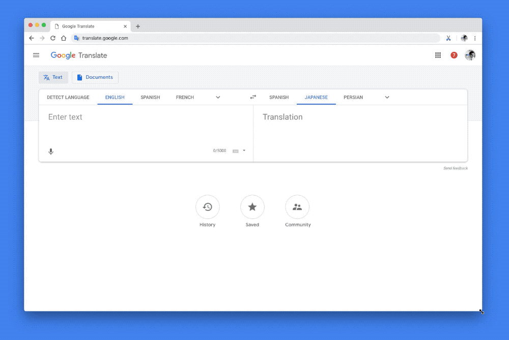
But this is the surface. You are well aware that your team will ensure the app or website is readable on smaller screens. But as we delve deeper, there are a lot of considerations you have to make while making your website responsive across devices, in a meaningful manner. It is challenging to build a responsive website, but it is even more challenging to know whether you are doing it right or not!
Aligning team with the correct approach
Continuous testing across multiple devices is essential in getting it right. The biggest consideration often comes on what content to keep and what not to, as you go on smaller screens. RWD is not a Bonsai. Taking a website and crunching it down in a bid to make it mobile-friendly is a cardinal mistake, and often a way out. You need to fundamentally evaluate use-cases, and decide what should go in your mobile website vs desktop one. You may need to alter your product features if required.
This is the primary reason why Inshorts is so much popular over mobile versions of say, someone like The Indian Express. People browsing news on their phones do not want the first paragraph with tidbits that make you want to read the whole story, they want a gist of the whole story in one paragraph.
When you move from a large office to a smaller one, you don’t opt for shorter tables and tiny chairs, you optimise the use of space around you. Maybe you don’t need such a large conference room. A smaller telephone booth will do. Perhaps the open cubicle system works better than secluded cabins.
It is all about balancing the User Experience
It all boils down to the kind of user experience you want to deliver on what screens. Today, making your content accessible to users at any place is not a problem, it is about how efficiently you design the system for a particular use-case; how you align the experience which will deliver the action you desire from your users. This will ensure your product or website achieves scale effectively, builds multiple sources of revenue and offers streamlined experience to your users – and in the process, appears prettier on every device they look on. Consider this scenario – Dave is planning a trip in the summer. Since it’s going to be sunny, he browses some sunglasses on his desktop at work. At home, while binge watching Netflix on iPad, he browses some more sunglasses and shortlists a few. Finally, while going to sleep, he selects and orders a pair from Amazon on his smartphone.
For the same purpose, Dave has used a desktop, an iPad and a smartphone. Three different screens. And this scenario is getting more and more common as we speak. This infographic does a nice job of capturing the multi-screen human behaviour in the modern era. Add to this the rise of different devices people are using now – phablets, tablets, laptops, 2-in-1s, consoles, wearables, phones with notches, and so on. This brings us to the concept of Responsive Web Design (RWD), which was originally defined by Ethan Marcotte in A List Apart, in… 2010. At the time, it focussed on making print-friendly designs work accurately in the web medium. But today, the concept still applies, although, across multiple devices, in different forms. It is not just making the website mobile-friendly, anymore. It is very simple to define RWD in one word. Water. It is equally hard to ascribe the properties of water, to the design you are building for users to watch on their screens.
Google recently announced a redesign of the Google Translate website, which does a good job of displaying the basic aspect of RWD – scaling the layout as per the screen requirement. But this is the surface. You are well aware that your team will ensure the app or website is readable on smaller screens. But as we delve deeper, there are a lot of considerations you have to make while making your website responsive across devices, in a meaningful manner. It is challenging to build a responsive website, but it is even more challenging to know whether you are doing it right or not! Continuous testing across multiple devices is essential in getting it right. The biggest consideration often comes on what content to keep and what not to, as you go on smaller screens. RWD is not a Bonsai. Taking a website and crunching it down in a bid to make it mobile-friendly is a cardinal mistake, and often a way out. You need to fundamentally evaluate use-cases, and decide what should go in your mobile website vs desktop one. You may need to alter your product features if required.
This is the primary reason why Inshorts is so much popular over mobile versions of say, someone like The Indian Express. People browsing news on their phones do not want the first paragraph with tidbits that make you want to read the whole story, they want a gist of the whole story in one paragraph.
When you move from a large office to a smaller one, you don’t opt for shorter tables and tiny chairs, you optimise the use of space around you. Maybe you don’t need such a large conference room. A smaller telephone booth will do. Perhaps the open cubicle system works better than secluded cabins. It all boils down to the kind of user experience you want to deliver on what screens. Today, making your content accessible to users at any place is not a problem, it is about how efficiently you design the system for a particular use-case; how you align the experience which will deliver the action you desire from your users. This will ensure your product or website achieves scale effectively, builds multiple sources of revenue and offers streamlined experience to your users – and in the process, appears prettier on every device they look on.
CATEGORIES
Google is Solving for the First 10 minutes and More

Google Labs is quietly building AI tools that don’t replace workflows, they sit on top of them. Learn how these contextual app layers reduce cognitive load at the exact moment users get stuck, and how to apply this thinking to your own product.
Why the Best Products Feel Simple… Until You Need More

The best products don’t show everything upfront they reveal complexity gradually. From Slack to Aadhaar, this “Onion Peel Design” approach helps users stay focused, confident, and in control. Instead of cutting features, the key is layering them—so users see what they need, exactly when they need it.
AI features Users Don’t Trust Yet: Designing for Trust

AI features can be powerful, but users still pause before trusting them. Not because they hate AI, but because the experience doesn’t make reliability obvious. This blog explores why trust breaks in AI products and the UX patterns that help users verify outputs, stay in control, and adopt AI with confidence.