Medical & Healthcare
 Cybersecurity
 Travel & Hospitality
 Edtech
 Enterprise
 Non-Profit
 Fintech
 Agritech
 Retail & Real Estate
 Design for AI
Tiny Words, Big Costs: A Microcopy Playbook
From Google to Apple: walk through examples and tips to write microcopy that moves metrics. Grab 100 proven microcopy ideas to ship today.


If you’re wondering whether microcopy really affects the bottom line, think about this: the global average cart-abandonment rate is roughly 70%, much of which is due to avoidable friction at checkout. Small clarity boosts can pay off outsized returns. For instance, a single wording + flow change at a major retailer unlocked $300M in additional revenue, by reducing a tiny-but-costly point of hesitation.
Below are real-world examples of microcopy that reduce friction, build trust, and nudge action. Also find 7 tips to write better microcopy for your product.
Real-World Microcopy Wins (and Why They Work)
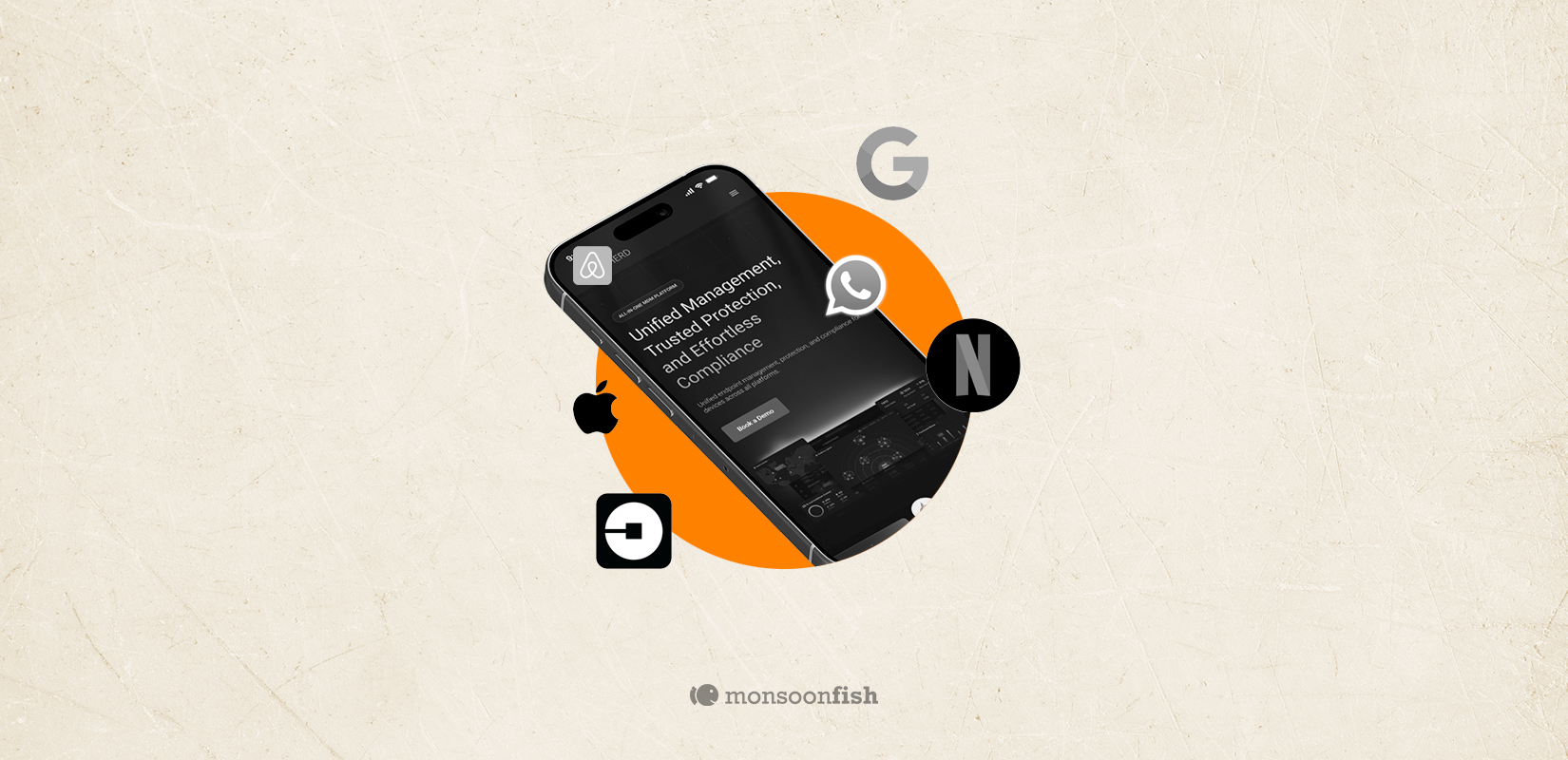
1) Google
Disambiguate icons with hover text → feature discovery.

What it says: Search by image.
Why it works: De-mystifies the camera icon; nudges Lens discovery and multimodal behavior.
Business effect: Higher Lens CTR → more multimodal searches → richer signals for ranking/ads.
2) Uber
Describe options in 5–7 plain words → reduce choice friction.

What it says (examples):
- Auto— Pay directly to driver, cash/UPI only
- Uber Go— Affordable compact AC rides
- Go Non AC — Everyday affordable rides
Why it works: Kills choice paralysis with plain-English benefits; sets expectations up front.
Business effect: Faster selection + better self-segmentation → higher request conversion, mix-shift to higher-margin categories; fewer support tickets from mismatched expectations.
3)Netflix
Label for time budgets → increase “quick start” sessions.

What it says: Category label 30-Minute Laughs.
Why it works: Solves the “I only have half an hour” problem; sharply reduces decision fatigue.
Business effect: More titles start in short sessions, higher daily frequency, habit formation.
4) Apple
Bundle with one-line math → ARPU & retention lift.

What it says: “Four Apple services. One easy subscription.”
Why it works: Clear bundle value + simplicity; reframes cost as savings & convenience.
Business effect: Higher services ARPU and retention; lower churn vs single-service subs
7 High-Value Tips to Write Microcopy That Works
- Lead with the issue
The first word should signal what’s wrong or what’s next: “Error: Card declined” / “Next: Pick a plan.” It cuts the mental lookup time. - 404 isn’t enough: add context + a path back
Say what happened, why it happened (if you know), and give one primary action (search, homepage, prior step). - Write for action, not labels
Replace generic CTAs like “Submit” with “Create account” or “Send application.” Users understand the outcome instantly. - Be specific in error states
Tell users how to fix it ( for example: “Use 8+ characters+1 number” while setting up an account) and validate inline. 31% of ecommerce sites still lack inline validation, which adds friction. - Match brand voice without sacrificing clarity
Playful is fine, but critical flows need calm, plain English. Pick tone by risk level in the user journey. - Design for edge cases
Loading, empty, and failure states are where trust is won or lost. Add a line of reassurance or a concrete fallback.
7. Cut the fillers and noise
Microcopy isn’t a marketing copy. Shorter = clearer = faster action. If a word doesn’t reduce confusion or drive the next step, drop it.
If design is how it works, microcopy is how it moves. Clearer labels, specific errors, and smarter nudges significantly reduce friction, lift starts and completes, and compound into real revenue. The best part? You can ship these changes without a full redesign.
Grab our 100 Proven Microcopy Suggestions, organized by stage and why they work.
Looking for a microcopy audit for your product? We’ve got you. We review your key flows, to pinpoint the 20% of copy causing 80% of friction, and share a prioritized set of fixes, example phrasing, and A/B test ideas.
CATEGORIES
AI features Users Don’t Trust Yet: Designing for Trust

AI features can be powerful, but users still pause before trusting them. Not because they hate AI, but because the experience doesn’t make reliability obvious. This blog explores why trust breaks in AI products and the UX patterns that help users verify outputs, stay in control, and adopt AI with confidence.
Good UX is boring (and that’s the point)

A friend showed me a “cool” app—animations, pulsing buttons, and micro-interactions everywhere. For a minute it looked impressive. By minute three, he was negotiating with it: double tapping, second-guessing saves, hunting for missing filters. That’s when “cool” stops being the goal. Good UX often feels boring because it quietly gets you to the outcome and gets out of your way.
The Practical AI Tool Stack for Content, Design, and Planning

Some products make you ask, “Who approved this?” Not because they’re ugly but because they’re trying to be everything. From silly combos to bloated apps, unnecessary feature bundling adds confusion, breaks trust, and increases risk. Here’s how to spot good bundles vs noise.