Medical & Healthcare
 Cybersecurity
 Travel & Hospitality
 Edtech
 Enterprise
 Non-Profit
 Fintech
 Agritech
 Retail & Real Estate
 Design for AI
Good UX is boring (and that’s the point)
A friend showed me a “cool” app—animations, pulsing buttons, and micro-interactions everywhere. For a minute it looked impressive. By minute three, he was negotiating with it: double tapping, second-guessing saves, hunting for missing filters. That’s when “cool” stops being the goal. Good UX often feels boring because it quietly gets you to the outcome and gets out of your way.


A friend once showed me a new app he had downloaded and said, “Look how cool this is.”
He didn’t mean “cool” like it solved a real problem. He meant cool like it moved. Cards slid in dramatic arcs, buttons pulsed with confidence, micro-animations kept winking at you like they had their own personality. For the first minute, it genuinely felt impressive. It also felt like walking into a restaurant where the chef keeps coming to your table to do tricks with fire.
By minute three, he stopped talking about how cool it was and started doing that thing all users do when an interface gets in their way: he began negotiating with it. He tapped twice because the first tap didn’t register. He paused because he couldn’t tell if something had been saved. He scrolled back up because the filter panel had disappeared. He stared at the screen and asked the most damning product question of all: “Wait… where is it?”
That’s the moment when “cool” stops being the goal.
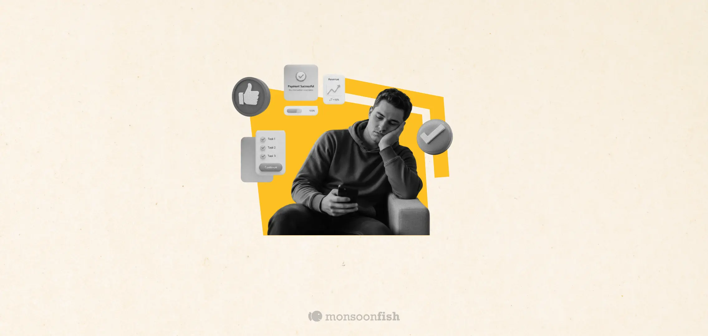
Good UX often feels boring because it doesn’t demand attention. It doesn’t ask for applause. It doesn’t make you admire the interface. It quietly gets you to the outcome you came for, and then it gets out of your way. If you’ve ever booked a cab, paid a bill, found a file, or reset a password without thinking twice, you’ve experienced “boring UX” at its best.
And boring is not a lack of creativity. Boring is a sign of alignment.
We’ve All Heard – Boring UX is Invisible when it’s working
The most valuable interfaces are the ones you don’t notice because you are too busy doing the thing you actually care about.
Nobody opens a banking app for vibes. Nobody uses a hospital portal because the typography is tasteful. Nobody in an enterprise tool thinks, “This dropdown is gorgeous.” They are there to complete a task, reduce uncertainty, and move on with their day without creating more work for themselves.
When UX is working, it disappears into the background. The user’s attention stays on the job they are trying to get done: send money, confirm an appointment, create an invoice, find a report, approve a request, ship a feature. That “I didn’t even think about it” feeling is not accidental. It is what happens when the design respects the user’s mental energy.
In that sense, boring UX is humane. It does not compete for attention. It protects it.
“Delight” is overrated when the basics are shaky
Teams love the idea of delight because it sounds like a shortcut to love. Add animation. Add a clever empty state. Add a fun microcopy line. Add a little confetti moment. All of this can work, but only when the foundation is solid.
If the user is unsure what to do next, no amount of delight will save the experience. If the user is anxious about whether something is final, no animation will reduce that anxiety. If the interface forces people to re-check, re-enter, and re-verify, even the best visual polish will feel like a distraction.
The truth is that most “delight” becomes noise when a product is unclear.
Good UX feels boring because it has already answered the questions the user would otherwise keep asking in their head:
- Where am I right now?
- What just happened?
- What happens if I click this?
- Did it work?
- How do I undo it?
- What do I do next?
When those questions don’t show up, the experience feels smooth. Smooth often reads as boring because nothing spikes. No confusion spike, no fear spike, no “wait what” spike. Just flow.
Boring UX reduces doubt, and doubt is expensive
From a business perspective, boring UX is not just “nice.” It is efficient.
Doubt creates friction, and friction creates drop-offs. Doubt creates support tickets. Doubt creates internal escalations. Doubt creates slow adoption in B2B products because teams do not trust what they cannot understand. Doubt creates training costs, longer onboarding, and a dependency on “that one person” who knows how the system works.
In most products, the biggest UX opportunity is not adding features. It is removing doubt.
That is why boring UX tends to correlate with outcomes that actually matter: better activation, higher completion rates, fewer errors, fewer reversals, fewer complaints, better retention. Users may not praise it, but they will keep using it. And repeat usage is usually the real KPI of design.
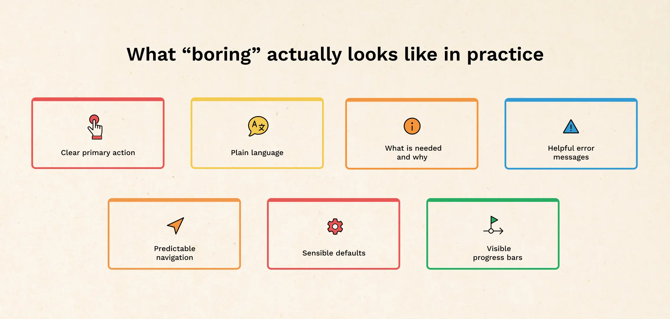
What “boring” actually looks like in practice
Boring UX is not plain. It is precise. It shows up in decisions that feel obvious in hindsight:
- The primary action is clearly the primary action, without you needing to hunt for it.
- The language is plain and specific, not clever at the cost of clarity.
- Forms ask only for what they truly need, and they explain why they need it when it feels intrusive.
- Errors are written like a helpful colleague, not like a scolding system message.
- Confirmation states exist where it matters, so users do not worry if the action went through.
- Navigation stays predictable, so users do not “re-learn” the product every time they return.
- Defaults are sensible, so users can start quickly and adjust later.
- Progress is visible, so users do not feel stuck in a black box.
If you read that list and think, “This is basic,” you’re right. That is exactly why it works.
Most products do not lose users because they are not exciting enough. They lose users because they are confusing at the wrong moment.
The difference between boring and lifeless
It is worth saying this clearly: boring UX does not mean lifeless design.
A product can have personality. It can have charm. It can have a strong brand voice. It can even have delightful moments. The point is that personality should not interfere with usability, and brand should not demand extra cognitive load.
The best products find a balance. They keep the workflow boring and the brand memorable.
Think of it like signage in a well-designed airport. The architecture can be beautiful, but the signs must be brutally clear. You are not there to admire the arrows. You are there to catch a flight without stress.
So why do teams still chase “cool”?
Because cool is visible, and boring is not.
A slick animation looks like progress in a demo. A redesign looks like output in a sprint review. A new feature looks like a win. Meanwhile, removing friction, simplifying flows, fixing ambiguous states, and improving information hierarchy can feel less glamorous even though it creates more value.
Good UX often requires humility. It requires the team to accept that the interface is not the hero. The user is.
If your product feels boring in the best way, users will not call it boring. They will call it “easy.” They will call it “simple.” They will say, “This just works.” And they will recommend it without needing a reason beyond that.
That is the point.
Because in the real world, where people are tired, busy, distracted, and trying to get things done, the most lovable experience is often the one that asks for the least attention.
Boring UX is not the absence of design. It is design doing its job.
CATEGORIES
Google is Solving for the First 10 minutes and More

Google Labs is quietly building AI tools that don’t replace workflows, they sit on top of them. Learn how these contextual app layers reduce cognitive load at the exact moment users get stuck, and how to apply this thinking to your own product.
Why the Best Products Feel Simple… Until You Need More

The best products don’t show everything upfront they reveal complexity gradually. From Slack to Aadhaar, this “Onion Peel Design” approach helps users stay focused, confident, and in control. Instead of cutting features, the key is layering them—so users see what they need, exactly when they need it.
AI features Users Don’t Trust Yet: Designing for Trust

AI features can be powerful, but users still pause before trusting them. Not because they hate AI, but because the experience doesn’t make reliability obvious. This blog explores why trust breaks in AI products and the UX patterns that help users verify outputs, stay in control, and adopt AI with confidence.