 Medical & Healthcare
 Cybersecurity
 Travel & Hospitality
 Edtech
 Enterprise
 Non-Profit
 Fintech
 Agritech
 Retail & Real Estate
 Design for AI
Craft Seamless Navigation For Your Product - 5 Types of Navigation Menus
A well-designed navigation leads users to their desired destinations, by elevating their journey and making it more efficient and enjoyable.
Social Share


Social Share
CATEGORIES
Imagine: Your user is in search of something and came across your website that is overwhelmed by content and captivating visuals. But wait! Have you thought about how they effortlessly explore it deeply, finding exactly what they need? Here’s where the essential part of the user experience comes in – the navigation menu.
In today’s digital landscape crafting an impactful navigation as per the mental model of the user has become an art form. Designers should first understand why the navigation menu holds such paramount importance and why is navigation responsible for the website’s user experience?
It’s not only the collection of links or submenus but also the asset for seamless navigation. A well-designed navigation leads users to their desired destinations, by elevating their journey and making it more efficient and enjoyable.
Why is Navigation Important
Effective website navigation plays a crucial role in guiding visitors seamlessly, ensuring they find the information they seek and enhancing their overall browsing experience. A thoughtfully crafted navigation system directs users to their desired destinations, streamlining their journey and making it more pleasant and efficient.
Leverage the appropriate tools and techniques to craft and refine your website’s navigation system, and witness significant enhancements in:
User Engagement: As users effortlessly traverse your website, accomplishing their objectives with ease, they become more engaged with your content.
Brand Reputation: Foster a favorable perception of your brand by providing a user-focused, seamless user experience.
Conversion Rates: By preventing users from prematurely leaving your site and encouraging continued exploration, a well-organized navigation system can boost conversion rates.
Organic Traffic: A meticulously structured navigation system aids search engines in comprehending your website more effectively, potentially increasing organic traffic.
Incorporating these elements can contribute to a more positive and productive online presence.
5 types of Menus
As navigation tends to be an important part of a website, it is essential to carefully select a navigation menu style that is appropriate for your website.
So let’s go through the 5 astonishing navigation menus that you can consider while crafting an effective navigation that is visually appealing as well as user-friendly.
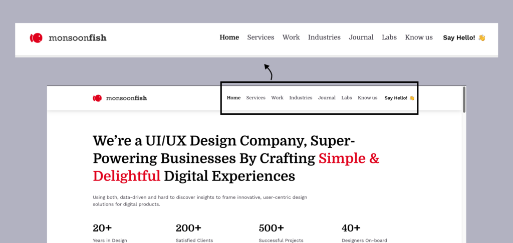
1. Horizontal Menu
The most used and common type of menu is the one placed at the top of a website, which provides a way for users to quickly access different parts of the site. They expand on hover/click and include links to the various pages of the website, for example – homepage, about, contact, blog, and services with additional elements like a search bar, contact info, or language selection.
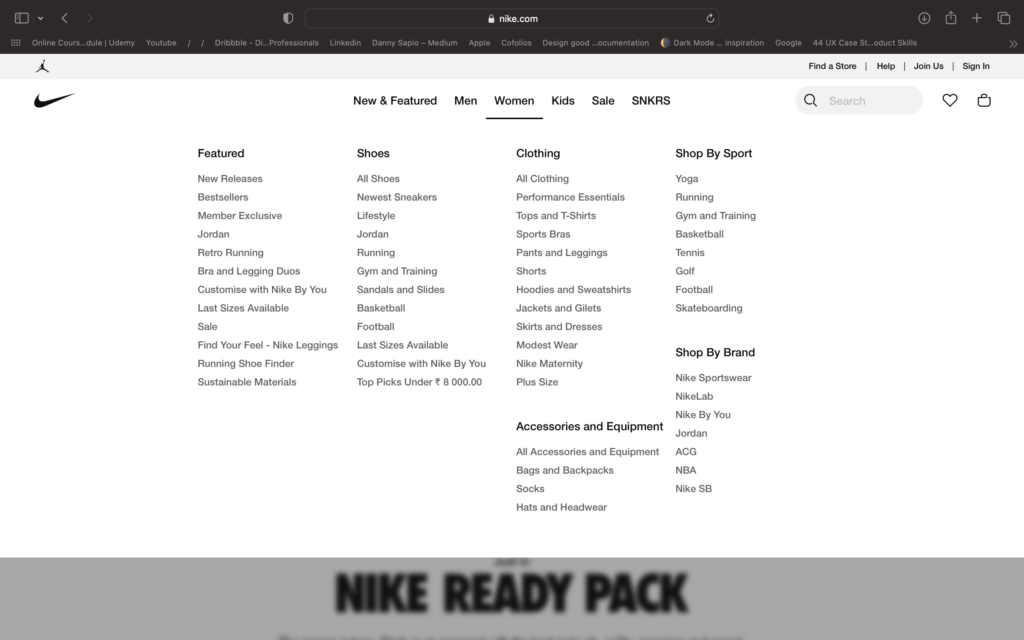
2. Mega Menu
A Mega menu also known as a mega menu, provides a large collection of navigation links for users. These appear in the set of vertical columns that hold different sets of links. When the menu item is selected, it can expand into submenus. Websites with a large number of categories or pages opt for these menus to make users find the right page more easily.
3. Vertical Sidebar Menu
The vertical sidebar menu at the left-hand side of the page is a commonly found feature on the website. Navigation menu that contains a list of clickable links to bring up key pages. It allows users to quickly and easily access a wide range of content.
4. Sticky or Fixed Menu
This means that the navigation menu is always visible and accessible, regardless of how far down the page the user has scrolled. This design approach is popular because it provides continuous and easy access to important navigation links, improving the user experience by reducing the need to scroll back to the top of the page to access the menu.
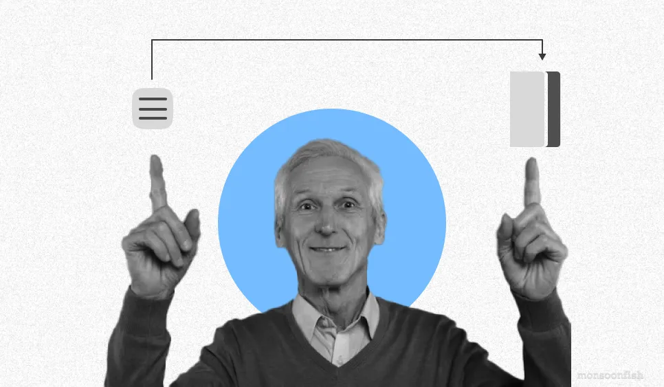
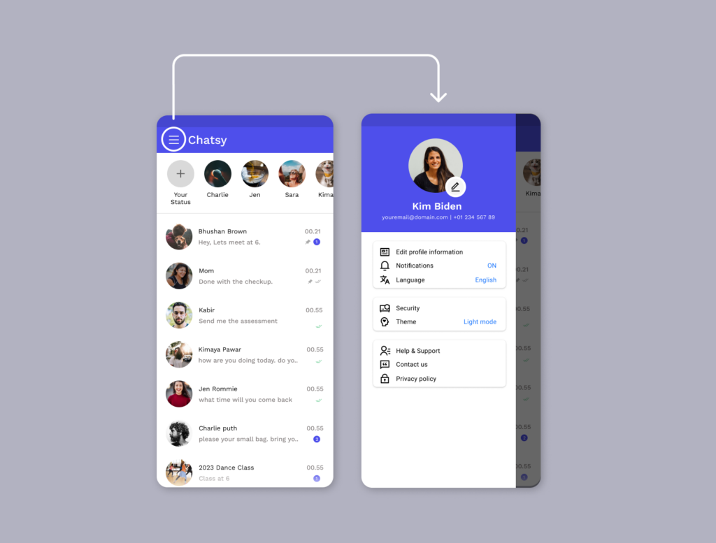
5. Hamburger Menu
When it comes to bringing all navigation links to one place, hamburgers will always be the top choice. It is stylish, subtle and dynamic, saves space and declutters the interface, particularly in smaller devices.
Top 5 tips to remember
But wait, there’s more! Along the way, we would like to share some valuable tips to ensure your navigation menu becomes an incredible site that keeps your users engaged and satisfied.
Tracking Users Journey
Learn your user’s needs and behavior and mapping out your persona that represents your target audience. And then outline the structure of your user’s journey to ensure suitable navigation.
Prioritize Information Access
Depending on the type of navigation menu you use for the website, utilize simple and concise labels for navigation options to complete the effortless journey of your users.
Communicate Orientation of the User on the Website
Help your visitors to have a track on their journey, by using bread crumbs which will reflect the structure of your site.
Make it Mobile Friendly
Design a navigation that will respond well on any device or display, because users tend to use their mobile screens for a quick browse.
Grouping
The practice of organizing and categorizing navigation links on websites or applications into logical groups based on the purpose they serve is called grouping. By grouping similar items, it’s easy for users to navigate to the specific section of your site, through the navigation menu.
Takeaways
An organized and intuitive navigation simplifies the user’s journey, improving their engagement, while optimizing your website for conversation. Invest time in designing a well-functioned navigation for your website, to enjoy the benefits it brings.
So, embark on this journey with us as we unlock the secrets to craft an organized and intuitive navigation. This is going to simplify your users’ experience, improving their engagement while optimizing your website in the best way! And get ready to witness the transformative impact of a well-functioned navigation menu, that will be the investment for your endless benefits.
CATEGORIES
Google is Solving for the First 10 minutes and More
Google Labs is quietly building AI tools that don’t replace workflows, they sit on top of them. Learn how these contextual app layers reduce cognitive load at the exact moment users get stuck, and how to apply this thinking to your own product.
Why the Best Products Feel Simple… Until You Need More

The best products don’t show everything upfront they reveal complexity gradually. From Slack to Aadhaar, this “Onion Peel Design” approach helps users stay focused, confident, and in control. Instead of cutting features, the key is layering them—so users see what they need, exactly when they need it.
AI features Users Don’t Trust Yet: Designing for Trust

AI features can be powerful, but users still pause before trusting them. Not because they hate AI, but because the experience doesn’t make reliability obvious. This blog explores why trust breaks in AI products and the UX patterns that help users verify outputs, stay in control, and adopt AI with confidence.