Are You Thinking Smaller? - Micro-Interactions to Increase User Engagement
You might have even noticed those pop-up emojis as suggestions on Facebook which make you want to react using one of them!
A technique which has tremendous potential for driving engagement that often goes overlooked during the design process is micro-interactions, which designers need to ensure to consider.
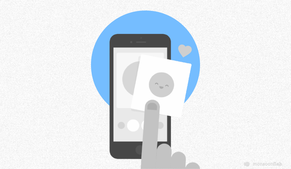
Have you noticed the small animation when you click the ‘add new tweet’ button on Twitter? Or just the simple unlock icon on your locked screen which shows you the direction of unlocking? Have you felt a tiny sense of satisfaction once the page gets refreshed after the animation of ‘pull-to-refresh’? You might have even noticed those pop-up emojis as suggestions on Facebook which make you want to react using one of them!

Right from the moment we wake up due to our phone ringing on the alarm to checking if the message notification is from a friend; all we encounter are micro-interactions that are very thoughtfully incorporated in designing these devices and applications.
Micro-Interactions
The little animations or visual responses that users see when they perform certain actions while using an app/website, are known as micro-interactions. Micro-interactions also have a significant psychological impact on users, which designers need to consider. As content is a crucial part of user engagement, so is responsive web design that reacts intuitively on various screens and devices. A technique which has tremendous potential for driving engagement that often goes overlooked during the design process is micro-interactions, which designers need to ensure to consider.
Micro-Interactions’ Play on Human Nature
We perform several micro-interactions every day without even realizing. As with any interaction, there is an action and a reaction; similarly, when a user performs an action, the interface responds to let the user know that they successfully performed the intended action.
A micro-interaction amidst this phenomenon, conveys to the user an action has been performed through some kind of indication.
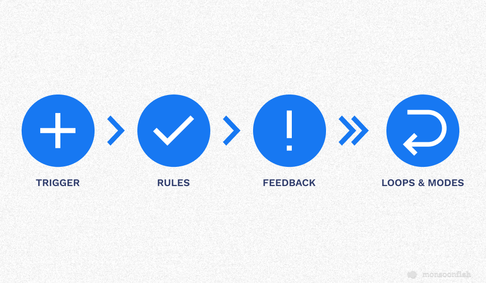
The four basic elements of a micro-interaction are:
- The Trigger
Initiates micro-interactions which are either system initiated or user initiated, that is intended to help the user figure out what action to take next.
- Rules for Responses
These create a streamline for users to successfully accomplish a task, ensuring that the micro-interaction performs properly.
- Feedback
This is a verification, which signals the user that their action was acknowledged. It can be a vibration or a visual cue, a sound effect, or a movement, etc.
- Loops and Modes
These make micro-interactions adaptable. Modes help to toggle features on and off.
The psychological factor involved in micro-interaction is that users generally enjoy the acknowledgement they receive for performing an action correctly. A good micro-interaction can accomplish this easily, quickly as well as efficiently.
For a designer it is essential to understand that these instances might be unnoticed by the user, but they are not meaningless. In Fact if the user is interacting seamlessly with the product with the help of micro interaction without noticing them, that also means that these micro interactions have been incorporated effectively. These indications, however small they might be, generally make the user’s life easier by limiting uncertainty!
Deep Diving into Facebook’s Success through Micro-Interactions
Facebook has been refreshing and updating its interface time and again to keep up with the digital transformation and the way users interact with technology. If you dissect the product, its progress is hidden in the subtlety — micro-interactions.
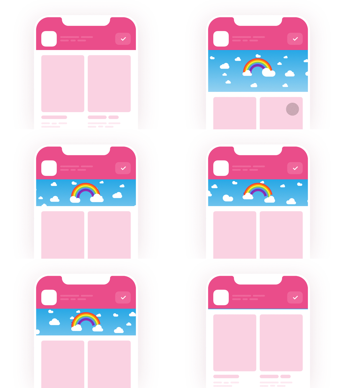
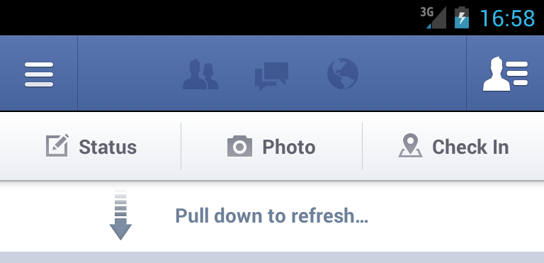
- Pull to Refresh
This action can be compared to that of a slot machine; where the machine lever leads to (possibly) winning a prize, which is an intermittent action linked to a reward. In the same way, Facebook users refresh their feeds to be presented with a variable entertaining or interesting content. Pulling the thumb down from the top of the screen is a simple action needed for this micro-interaction.
- Infinity Scrolling
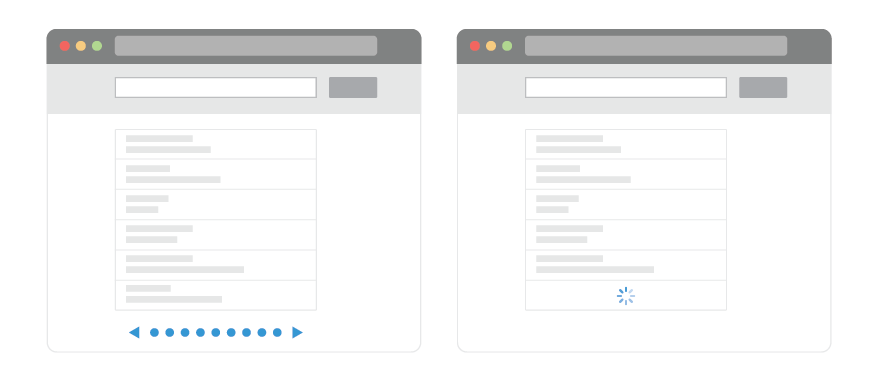
In this micro-interaction, the user has to keep scrolling up at the bottom of the page. It results in seeing more content, with new entertaining posts. This is achieved both on mobile and desktop. Designers can rethink this – if Facebook were to switch to pagination, it would most likely cause a drop in business value. The repetitive motion of scrolling engraves a habit into the user’s mind, thus making the infinite scrolling work to the user’s advantage.
- Like Button
Facebook’s Like button has evolved to express more human emotions by the usage of emojis. Users can react to posts with a more accurate description of their emotions to a particular post. This functionality imparts the feeling that the user’s emotional complexities are empathized, acknowledged; thus enabling them to be more honestly expressed as a reward, making the product more human or empathetic.

All the platforms, websites and apps in this digital era are competing for user’s (limited) time and attention, and hence are focusing more and more on making the most engaging experience possible.
The above mentioned elements have gradually become the standards for product design now.
Companies will always have an incentive to engage their audience as much as possible even if it boils down to influencing thoughts and actions. There are thousands of users on the other side of the screen interacting with a product, and these small details are the most important aspects which can make these thousands of people engage better with the product.
Take-Away: Delight Users with Micro-Interaction to In Turn Increase Engagement
Micro-interactions are one of the most recommended secrets to improving the user experience of a product by making it more engaging.
It’s up to the designers to deliver well-designed micro-interactions that are clear, easy yet effective. By putting value into the smaller details, it becomes evident that attention was given to the user and their needs. Micro-interactions can invoke positive feelings about a product and influence a user’s actions, often without them even realizing about it. Though the details seem minor, they are the biggest difference between functionality and an experience that feels intuitive to users.
UX Designers can continuously improve the ability to generate delightful experiences that change a user’s behavior by using the right micro-interaction throughout the product. By measuring those behaviors, researchers and designers can deliver evidence to clients that these micro-interactions are habit-forming just by humanizing a computerized system.
CATEGORIES
