Medical & Healthcare
 Cybersecurity
 Travel & Hospitality
 Edtech
 Enterprise
 Non-Profit
 Fintech
 Agritech
 Retail & Real Estate
 Design for AI
AI features Users Don’t Trust Yet: Designing for Trust
AI features can be powerful, but users still pause before trusting them. Not because they hate AI, but because the experience doesn’t make reliability obvious. This blog explores why trust breaks in AI products and the UX patterns that help users verify outputs, stay in control, and adopt AI with confidence.
CONTENTS
Why users don’t trust AI features (even when they work)Design principle #1: Make it easy to check, not hard to believeDesign principle #2: Put the user in control of the last mileDesign principle #3: Be honest about boundaries (and make failure graceful)Design principle #4: Match the UI tone to the riskA quick checklist for designing AI trustCommon mistakes teams makeWrap-upSocial Share
CATEGORIES
Last week, someone on a team I worked with told me, “The AI summary is great… but I still read the whole thing.”
Not because the summary was bad. Because it was confident. And on the one day it missed a key detail, it created a tiny mess: a wrong follow-up, an awkward Slack thread, and a quiet decision that went sideways for a few hours.
That’s the thing about AI features. They don’t need to be wrong often to lose trust. They just need to be wrong once at the wrong moment.
So when people ignore your AI suggestions, it’s usually not because they hate AI. It’s because the product hasn’t earned the right to be believed yet.
This blog is about how to design for that: not “trust the model,” but “make trust a default outcome of the UX.”
Why users don’t trust AI features (even when they work)
With traditional features, users expect predictable output: click a button, get a known result.
With AI, the output can vary — so users don’t just ask “Did it work?” They ask “Is this reliable enough that I can use it without double-checking every time?”
Trust drops fast when:
- The AI sounds more certain than it should
- There’s no obvious way to verify
- Mistakes are costly or embarrassing
- Users don’t understand what it’s using (data, context, permissions)
- The feature interrupts their flow instead of helping it
If your AI sits inside a high-stakes moment (sending an email, approving a change, publishing something public), the tolerance for “mostly right” is basically zero.
Design principle #1: Make it easy to check, not hard to believe
Users need a fast way to verify. For example: “Here’s the summary + what it’s based on.” Patterns that usually work:
Similarly, add a “Show work” drawer. Most people won’t open it every time but knowing it exists changes how willing they are to trust the output.
If you’re not sure where trust is breaking in your flow, a quick UX Audit often surfaces the exact moment users start second-guessing.
Design principle #2: Put the user in control of the last mile
People trust AI more when it feels like an assistant, not an author. So design for “AI proposes, human decides.”Some of the good defaults can be:
- Suggestions are editable
- Risky actions require confirmation (send, publish, delete, approve)
- Users can steer the output with lightweight controls (“shorter”, “more formal”, “don’t mention pricing”)
Example: AI email replies.
Don’t place a shiny “Send” button next to a generated message. Instead you can add: Edit → Approve → Send, with quick constraint chips like “Friendlier” or “Remove assumptions.”
It’s not friction. It is safety and safety is what creates repeat usage.
Design principle #3: Be honest about boundaries (and make failure graceful)
Trust dies when AI confidently returns junk. You need “failure UX” the same way you need empty states.
When the model is unsure, it should say it’s unsure (plain language) or simply ask for the missing input or even offer safe alternatives.
Example: “I can’t tell which account caused the spike because revenue is missing for the last 14 days. Want me to use sessions instead?”
This is also where good User Research & Insights helps: you learn what “safe” means in your users’ world, not in your team’s assumptions.
Design principle #4: Match the UI tone to the risk
Overconfident copy makes people suspicious. So, avoid language like “Done” “This is the answer” “Guaranteed.”
Rather be safe with the language and tonality by using words like: “Suggested” “Draft”, “Possible reasons”,“Based on X and Y”
Also, don’t hide the AI label. If something is generated, say it.
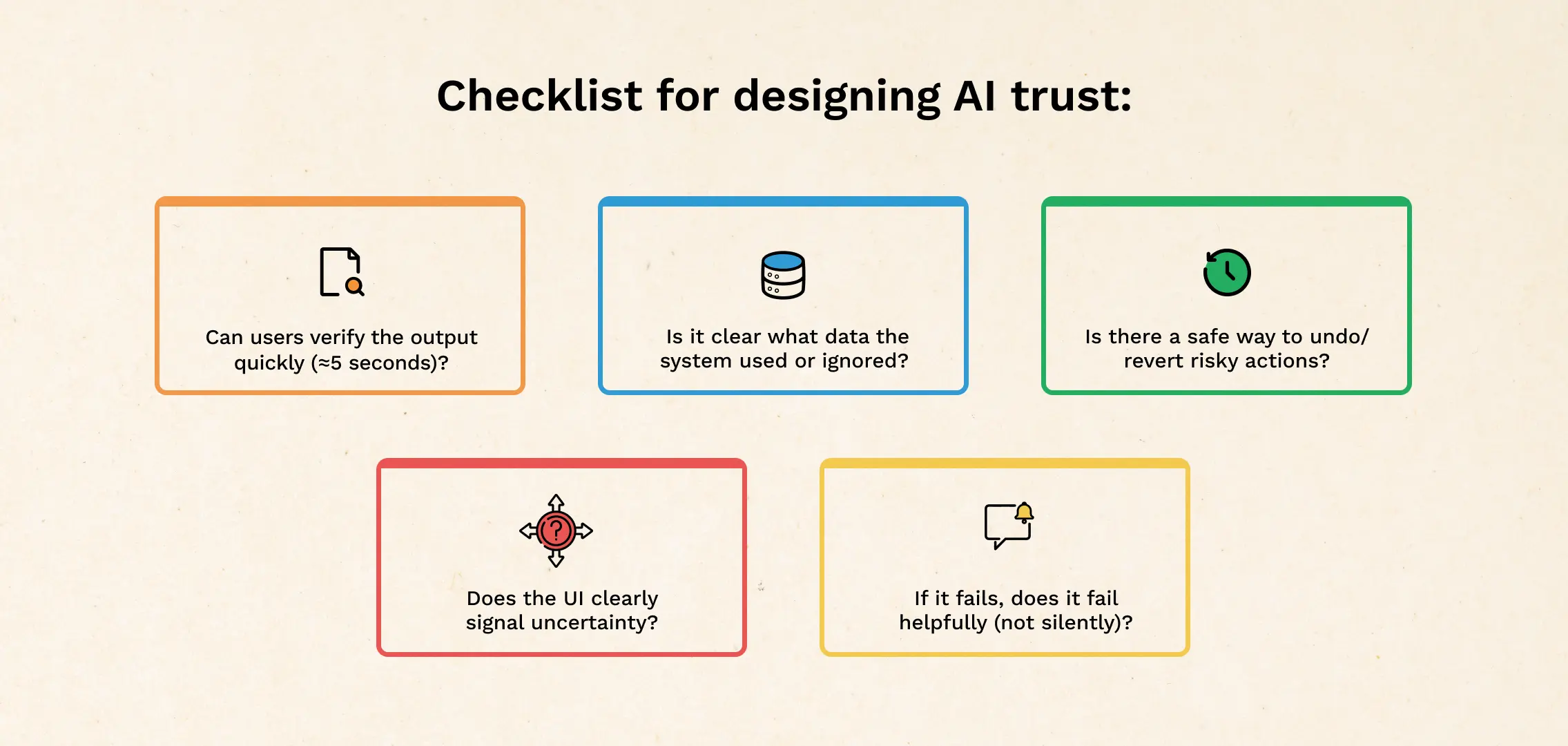
A quick checklist for designing AI trust
Use this when reviewing any AI-powered screen:
- Can users verify the output in 5 seconds?
- Is it clear what data was used (and what wasn’t)?
- Are there controls to steer the result (constraints, toggles, edit)?
- Is there a safe undo or revert for risky actions?
- Does the UI signal uncertainty appropriately?
- If it fails, does it fail helpfully (not silently, not confidently wrong)?
If you’re rebuilding these patterns, this usually becomes a broader design exercise — the kind you’d treat like core product UX, not a “nice-to-have AI layer.” That’s where UI/UX Design services fit naturally.
Common mistakes teams make
- Adding a “confidence %” and calling it trust (most users can’t interpret it)
- Shipping AI into the highest-stakes workflow first (start where errors are cheap)
- Over-automating (people want help, not surprises)
Wrap-up
Users don’t distrust AI because it’s “new.” They distrust it because it’s harder to predict, harder to verify, and sometimes too confident for its own good.
Design for trust by making outputs checkable, keeping humans in control of final actions, showing boundaries clearly, and handling uncertainty like a first-class state.
If you’re planning a redesign of your AI experience, a lightweight UX Audit before you ship can save you from the “cool demo, dead feature” outcome.
CATEGORIES
Good UX is boring (and that’s the point)

A friend showed me a “cool” app—animations, pulsing buttons, and micro-interactions everywhere. For a minute it looked impressive. By minute three, he was negotiating with it: double tapping, second-guessing saves, hunting for missing filters. That’s when “cool” stops being the goal. Good UX often feels boring because it quietly gets you to the outcome and gets out of your way.
The Practical AI Tool Stack for Content, Design, and Planning
Some products make you ask, “Who approved this?” Not because they’re ugly but because they’re trying to be everything. From silly combos to bloated apps, unnecessary feature bundling adds confusion, breaks trust, and increases risk. Here’s how to spot good bundles vs noise.
5 Questions to Ask Yourself as a Healthcare Product Leader, Now that ChatGPT Health is Here

ChatGPT Health turns “health chat” into a proper product surface. That changes what users expect from every healthcare app: instant clarity, calmer journeys, and fewer steps. Instead of rushing to bolt on a chatbot, use this moment to pressure-test what your product truly owns—workflows, trust, governance, outcomes, and service delivery. These five questions will help you decide where to compete with chat, and where to win with systems.