Medical & Healthcare
 Cybersecurity
 Travel & Hospitality
 Edtech
 Enterprise
 Non-Profit
 Fintech
 Agritech
 Retail & Real Estate
 Design for AI
Why Friction is Necessary in UX Design – From Security to Accessibility
Friction in UX is any action disrupting the normal flow of users when accessing a website. It plays a key role in each aspect of user flow.

Shravani joshi
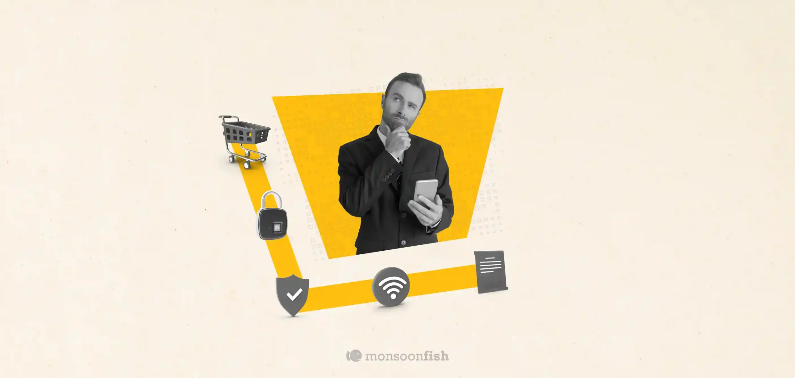
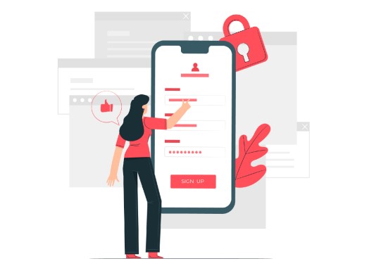
Friction in UX is a necessary component in designing the ideal user flow for accessing various aspects on a website. It is required to disrupt the unconscious movement across the site or mobile app and to drive attention to the key call-to-action protocols. It is also essential when introducing a 2-step authentication or necessary security actions prior to confirmation or completing the desired action.
 The Good
Friction in UX is required if users need to confirm their orders, perform irreversible actions, or enable two-factor authentication. It is also a critical strategy to implement when users are entering personal data or sharing sensitive details with web platforms. Friction ensures that users are not on auto-pilot mode when accessing your e-commerce store, landing page, marketing campaign site, or mobile application.
Friction is also necessary to eliminate accidental clicks that may take users outside the original platform or web experience. It enables users to stay engaged with the current blog, news article, or store page, especially when using mobile devices or older generation laptops.
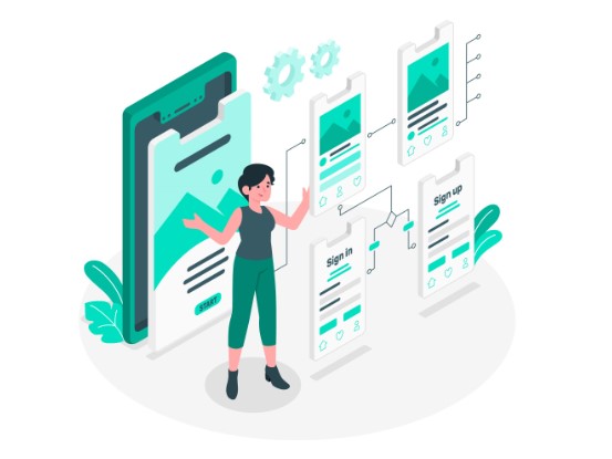 While providing an undo function is difficult in terms of backend coding and front-end management, enabling positive friction in UX is a cost-effective alternative. UX friction techniques also focus on crafting the user journey in a more refined manner. Users can gain a feeling of complete control over their experience while engaging with a more interactive site or application.
The Bad
Friction in design can also be introduced unintentionally in terms of lag, image-heavy experiences, or multiple pop-ups or confirmation blocks. This can throw off the user experience significantly, driving greater attrition and cart abandonment. This is generally the case when brands first initiate an e-commerce store or launch an online marketing campaign and want users to perform too many actions in the beginning.
Another critical negative friction-based experience that users often interact with is lengthy form-fields. This is a deal-breaker for many users that prefer logging off rather than providing extensive unnecessary information to websites, without a save or preview option. Regions with unstable internet connection or users on 3G connectivity can often experience data-wipes when pages reload.
 Having too many different colours on the website can also turn users off, as this is a strong negative UX design choice. When the submit button for a landing page is completely different from the brand storyline or design flow of the page, users may be hesitant to engage with it. Additionally, pages, applications, and sites with too much text or too many buttons on the homepage can instantly disengage users. Less is more when it comes to good UX practices.
Concluding Thought
The main goal of any successful UX strategy is to highlight specific actions across the web flow. From checkout processes to security protocols there are various areas where UX designers need to optimize the experience that users have, to reduce bounce rate and improve retention. Users also gain a sense of greater control over their experience when strategic friction has been introduced.
CATEGORIES
Google is Solving for the First 10 minutes and More

Google Labs is quietly building AI tools that don’t replace workflows, they sit on top of them. Learn how these contextual app layers reduce cognitive load at the exact moment users get stuck, and how to apply this thinking to your own product.
Why the Best Products Feel Simple… Until You Need More

The best products don’t show everything upfront they reveal complexity gradually. From Slack to Aadhaar, this “Onion Peel Design” approach helps users stay focused, confident, and in control. Instead of cutting features, the key is layering them—so users see what they need, exactly when they need it.
AI features Users Don’t Trust Yet: Designing for Trust

AI features can be powerful, but users still pause before trusting them. Not because they hate AI, but because the experience doesn’t make reliability obvious. This blog explores why trust breaks in AI products and the UX patterns that help users verify outputs, stay in control, and adopt AI with confidence.