UX Guidelines on How to Build Winning Fintech Apps
Fintech is an exemplary amalgamation of finance and cutting-edge technology, which is pioneering digital disruption solutions across the globe.

Fintech is an exemplary amalgamation of finance and cutting-edge technology, which is pioneering digital disruption solutions across the globe in today’s day and age. Fintech apps are accelerating digital transformation in every sphere, democratizing the markets, by allowing new players in the domain. Fintech is taking over various industries such as AI, ed-tech, healthcare, etc. which are undergoing massive transformations, leaving behind legacy practices and adopting more efficient systems.
There is an exponential growth in the fintech industry that now has a direct impact on organizations, institutions, policies, and development strategies.
Therefore, as designers, if you are working on a fintech app design, let us first walk you through the primary implications of fintech in order to design a solution that is trusted by users, keeps them engaged and informed, evokes positive emotions, and helps build financial habits.
Understanding Fintech
The finance industry has marked exponential changes in the way people handle their money and financial transactions. Credit cards and debit cards were the only methods dominantly used earlier, whereas, now the industry has opened up multiple options such as digital wallets, e-payments, and mobile wallets, which have made handling physical currency almost obsolete.
Fintech entities are aiming towards transforming and revolutionizing the entire spectrum of financial behaviors we practice today.
Starting with banks, almost all banks now have a digital version of the legacy system in the form of a mobile app version. Another segment of fintech app designs gaining fast popularity is that of the microloan apps which provide small-scale loans to individuals and small businesses. Digitizing the whole banking and financial processes through simple steps on smart devices enables easy and secure payments for users, where there are no long queues or tons of paperwork involved.
Difference Between Conventional Systems and New-Age Fintech Apps
The fintech industry is booming because people are slowly but surely moving toward adopting other financial institution formats instead of conventionally stable banks, simply because it offers various benefits to the user in a segment which is largely known for its lengthy and exhaustive legacy system.
Millennials are the primary segment of population facilitating the shift in the demographics today, wherein freedom is a big priority to them! They’re more inclined towards having the ease and convenience, rather than committing to a particular bank or financial institution.
Fintechs have simplified and streamlined processes that were once known for long standing queues at banks, lots of paperwork and hiccups at some or the other point. The overall exhaustive, formal, information-heavy, and impersonal tone of traditional legacy systems and banks is no longer a part of the new-age fintech systems.
Decentralizing the banking model, removing middlemen, and putting the power back into the hands of the public is what the fintech companies are executing, which is the major reason for the fast growing adoption of the fintech products by users.
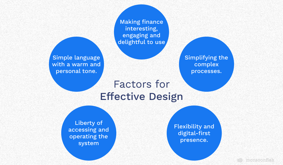
Therefore, in order to design an effective fintech app that is well-accepted by users, designers it must focus on all the factors that can make the process or app a better choice, which would include:
- Simple language with a warm and personal tone.
- Liberty of accessing and operating the system without needing to visit the brick-and-mortar entities.
- Simplifying the complex processes.
- Flexibility and digital-first presence.
- Making finance interesting, engaging and delightful to use, instead of making it seem like a burden or a chore.
Some of the best examples of legacy systems that have transformed themselves or adopted new-age processes using UI/UX design are DCM (Data Capital management), One Card, and Transunion Cibil.
6 Important Aspects and Guidelines for Building Winning Fintech Apps
Let us deep dive into understanding details on how to make an exceptional and efficient fintech app design.
1. Simplified Design to Reduce Cognitive Load
An average user is unlikely to be an expert or well-knowledgeable in financial matters, as ‘finance’ in general is a complex sphere. Thus, it becomes imperative for the fintech app designs to have a solid user-centric approach with following considerations:
- Doesn’t overwhelm the user with exhaustive information.
- Translates complicated financial data into simplified insights.
- Guides users to perform the desired action in an easy, stepwise process.
- Perform heavy calculations while also conveying the meaning and significance of the numbers.
One of the key ways to achieve this is through efficient data visualization, which means analyzing complex financial data and presenting it to the user in easy-to-digest formats, such as pie charts, graphs, etc. (which are visually appealing yet easy to understand). Not only does this help in enhancing the visual appeal and aesthetics of the app design but also helps in retaining users and boosting engagement.
Also, financial literacy can be enhanced among users by making them more informed about their saving, expenditure and potential investment advice, through thoughtful usage and application of data visualization in fintech app design.
2. Concentrating on User Journey

A design rule that stands true regardless of the industry, is that- user experience drives user acquisition and retention. Therefore, you need to ensure that the user is motivated and interested in using the app. To achieve the same, your app should resolve a user problem, add value to the user’s financial decisions, and exhibit ease as well as convenience of usage.
And hence, it is essential to know all the aspects of the fintech product, including the target demographic and the stakeholders. Using appropriate CTAs at the right places and desired actions must be combined with the right information; to help ease the user’s way into the product.
3. Reducing Friction
Friction in design refers to anything that prevents a user from accomplishing a goal as it weighs down interactions, making interfaces very difficult to use. So, as a designer your goal is to create interactions which match with a natural sense of order and logic, that can thus lead to seamless interactions without complications. Therefore, reducing friction is good hygiene for any app design.
In the financial segment, though users are looking for easier, more convenient ways of handling their money, it is also essential to consider that you don’t design processes systems where it’s equally easy to make financial blunders. Even though you design the features well to make things easier for the user, missing the required friction here might lead to heavy and irreversible losses for the users. This means incorporating a healthy level of friction to add layers of safety in the transactions is the most appropriate way of designing for the user in a fintech product design.
4. Designing for Trust and Transparency
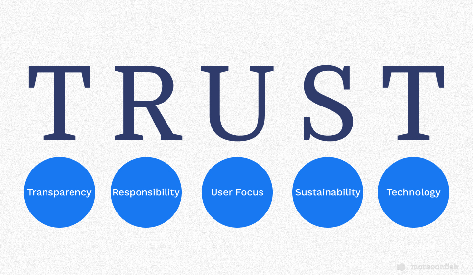
Even though it is difficult to generate metrics that measure trust and transparency, you can still find the answer by conducting some research of the user while using the app and noticing the following patterns during the same:
- The user is unsure whether or not an action has been performed.
- Unsure that a particular action is effective so they keep repeating the same action multiple times.
- Unsure of which stage in the process they’re in currently.
- Users are confused on how to proceed further.
- High-dropout rates.
All this leads to frustration and distrust in the app and thus to avoid such debacles, following a few best practices can result in user’s higher trust in the app.
- Make sure to provide simple and clear information about where or what their actions lead to. Communication works the best when it’s easily understood and can thus help build users’ trust.
- In simple terms, explain what happens next with each step, so that they feel guided through the entire process.
- Show what stage is in progress (verification or waiting for OTP, etc.).
- Ensure to incorporate encryption, biometric security, etc. to assure the user of their safety and security.
5. Engaging, Conversational and Personalized User Experience
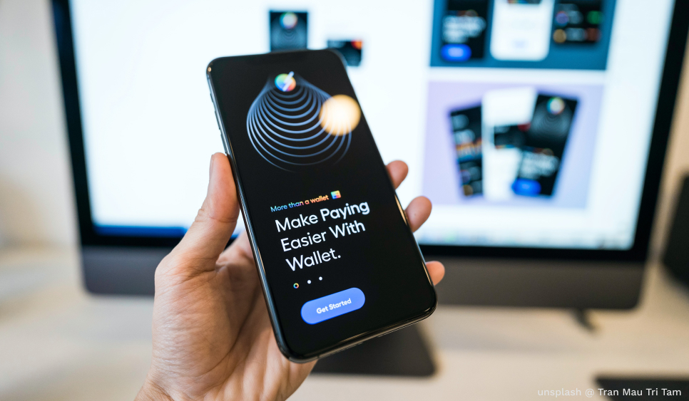
Users have always had the formal, and dull tone of legacy financial institutions which tends to overwhelm them. So, now with the fintech revolution, your app design should create a comprehensive digital-first ecosystem that imparts positive emotions and interacts with the users in their language. Listed below are some tips to ensure an engaging and personalized experience for users:
- There are a lot of visual design elements that can be added, such as pleasing colors (relevant to your fintech branding), illustrations, iconography, animations, micro-interactions, etc. to make the process engaging.
- The microcopy has to be in a conversational tone, and that is engaging which makes them feel guided instead of formal or burdened. Chatbots are a great way to add a human element and establish a personal connection to guide the user throughout the process.
- Keeping the flow smooth and clean, with minimal designs can work in your favor instead of overloading the interface with texts and features.
- Research and statistics show that users tend to create an opinion about the product in split seconds based on just the visuals. Hence, ensure to design your app well, that is also aligned to the business goals and the target audience.
6. Design Leading to Positive Behavior/Habit Formation for the User
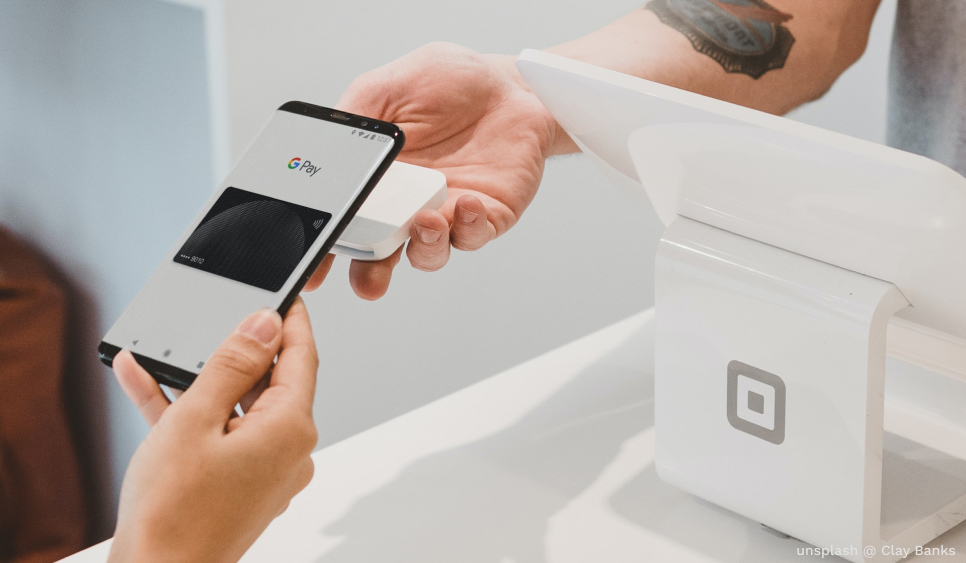
Today users are expecting a lot more than just a glimpse of their savings, expenditures, etc. from fintech, which can rather be their trusted finance partner who nudges them to make the right financial decisions.
Your fintech app design should basically encourage a positive habit formation for the users, here are a few example on how you can incorporate a few aspects for the same:
- Rewards are a great way to make the user feel confident about their finances.
- Adding features that nudge the user or increase friction when the user is spending more than the pre-set monthly amount can help the user keep a track of their expenditure.
Take-Away
Ensure to understand how the world of finance works, where the legacy systems are lacking in serving their users and how design can add value to make the process easier. Liberty, trust, transparency, and convenience are the biggest driving factors while designing a fintech app. Users should be able to trust the platform with their money and financial decisions. Therefore, make sure to research well for analyzing how you can utilize the platform to empower users through positive habit formation.
CATEGORIES
