Medical & Healthcare
 Cybersecurity
 Travel & Hospitality
 Edtech
 Enterprise
 Non-Profit
 Fintech
 Agritech
 Retail & Real Estate
 Design for AI
The Purpose Of Data Visualization In UI Designing
Data visualization makes it easier to understand and decode information. It has become an important factor in UI designing. Let’s read to know why.

The ease of use is one of the most important aspects of an excellent user interface. This is applied to data visualization to make understanding and decoding information easier. It simplifies abstract knowledge by converting it into a visual image that is clearer and easier to comprehend.
Focus visually rather than speech
A block of text isn’t engaging or interesting. What can be said in a lengthy, drawn-out essay can also be articulated using imagery and form. Data visualizations are classified as “the graphical display of abstract knowledge for two purposes: sense-making (also called data analysis) and communication,” according to the Interaction Design Foundation.
 It will be easier to read and interpret material if it is broken up into visual components. Visual elements often provide a simple hierarchy, allowing users to understand the order in which they can examine the content.
A consumer can quickly pick out and classify relevant pieces of information by breaking down information into digestible chunks. This relieves a user’s mental burden by putting things in front of them rather than in their heads.
When content is difficult to access or read, the user gets frustrated, which leads to a negative relationship. It increases the user’s overall experience by making them labour less to interpret the results.
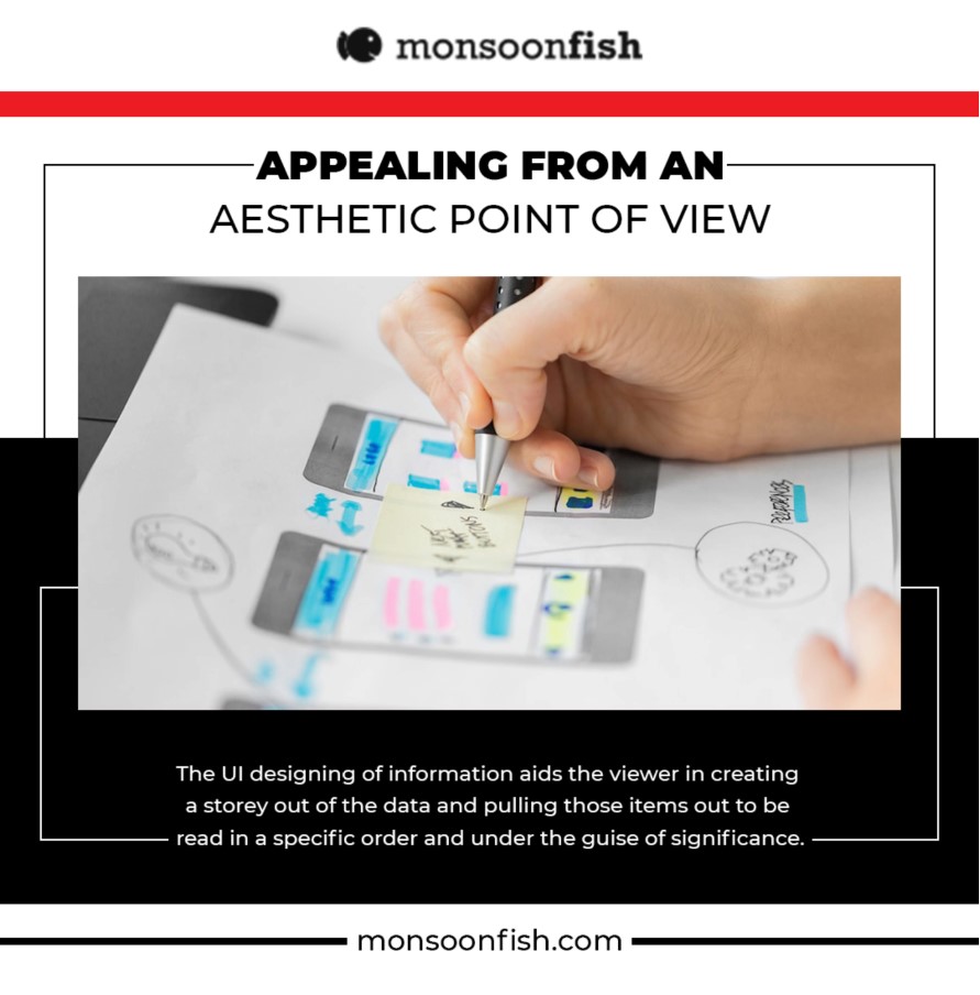
Appealing from an aesthetic point of view
There are certain people who are visual learners. Many that aren’t, whether they know it or not, enjoy well-designed white space and an educated intelligence hierarchy. The UI designing of information aids the viewer in creating a storey out of the data and pulling those items out to be read in a specific order and under the guise of significance.
 The data’s colour, typography, and structure can all be customized to fit a company’s product’s branding. This unifies the brand experience when it seems to be planned and part of the same structure. This increases brand loyalty while still increasing customer confidence.
It doesn’t mean that data visualization has to be dull to be useful. It has to be incredibly sophisticated in both aesthetic form and functionality, as these must work together to communicate concepts efficiently, offering visibility into a sparse and nuanced data collection. Designers also struggle to strike a balance between form and function, resulting in beautiful data visualizations that fail to achieve their primary goal of communicating information.
All in one place
In dashboard interfaces, whether physical or digital, various types of data visualization techniques can be used. Consider an analogue vehicle dashboard: given that people can only spare a two-second glance down to check the time, a variety of different pieces of information must be able to be read rapidly and easily.
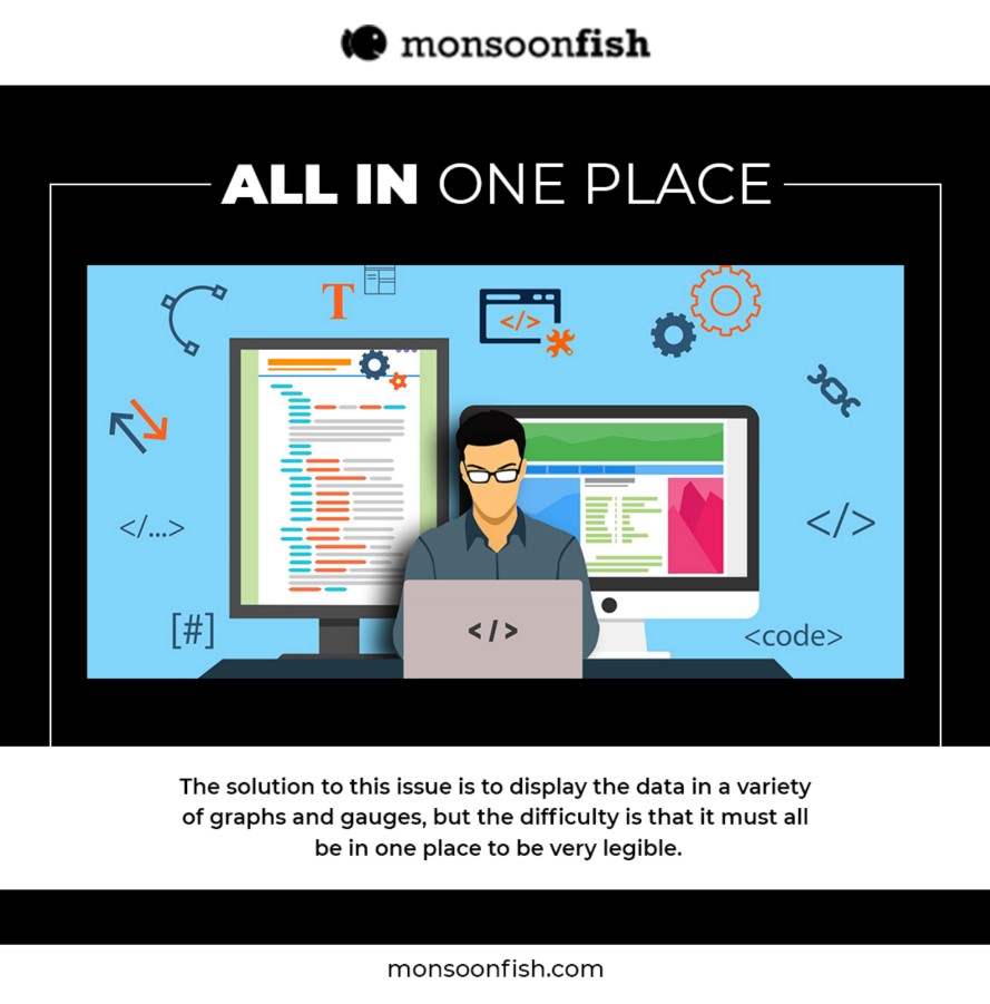 The solution to this issue is to display the data in a variety of graphs and gauges, but the difficulty is that it must all be in one place to be very legible. This makes a huge difference, and the result is a well-informed driver who has all of the knowledge he or she needs to make better decisions on the road.
Institutions that deal with vast volumes of data, such as banks or healthcare providers, are other real-world examples. They build digital dashboards that allow users to quickly and accurately display and analyze their results. The trick is to plan and display the material in such a manner that it is easily accessible.
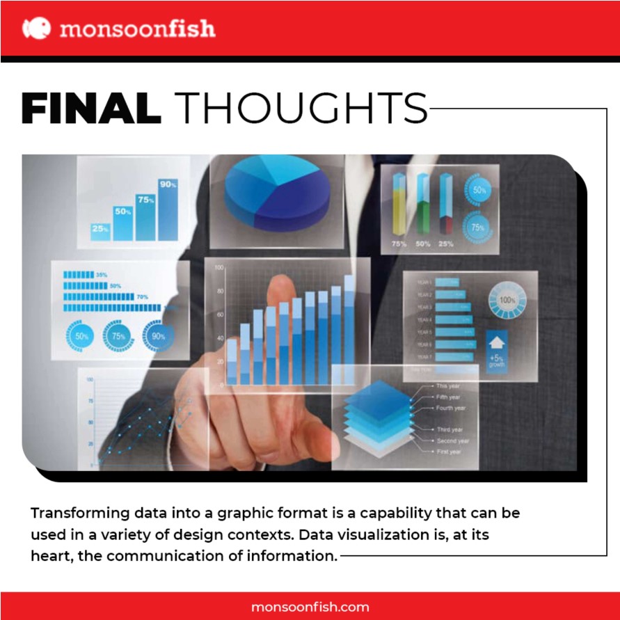
Final Thoughts
Transforming data into a graphic format is a capability that can be used in a variety of design contexts. Data visualization is, at its heart, the communication of information. It results in less frustrating, ambiguous, and difficult-to-read content, as well as faster reading and comprehension.
 The aim of visualization is to help people interpret the knowledge provided in a more efficient and meaningful way. It serves as a visual aid to assist users in quickly and conveniently synthesizing results, resulting in a positive user experience.
If you are looking for a reputable UI/UX service provider, do visit Monsoonfish today!
Google is Solving for the First 10 minutes and More

Google Labs is quietly building AI tools that don’t replace workflows, they sit on top of them. Learn how these contextual app layers reduce cognitive load at the exact moment users get stuck, and how to apply this thinking to your own product.
Why the Best Products Feel Simple… Until You Need More

The best products don’t show everything upfront they reveal complexity gradually. From Slack to Aadhaar, this “Onion Peel Design” approach helps users stay focused, confident, and in control. Instead of cutting features, the key is layering them—so users see what they need, exactly when they need it.
AI features Users Don’t Trust Yet: Designing for Trust

AI features can be powerful, but users still pause before trusting them. Not because they hate AI, but because the experience doesn’t make reliability obvious. This blog explores why trust breaks in AI products and the UX patterns that help users verify outputs, stay in control, and adopt AI with confidence.