 Medical & Healthcare
 Cybersecurity
 Travel & Hospitality
 Edtech
 Enterprise
 Non-Profit
 Fintech
 Agritech
 Retail & Real Estate
 Design for AI
Rules of UX for Tech Startups
It’s very easy to get blown away by ideas. But it all lies in the execution. Here are some rules of UX to be kept in mind by tech startups.


Rohan Baruah
Director OpsTech startups, at times, sprout from the minds of developers who may not have an extensive understanding of the significance of front-end aesthetics. This is how many upcoming startups end up with UX designs that puzzle, annoy, and bring up more questions than answers.
There could be innumerable rules of UX that one could identify with, but here are six that we believe are the most important for startups in the tech industry. The earlier they’re recognized in the development process, the better.
Rule 1: Relinquish the vanity designs.
Let’s say your back-end tech ideas are far-reaching, but that doesn’t imply that a design you come up with is by default suited to the purpose. The opinions that count ultimately are that of the users and the users alone. Why this is considered the first rule for tech startups to follow is because it’s a difficult thing to come to terms with.
There’s no need to reinvent the wheel. If you don’t have a credible, believable justification for it, stick to existing standards of UX and offer your users something easily recognizable and emotionally resonates with them. Out-of-the-box creativity may not always translate to success.
Rule 2: User Psychology towers over all else.
Content may be king, but user psychology is what drives it. The best UX designers always think from a psychological perspective, probing into how and why users perform specific actions.
It’s easy for startups to get it all wrong, studying only one type of end-user and falling for their perspectives. Human beings are complex. They will think in one way and react in another. Accounting for everyone is practically impossible but considerable amounts of research can help you come up with personas that indicate a majority of your target audience.
What’s the point of having the “perfect UX” that doesn’t cater to a large chunk of your users?
Rule 3: Simplicity still rocks!
During the prototyping phase, you need to carefully look at every single element – this includes paragraphing, images, CTAs, buttons, or pieces of styling – ask yourself if it all makes sense and has a distinct purpose. By getting rid of an element, does the user stand to lose something significant? Will the goals of the user not be achieved by doing so? Scrap away any element that doesn’t warrant itself. The friction needs to be as smooth as possible.
Moreover, a lean, simple design is a lot easier to demonstrate, learn, run, and maintain. You have the option to add and modify on the go if at any point the demand arises.
Rule 4: Maintain that consistency.
Users dropping off your website or app could be due to confusing (and cluttered) layouts, varying design elements, and inconsistency in conveying intent. The UX design needs to be consistent across every single aspect of the project.
In some ways, this is an extension of Rule 1. Basic visual elements such as icons can stand out when used poorly. And this can prove to be detrimental to the overall user experience.
It’s easy to explain what one can or cannot play within a layout by browsing through the themes available for a website creator like WordPress. Colors can change, fonts can change. But icons and basic navigation? Think again. Get these slightly incorrect and users will lose track of what’s going on. You definitely would not want to confuse your users.
Rule 5: Keep iterating.
“Design is not a single object or dimension. Design is messy and complex.”
– Natasha Jen, Designer & Educator
You’re not supposed to get everything right in the first go. That’s not how design works. The process goes through stages – brainstorming and ideation, prototyping, testing – but that’s not all. There’s a solid chance that you may have missed things, and the process will need to be repeated several times to ensure that your work gets refined.
Do not worry about ‘getting everything done perfectly’ early on in the design process. Try out some ideas, make a note of what works and stick to them, and aim to persistently make things better.
Rule 6: Use real copy.
Text is a key component of UX. It can draw user attention or drive it away. In fact, it even has a knock-on effect on how the rest of the interface is discerned.
Iterating upon copy is as essential as iterating upon any UX element. Add relevant copy to your UX designs as early on as possible. This helps save time and gain valuable feedback from users on everything from tone to names of categories. It will, in all probability, make a tremendous difference to the quality of your experience.
Concluding thought:
If you have these rules of UX sorted out in the initial stages, you can look forward to creating designs that communicate value and keep your end-users happy.
CATEGORIES
Google is Solving for the First 10 minutes and More

Google Labs is quietly building AI tools that don’t replace workflows, they sit on top of them. Learn how these contextual app layers reduce cognitive load at the exact moment users get stuck, and how to apply this thinking to your own product.
Why the Best Products Feel Simple… Until You Need More

The best products don’t show everything upfront they reveal complexity gradually. From Slack to Aadhaar, this “Onion Peel Design” approach helps users stay focused, confident, and in control. Instead of cutting features, the key is layering them—so users see what they need, exactly when they need it.
AI features Users Don’t Trust Yet: Designing for Trust
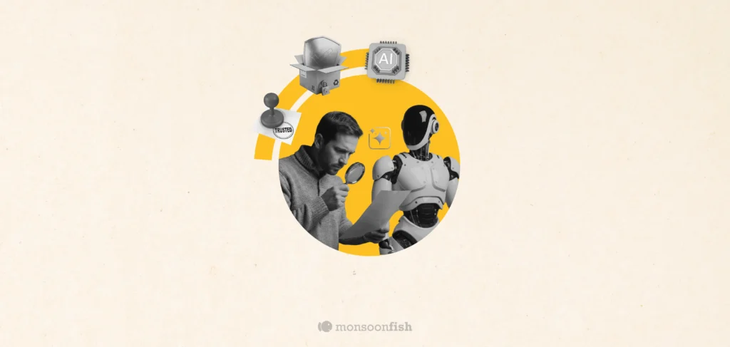
AI features can be powerful, but users still pause before trusting them. Not because they hate AI, but because the experience doesn’t make reliability obvious. This blog explores why trust breaks in AI products and the UX patterns that help users verify outputs, stay in control, and adopt AI with confidence.