 Medical & Healthcare
 Cybersecurity
 Travel & Hospitality
 Edtech
 Enterprise
 Non-Profit
 Fintech
 Agritech
 Retail & Real Estate
 Design for AI
Mobile Optimised does not Mean Responsive Design
When you are doing UX for your product, you must look at the digital journey of your customers and prospects. This journey is increasingly on a mobile smart phone and recent studies in the adult age group show the average minutes of surfing on mobile is more than the time spent surfing from a laptop or desktop.
When you are doing UX for your product, you must look at the digital journey of your customers and prospects. This journey is increasingly on a mobile smart phone and recent studies in the adult age group show the average minutes of surfing on mobile is more than the time spent surfing from a laptop or desktop.
Responsive design is relevant and useful for rendering pages smoothly across different phone screens and browsers, but there’s more to mobile optimization. Your aim through a process of mobile optimization is to improve usability and effectiveness because it pays off in terms of customer conversion.
Mobile optimization is about leveraging what the device offers to engage a business’s visitors better. While mobile screens offer less screen estate, let’s not start out viewing this as a handicap. The device has its strong points too – it presents the potential for a variety of interactions.
* Handiness is why phone users do so much on it
* User easily uploads a photo or video
* Rings up your company
* Turns Location on to receive map guidance
* Other sensors can be used for interaction
On the other hand, Responsive Design is only about ensuring the appearance of the site on the mobile is fine. It is about using different CSS style rules based on browser width and the user’s device. However, UX has to deliver more than that.
What are the typical mobile user’s issues? He/she has a more urgent agenda, wants a quick response, and wants to access a resource fast ( a ticket, a cab, a pharmacy, a plumber, a bouquet…). Appreciating this, your UX should:
# Identify what’s really key for the user to have.
# Show only the icons needed by a user to achieve their goal
# Your target is a 3-sec page load. Keep the page light.
# Images will add to loading time. Use few and only the most relevant ones. Compress the images.
# Readability shouldn’t be a challenge. Base font size should be 16 CSS pixels. Line height is important too – the browser default of 1.2 em is popular. Don’t use many fonts.
# If there’s a lot of information, layer it (use secondary pages) and provide an easy navigation. Place a search bar if it’ll help.
# Check it out on multiple phone/phablet models.
To achieve visitor satisfaction and customer conversion through your UX, you need mobile optimization not just Responsive Design. You should assume that the visitor isn’t attending properly, he or she is on the move, engaged in other activities simultaneously, and only a fraction of their brain processing is involved in scanning your site.
Your UX design should require the least amount of mental effort on the user’s part and not allow common errors to occur because of their partial attention. Some of the things it can do is to invite to a chat, offer an address map, add to a cart, or encourage a tweet or social mention.
How can you tell that it’s a proper for mobile design approach?
* Content is formatted for easy readability
* Smaller image file sizes
* Generous spacing between graphic elements
* Visitor is hardly required to type anything
* A minimalist design which doesn’t crowd the screen.
Finally, a simple comparison: on a bicycle, you can have a water-bottle holder, while in a car you might have a coffee cup holder. Each device (like a vehicle) has its possibilities.
CATEGORIES
Google is Solving for the First 10 minutes and More
Google Labs is quietly building AI tools that don’t replace workflows, they sit on top of them. Learn how these contextual app layers reduce cognitive load at the exact moment users get stuck, and how to apply this thinking to your own product.
Why the Best Products Feel Simple… Until You Need More

The best products don’t show everything upfront they reveal complexity gradually. From Slack to Aadhaar, this “Onion Peel Design” approach helps users stay focused, confident, and in control. Instead of cutting features, the key is layering them—so users see what they need, exactly when they need it.
AI features Users Don’t Trust Yet: Designing for Trust
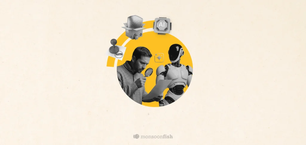
AI features can be powerful, but users still pause before trusting them. Not because they hate AI, but because the experience doesn’t make reliability obvious. This blog explores why trust breaks in AI products and the UX patterns that help users verify outputs, stay in control, and adopt AI with confidence.