Medical & Healthcare
 Cybersecurity
 Travel & Hospitality
 Edtech
 Enterprise
 Non-Profit
 Fintech
 Agritech
 Retail & Real Estate
 Design for AI
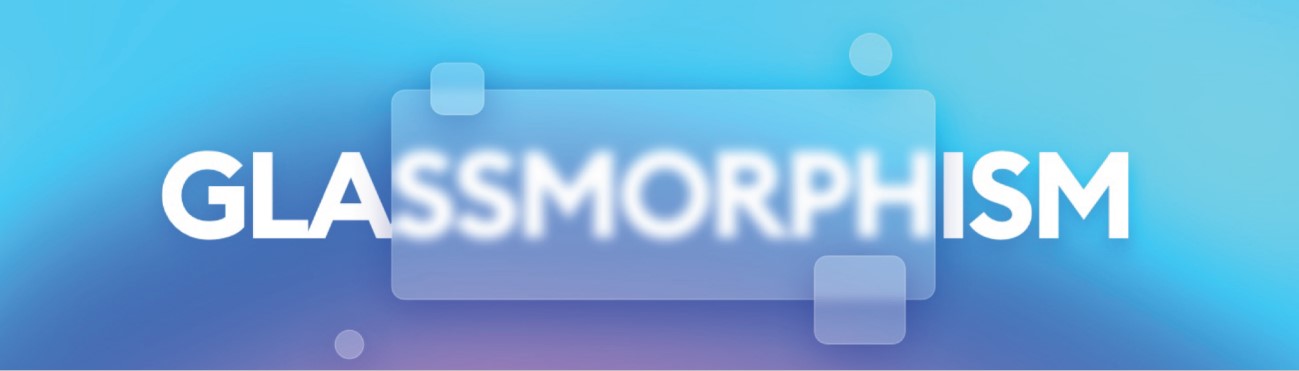
Is Glassmorphism A Trend For UI Developers In 2021?
If you’re interested to follow the latest web design trends, you’ve undoubtedly heard of Glassmorphism. This pattern favours

Rahul patil
Principal UI DesignerIf you’re interested to follow the latest web design trends, you’ve undoubtedly heard of Glassmorphism. This pattern favours transparency and multi-layered techniques and is eye-catching and colourful. It has received a lot of favour among UI developers because of its milky glass surface appearance. It can be effective – much like its cousin Neomorphism, which was all the rage last year – when used appropriately. Here’s what you need to know about this UI interface pattern before you start using it.
What is Glassmorphism, and How does it work?
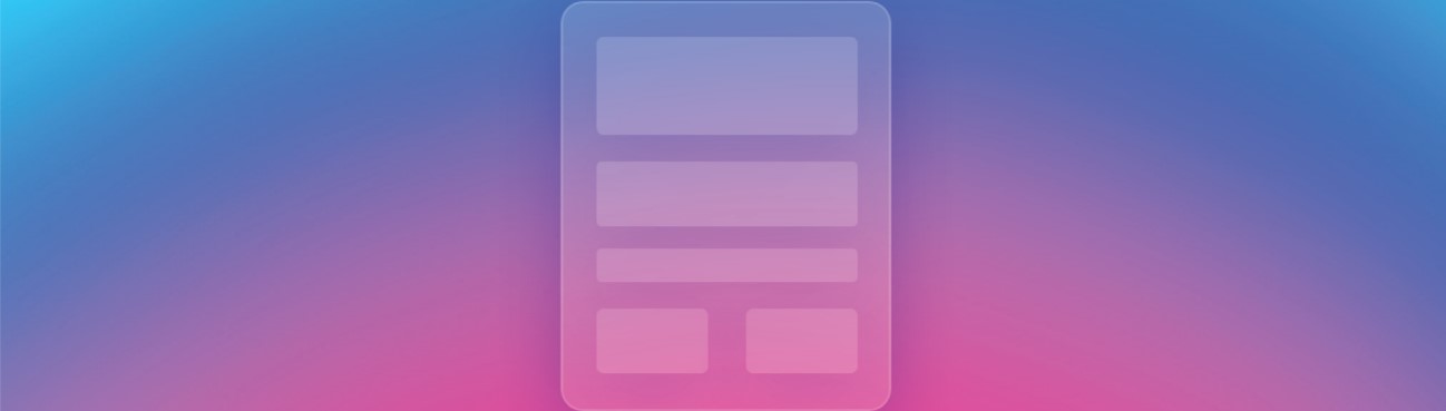
The expression “glassmorphism” refers to UI architecture that emphasizes light or dark objects over colourful backgrounds. The objects are given a background blur that helps the background show through, lending the appearance of frosted glass.
 What are the Elements of Glassmorphism?
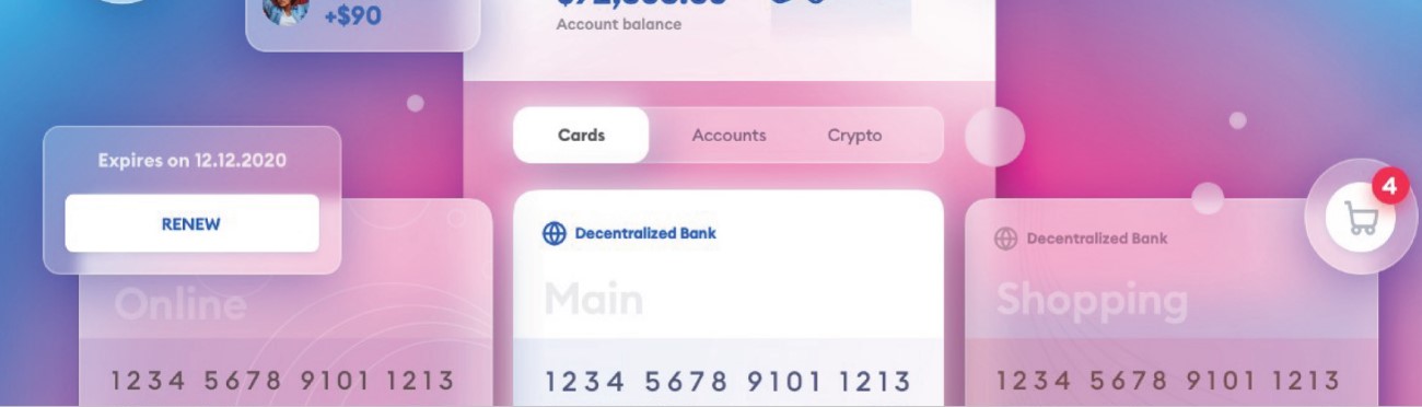
HYPE4 describes it as an “array of glass panels floating in the vertical vacuum,” which we believe, is a very accurate description. The result is achieved by using transparency, textures, vibrant background colours, and shadows in a composition.
- It is transparent
Background blur is used to provide the frosted-glass look. This gives the style more dimension and establishes verticality. The blurring of objects creates a sense of perspective in the layout, almost as if they were floating in 3D space.
- It is multi-layered
The layered interface retains a smooth, easy-on-the-eyes look with objects floating in space. On a vivid, colourful backdrop, this look fits well for one or more translucent layers.
- It is packed with vivid colour combinations
The background colour is extremely important. It should be colourful but discreet to emphasise the blurred clarity. This is needed for the impact to be noticeable. Backgrounds that were dull and low-contrast would fade away beneath the subjects, and the effect would be lost. They can’t be too cluttered (or informative) either.
- Translucent objects with subtle, light borders
Semi-transparent white borders will help objects stand out from the background by simulating the glass edge.
Why is Glassmorphism Getting so Popular?
Glassmorphism UI is a new UI style movement that has slowly been gaining traction over the last year. It’s widely used in web and app design and is rapidly gaining popularity. However, it isn’t exactly a novel concept.
Apple first adopted similar designs in 2013 with iOS 7. It reappeared in November 2020, when Apple reintroduced the effect with its new update, MAC OS Big Sur.
 It has also been incorporated into Windows Vista and Microsoft’s Fluent design framework. Many who remember the transition to iOS 7 and Windows Vista will remember how refreshing it was to see messages show up in the background with blurred objects. This result, dubbed “The Acrylic” by Microsoft, is used on app surfaces to add depth and help create a visual hierarchy.
How to Make the Most of This Trend
Although achieving this effect isn’t impossible, there are a few things to keep in mind. Glassmorphism design can be used at the discretion of the artist. It is important to not overuse it. When only one or two elements are used, this design shines the most. For anything else, use standard contrast and follow UI interface best practices.
Incorporate Glassmorphism in 3 simple steps:
- Choose the appropriate layers
Select the right vantage point for this design theme in your website or smartphone mock-up – remember a) not overuse it and b) it looks best against bright and colourful backgrounds. Icons built in this style are still a little divisive, particularly in terms of accessibility. Though they are becoming more common, we advise using them sparingly and with great care.
- Give it a glass-like feel
Glassmorphism is a technique for creating the image of a transparent screen moving over a background. Using popular glassmorphism design tools like Figma, you can easily set the correct transparency level. Keep in mind that only the fill of the form should be translucent.
- Add dimensions for a more realistic look
Attach a fine border to the item and lower its transparency to make it appear glassy and give it some depth. To give it dimension, add a shadow underneath. Some technical updates will need to be tweaked in the code as well. If designing and coding aren’t your strong suits, but you’d like to integrate this pattern into your web design, seek professional assistance.
 Hop into your Experimental Shoes with Glassmorphism
As UI developers, we must always be on the lookout for emerging ideas and innovative ways to create products. Glassmorphism can make websites and applications appear more appealing to consumers in certain ways. This assumes we can maintain a high level of user interface usability, allowing for people with visual impairments to use and appreciate it quickly.
When it comes to UI architecture, there are no hard and fast rules, and some of the best and most user-friendly websites are created by designers who experiment. Keep in mind that this is a development, and it will most definitely pass. Now have some fun with what you’ve discovered by playing with it!
Visit Monsoonfish to learn more about UX-UI design solutions for your company. Please do not hesitate to contact us directly if you have any design requirements. We’re here to help!
CATEGORIES
Google is Solving for the First 10 minutes and More

Google Labs is quietly building AI tools that don’t replace workflows, they sit on top of them. Learn how these contextual app layers reduce cognitive load at the exact moment users get stuck, and how to apply this thinking to your own product.
Why the Best Products Feel Simple… Until You Need More

The best products don’t show everything upfront they reveal complexity gradually. From Slack to Aadhaar, this “Onion Peel Design” approach helps users stay focused, confident, and in control. Instead of cutting features, the key is layering them—so users see what they need, exactly when they need it.
AI features Users Don’t Trust Yet: Designing for Trust

AI features can be powerful, but users still pause before trusting them. Not because they hate AI, but because the experience doesn’t make reliability obvious. This blog explores why trust breaks in AI products and the UX patterns that help users verify outputs, stay in control, and adopt AI with confidence.