Medical & Healthcare
 Cybersecurity
 Travel & Hospitality
 Edtech
 Enterprise
 Non-Profit
 Fintech
 Agritech
 Retail & Real Estate
 Design for AI
Making Data Understandable: Simplifying Complexity with Data Visualization through UX Design
Did you know – it is Netflix’s recommendation algorithm, powered by sophisticated data visualizations and UX design principles, that empowers users to discover personalized content tailored to their preferences?
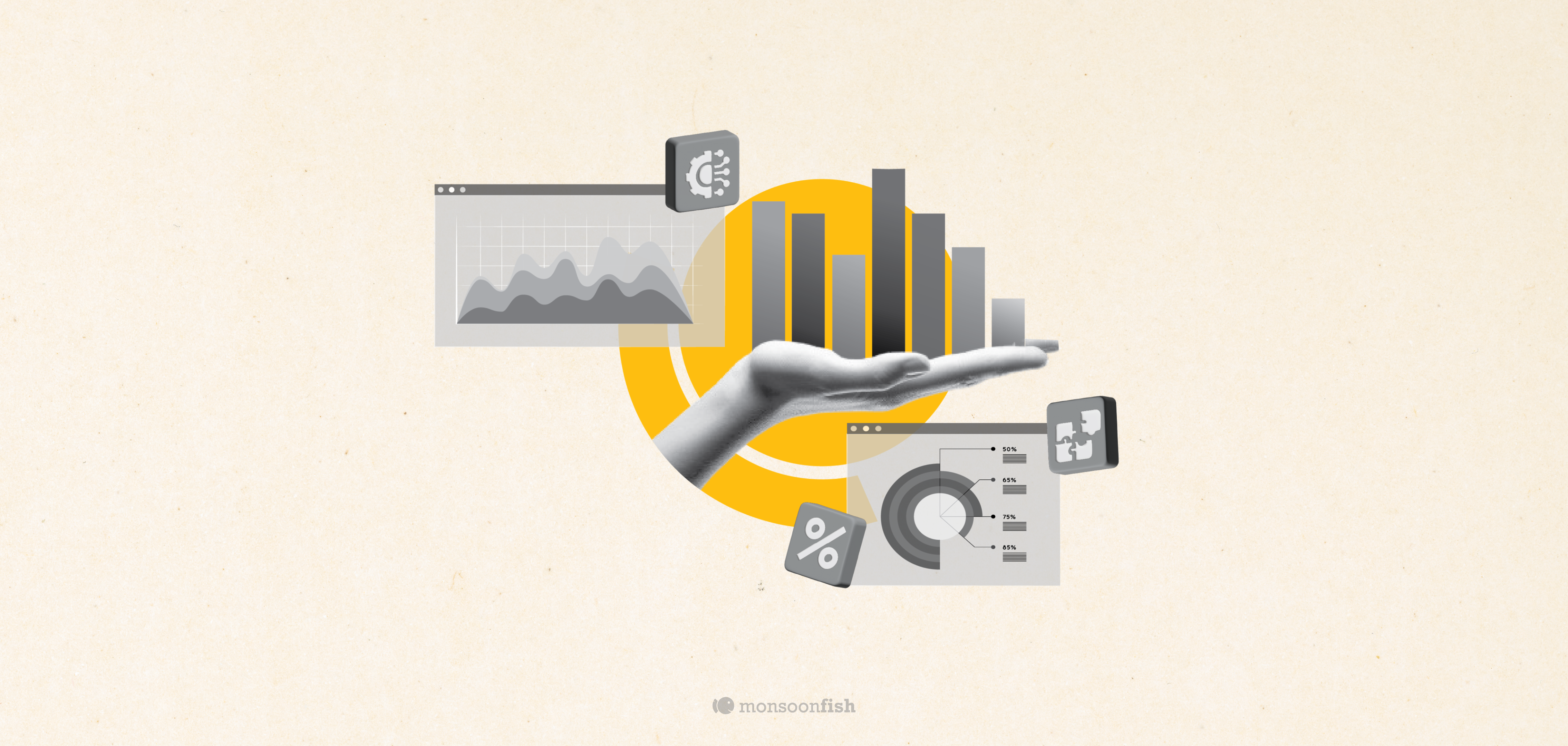


Data can pile up like a messy room – overwhelming and difficult to find what you need. That’s where data visualization and UX design come in as your cleaning crew and organizers. Data visualization tools, like charts and graphs, act like a flashlight, illuminating the key information. UX design principles, like clear layouts and intuitive interactions, arrange everything neatly so you can easily find what you’re looking for. Together, they transform that cluttered data into a treasure trove of insights, ready for you to discover and use. By presenting information visually, we can quickly identify patterns, trends, and outliers that might not be obvious from raw data alone.
Understanding the Essence of Data Visualization
Data visualization serves as a powerful tool for transforming raw data into meaningful insights. It goes beyond the surface level of presenting information in charts and graphs; it’s a strategic approach to simplifying complexity and enhancing understanding. By leveraging visual elements such as color, shape, and size, data visualization condenses complex datasets into digestible formats, making it accessible to a wider audience.
Simplicity in Complexity
When faced with large volumes of data, it’s easy to feel overwhelmed. This is where data visualization shines. Rather than presenting users with dense blocks of numbers or text, data visualization transforms intricate datasets into visual representations. For example, Google’s search trends visualization takes raw search data and presents it in an easily understandable format. Instead of sifting through rows of data, users can visualize trends over time, identifying rising topics and patterns at a glance. This simplification of complexity empowers users to extract insights efficiently and make informed decisions.
Interactive Engagement
Data visualization isn’t just about presenting static images; it’s about fostering interactive engagement. Interactive features allow users to explore data in a more immersive and dynamic way, enhancing understanding and retention. Take Spotify’s Year in Review feature as an example. Through interactive visuals, users can delve into their listening habits throughout the year, from their top artists to favorite genres. By providing users with the opportunity to interact with the data, Spotify not only enhances engagement but also encourages users to delve deeper into their own habits and preferences.
Data visualization is more than just a means of presenting information; it’s a strategic tool for simplifying complexity and fostering engagement. Through intuitive design and interactive features, data visualization empowers users to unlock insights and make informed decisions with ease.
The Crucial Role of UX Design
UX design acts as the bridge between users and data visualizations, ensuring seamless interaction and comprehension. By prioritizing user needs and preferences, UX designers craft intuitive experiences that guide users through complex data landscapes.
Accessibility at the Forefront
In addition to clarity and simplicity, it’s important for data visualizations to be accessible to all users, regardless of their abilities. This means designing interfaces that are easy to navigate and understand for people with visual impairments or other disabilities. Look no further than the accessibility features in Google Maps. From color contrast adjustments to screen reader compatibility, Google Maps prioritizes inclusivity, ensuring that all users can navigate with ease.
Responsive Adaptability
Responsive design is a cornerstone of modern UX design, ensuring that interfaces adapt seamlessly to various devices and screen sizes. This adaptability enhances user experience by maintaining consistency and intuitiveness across different platforms. The responsive nature of Airbnb’s search filters exemplifies UX design at its finest. Whether users are browsing on a desktop or mobile device, Airbnb’s interface seamlessly adapts to provide a consistent and intuitive experience.
The Impactful Fusion of Data Visualization and UX Design
- Empowering Decision-Making: Netflix’s recommendation algorithm, powered by sophisticated data visualizations and UX design principles, empowers users to discover personalized content tailored to their preferences.
- Driving Engagement: Instagram’s Explore page employs data-driven recommendations and a user-friendly interface to keep users engaged and immersed in content discovery.
Navigating the Data Landscape with Clarity
Data visualization and UX design are invaluable tools for simplifying complexity and enhancing user experiences. From Google to Spotify, examples abound of how these principles converge to deliver meaningful insights and drive engagement. As we continue to navigate the data landscape, let’s embrace the fusion of data visualization and UX design to empower users and unlock the true potential of information.
Ready to make sense of your data clutter?
Monsoonfish offers expert UI/UX Designing services to simplify complexity and drive actionable insights. Our team of designers and data experts will collaborate with you to understand your goals and transform your data into valuable assets. Whether you’re looking to improve decision-making or enhance user engagement, we’ll tailor our solutions to meet your specific needs. Contact us now to transform your data experience and unlock the full potential of your data!
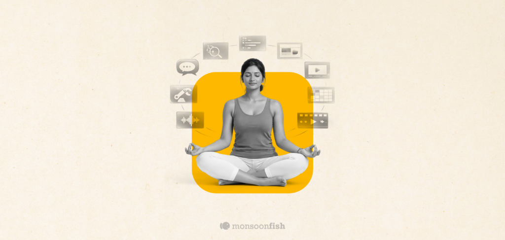
AI features Users Don’t Trust Yet: Designing for Trust

AI features can be powerful, but users still pause before trusting them. Not because they hate AI, but because the experience doesn’t make reliability obvious. This blog explores why trust breaks in AI products and the UX patterns that help users verify outputs, stay in control, and adopt AI with confidence.
Good UX is boring (and that’s the point)

A friend showed me a “cool” app—animations, pulsing buttons, and micro-interactions everywhere. For a minute it looked impressive. By minute three, he was negotiating with it: double tapping, second-guessing saves, hunting for missing filters. That’s when “cool” stops being the goal. Good UX often feels boring because it quietly gets you to the outcome and gets out of your way.
The Practical AI Tool Stack for Content, Design, and Planning
Some products make you ask, “Who approved this?” Not because they’re ugly but because they’re trying to be everything. From silly combos to bloated apps, unnecessary feature bundling adds confusion, breaks trust, and increases risk. Here’s how to spot good bundles vs noise.