The Ugly Duckling of Typography!
You know the one, right?
In today’s UI world, even though Comic Sans has certainly earned its reputation as a font to avoid, it’s not inherently bad!
Social Share
CATEGORIES
Have you ever seen a presentation, social media post, or website that seemed just a bit…off? Chances are, the culprit was Comic Sans. This widespread font has become synonymous with bad design, but why? Let’s dive into the ugly history of Comic Sans and explore why it’s still the butt of many typographic jokes.
The Birth of a Misfit
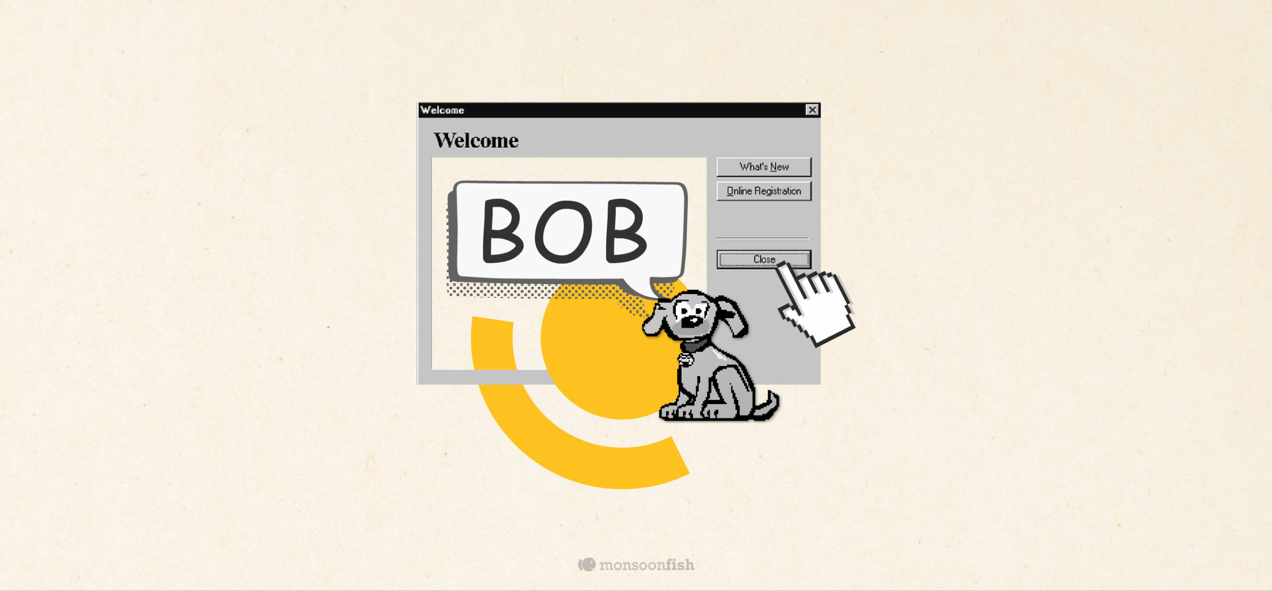
It all started in the mid-1990s when Microsoft was trying to make computers more approachable for everyday users. They created a colorful, cartoonish interface called Microsoft Bob, designed to mimic a home environment. To complement this whimsical aesthetic, Microsoft commissioned type designer Vincent Connare to create a font that would evoke the feeling of comic books and cartoons. The result was our dear old Comic Sans.
Unfortunately, Microsoft Bob was a commercial flop, but Comic Sans survived. Its playful, informal style resonated with people, which quickly became a popular choice for casual projects.
However, Comic Sans’s popularity soon turned into notoriety. As more and more people began to use it, even for serious or professional contexts, it started to be seen as tacky and unprofessional. Its association with amateurish design led to a wave of online mockery and criticism. Comic Sans became a punchline, a symbol of bad taste.
But Why is it the Object of Universal Disdain?
Part of it is its commonality. Because it’s so widely available and easy to use, it’s often overused, leading to a sense of visual fatigue. Additionally, its informal style can clash with more formal or professional contexts.
While Comic Sans has certainly earned its reputation as a font to avoid, it’s not inherently bad. In the right context, it can be a fun and effective choice. It still works well for children’s books, comic strips, or even informal social media posts (if you’re bold enough!)
The trick is to match the font to the mood. Comic Sans, like any other font, has its place.
Remember, Comic Sans is like a bad joke. It’s overused, but still capable of a good laugh when done right.
CATEGORIES
