Medical & Healthcare
 Cybersecurity
 Travel & Hospitality
 Edtech
 Enterprise
 Non-Profit
 Fintech
 Agritech
 Retail & Real Estate
 Design for AI
Redesigning Condom Packaging for the Moments That Matter
A design exploration for a South East Asian Pharma company, into how thoughtful packaging can remove friction from one of the most human and most overlooked everyday experiences.

21
billion units produced in 2020
18-35
years strong demand age group
15 %
surge in sales, in last 2 years
64 %
surge in online sale in 2023
The Problem Nobody Was Talking About
Condoms have been around for decades. The packaging? Barely changed. Variants exist dotted, ribbed, ultra thin, extra safe but nobody had stopped to ask: what actually happens in the moment of use?
Low light. Some pressure. No time to read.
And yet the entire system assumes you will calmly read the pack, identify your variant, figure out orientation, and open it cleanly.
Nobody does that. They adapt. And companies, seeing no complaints, assume it’s fine.
That’s the most dangerous kind of design failure – when the problem gets normalized.
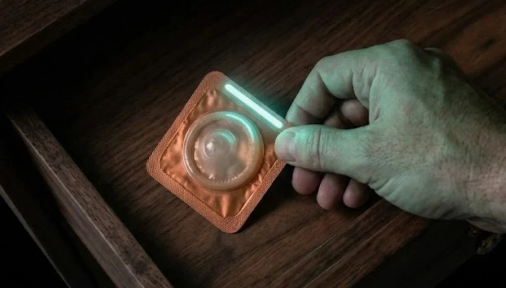
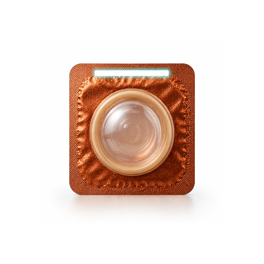
Problem 1: Locating It in the Dark
The condom is rarely stored right next to you. It’s in a drawer, a bag, a wallet — somewhere nearby but not immediately visible. And in low light, that small distance becomes a surprisingly big moment of friction.
The packaging offers no help here. It’s not visible, it’s flat, uniform, and silent in the dark.
Our solution: Tactile surface + glow in the dark
A subtle glow strip on one edge, charged by ambient light, makes it visually locatable without needing to switch on a light. A distinct tactile pattern on the pack surface makes it immediately identifiable by touch even among other items in a drawer or bag.
No searching. No second-guessing. Your eyes can locate it in a glance.

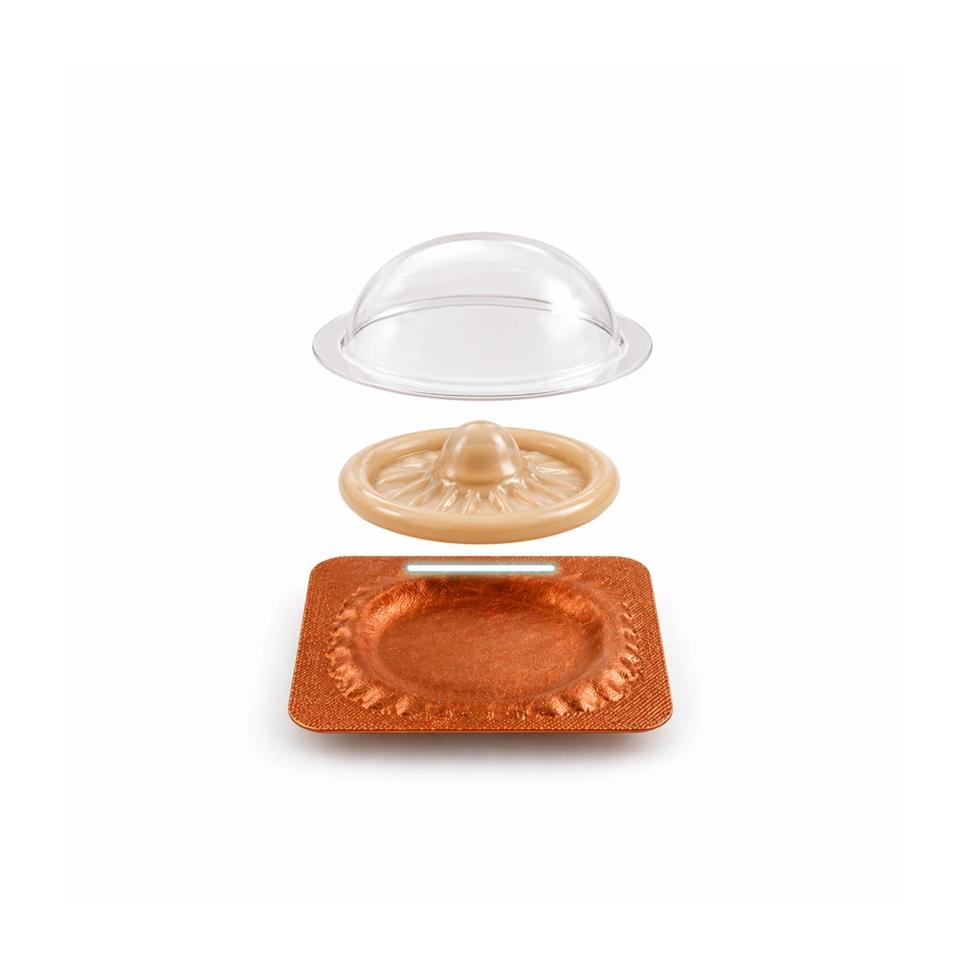
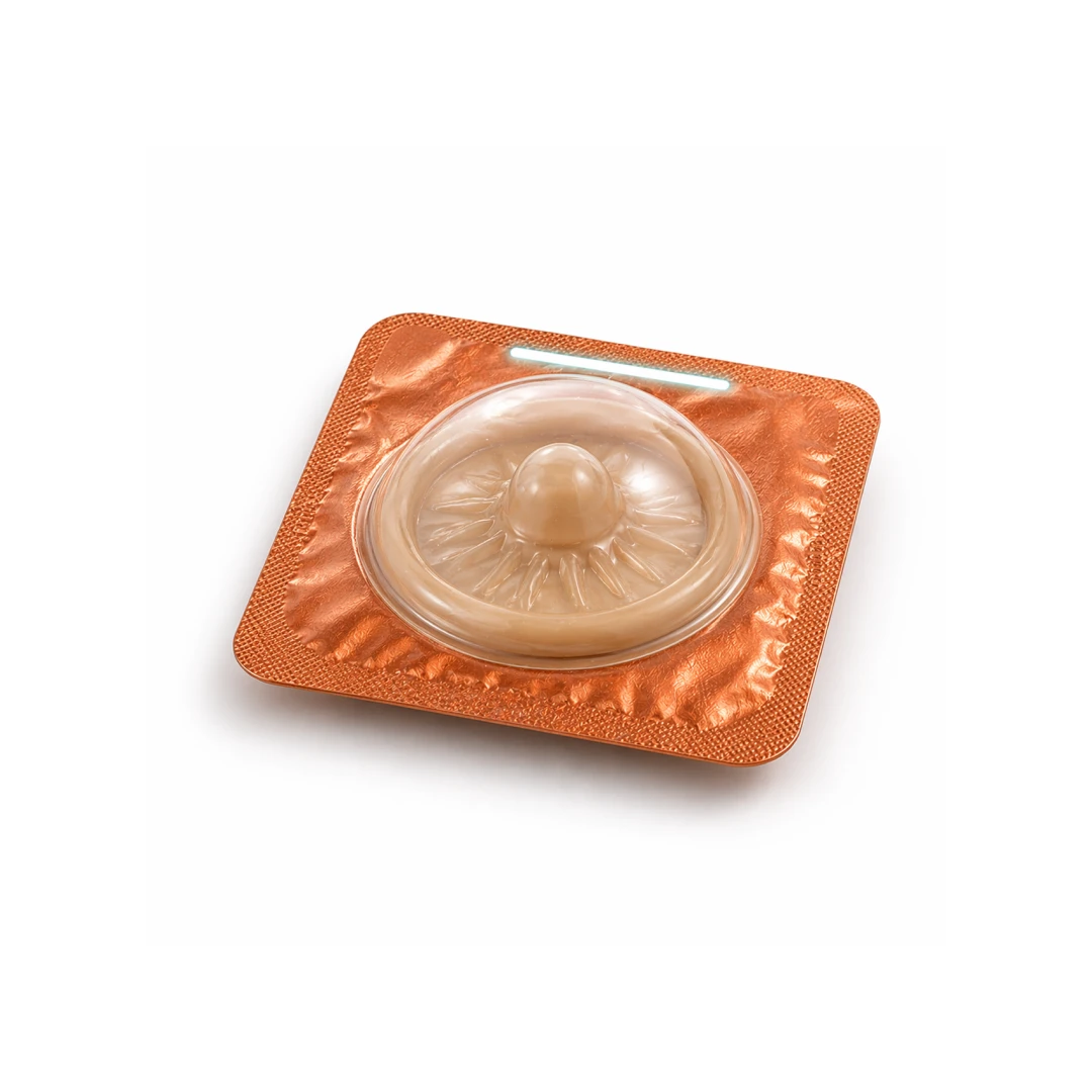
Problem 2: Knowing Which Side to Wear It
This one is almost never spoken about. But it’s a real, recurring moment of confusion especially in the dark.
The current pack gives you no directional cue. You figure it out by feel, or trial and error, or just hoping.
Our solution: Structural orientation cue
A subtle raised edge or notch on one side of the pack — and mirrored on the condom rim itself — communicates direction without any instruction. One side slightly different. That’s all it takes.
No guessing. No fumbling. Just knowing.
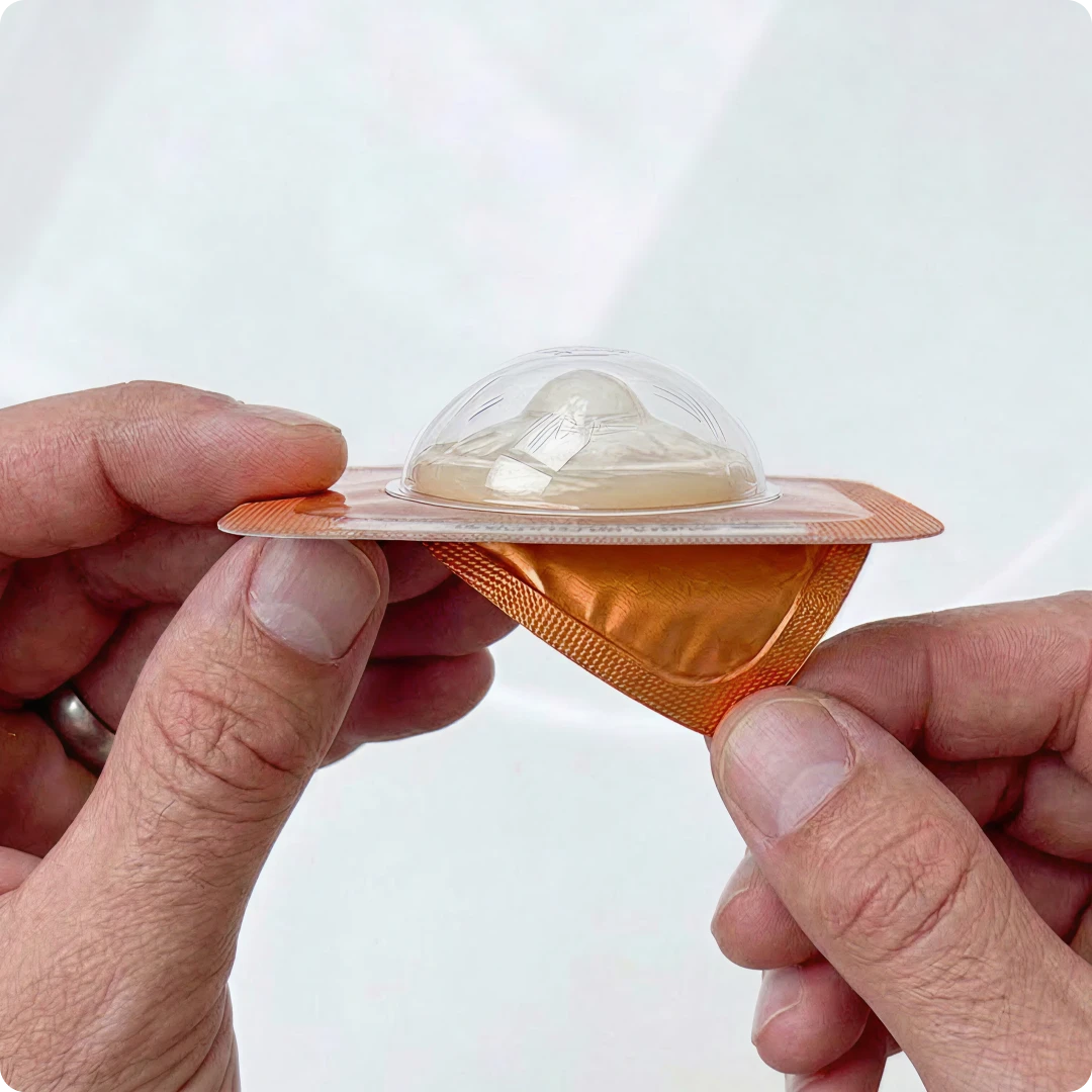
Problem 3: Opening It Without a Struggle
Tearing a condom pack under pressure is more unreliable than it should be. The tear doesn’t always go where expected. Sometimes the contents shift. Sometimes both hands are needed.
Our solution: A guided tear line + single-hand opening
A pre-scored, directional tear line on the corner — wide enough to grip, narrow enough to control. Designed for one-handed use. The condom stays positioned correctly inside, ready to use immediately after opening.
Fewer steps. Less pause. More confidence.
Problem 4: Dealing with Disposal
Post-use disposal is often an afterthought. There’s uncertainty around where to put it, how to wrap it, and how to do it discreetly (especially when you’re not in a familiar space).
Our solution: A built-in disposal container
A discreet, easy-to-use container integrated into the packaging designed to hold and seal the used condom without mess or awkward handling. Compact, hygienic, and intuitive.
The Design Principle Behind All of This
We didn’t add information. We removed the need for it.
Every solution here works because it moves the communication from the label to the object itself. The pack tells you what it is. The structure shows you how to use it. The tear guides you without instruction.
That’s the shift from a pack you read to a pack you just use.
Design Creates Experiences That Facilitate Human Moments.
The best design problems are hidden in everyday behavior. They don’t show up in support tickets or NPS scores. They live in the small, private moments where people quietly adapt to something that was never designed well enough.
Solve those moments well and the product disappears. Leaving behind only a better experience.