Why Tiny Screen UX Matters More Than Ever?
Gone are the days of technology dictating user behavior. Wearable UX design thrives on a user-centered approach. We need to understand the who and why behind the wearable.
CONTENTS
Less is More: Simplifying UX for Wearable DevicesWhy User-Centered Design is the Heartbeat of WearablesKey Factors to Consider while Designing for the MicroBest Practices for Intuitive Interfaces: Tiny Taps, Big ImpactOvercoming Navigation and Interaction Challenges: Thinking Outside the BoxOptimizing for Different Wearables: One Size Doesn’t Fit AllReady to Revolutionize Your Wearable Tech?Social Share
CATEGORIES
The future is wearables, period. Fitness trackers hug your wrists, smartwatches buzz with notifications, AR glasses paint the world with information, and health monitors silently track your well-being. The world of wearable technology is booming. From fitness trackers to smartwatches, augmented reality glasses to health monitors, wearables are seamlessly integrating into our lives. But with this exciting tech revolution comes a crucial design challenge: crafting exceptional user experience for these miniature marvels. Let’s explore the challenges and methods to overcome them in these wearables.
Less is More: Simplifying UX for Wearable Devices
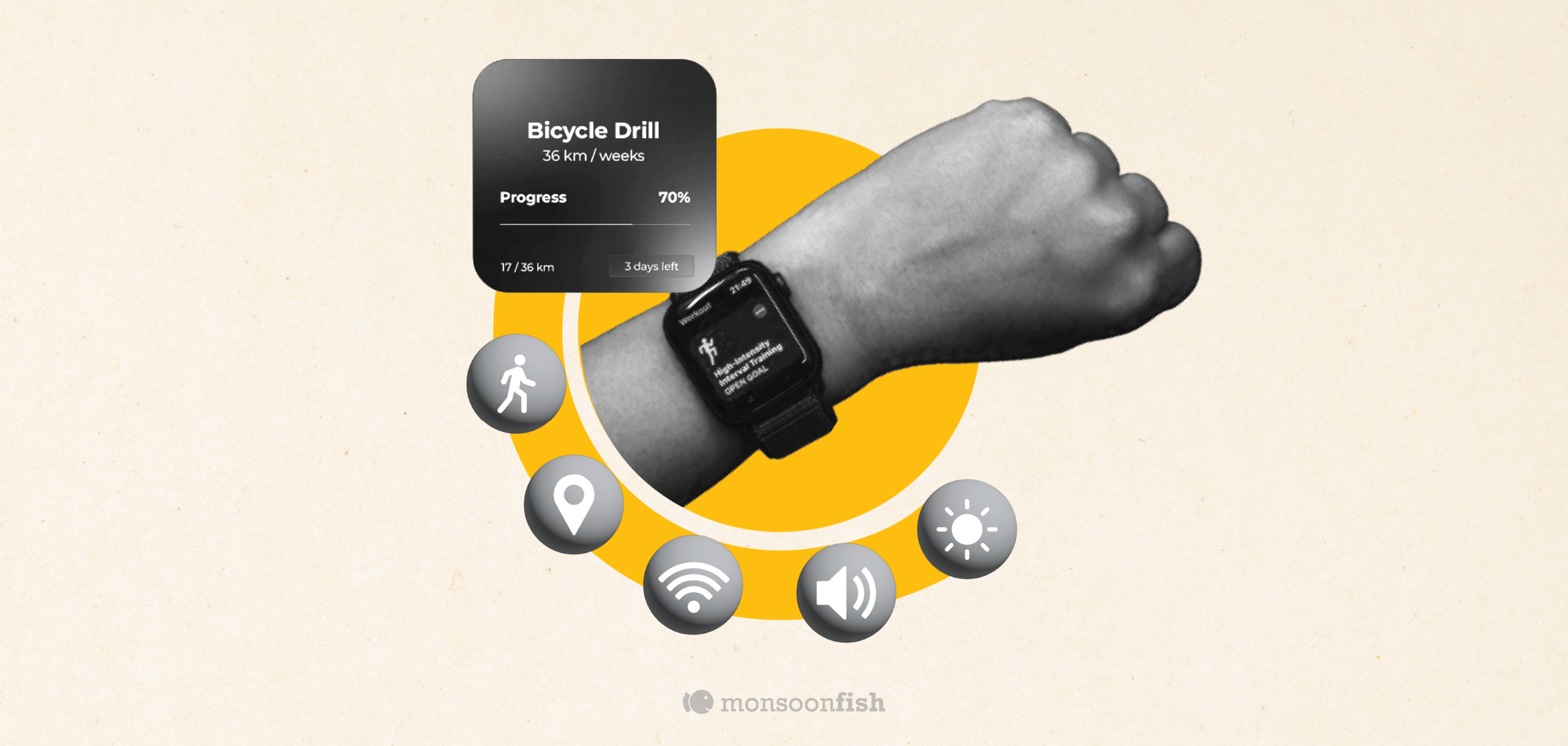
Unlike designing for expansive desktops or smartphones, wearables present unique limitations. Tiny screens demand a minimalist approach, while battery life dictates efficient UI interactions. Complex menus and overwhelming information overload can frustrate users. Here’s where your UX magic comes in – creating intuitive interfaces that are both functional and delightful to use.
Why User-Centered Design is the Heartbeat of Wearables
Gone are the days of technology dictating user behavior. Wearable UX design thrives on a user-centered approach. We need to understand the who and why behind the wearable. Who is the target audience? Athletes, fashionistas, healthcare professionals? Why are they choosing this wearable? Fitness tracking, contactless payments, or enhanced gaming experiences? By empathizing with user needs and motivations, we can design wearables that seamlessly integrate into their lives.
Key Factors to Consider while Designing for the Micro
Here are some key factors to keep in mind when designing a satisfying UX for wearables:
- Prioritize Core Functionality: Don’t overwhelm users with a feature overload. Identify the core functionalities that align with the purpose of the wearable and prioritize those in the design. Think of a smartwatch – its core function might be fitness tracking and notifications, so prioritize those features and make them easily accessible.
- Simplicity is Key: Minimalist interfaces with clear and concise information are your best friend. Opt for icons that are universally understood and prioritize single-tap interactions. Imagine a pair of smart glasses – bombarding users with text on a tiny screen would be overwhelming. Instead, focus on clear and concise information delivery through well-designed icons.
- Embrace Hierarchy and Scannability: Limited screen size means prioritizing what users see first. Lead with the most important information and utilize visual hierarchy to guide users’ attention. For instance, on a fitness tracker, prioritize displaying heart rate and steps taken during a workout, with additional metrics tucked away in a sub-menu.
Best Practices for Intuitive Interfaces: Tiny Taps, Big Impact
Let’s discuss interaction! Here’s how to create intuitive interfaces that users can navigate with ease:
- Minimize Text Reliance: Short, actionable phrases or single words are more user-friendly than lengthy text blocks. Imagine controlling your music player on a smartwatch – a simple “play” or “pause” icon is far more intuitive than written instructions.
- Power of Gestures: Utilize gestures like swiping, tapping, and holding for different functionalities. However, keep it simple and consistent to avoid overwhelming users. A fitness tracker might use swiping gestures to navigate through different workout data screens, while a smartwatch might use tapping to accept notifications.
- Haptic Feedback is Your Friend: Subtle vibrations can provide valuable feedback to users, confirming actions and guiding interaction. For example, a smartwatch might use haptic feedback to confirm a button press, ensuring the user doesn’t need to constantly stare at the screen.
Overcoming Navigation and Interaction Challenges: Thinking Outside the Box
Navigation on a tiny screen presents a unique challenge. Here’s how we can tackle it:
- Circular Menus: Utilize circular menus that allow users to scroll through options with ease, even on a small smartwatch screen. Imagine a fitness tracker with a circular menu offering options like “start workout,” “view goals,” and “check progress.” Users can simply swipe their finger around the circle to navigate.
- Card-Based Interfaces: Break down information into digestible cards that users can swipe through for a clear and organized experience. For instance, imagine a smartwatch that displays notifications in a card format, allowing users to easily swipe through them and prioritize important messages.
- Leverage Voice Control: Voice assistants are a powerful tool for wearables, allowing users to interact with the device hands-free. Imagine controlling your music player on a smartwatch with simple voice commands like “play” or “skip track,” all without needing to take your eyes off your workout.
Optimizing for Different Wearables: One Size Doesn’t Fit All
The UX design for a smartwatch will differ vastly from that of a pair of smart glasses. Understanding the form factor of the wearable is crucial. For example, smart glasses might prioritize visual information overlay, allowing users to see workout data or receive messages without needing to look down at their wrist. A fitness tracker, on the other hand, might focus on simplified visuals for quick interaction.
Ready to Revolutionize Your Wearable Tech?
Whether it’s smartwatches, fitness trackers, or AR glasses, our UX design services are tailored to meet the unique challenges of tiny screens and diverse user needs. We specialize in creating intuitive and delightful user experiences for wearable devices. Contact us today to ensure your wearable tech stands out with exceptional UX design. Let’s make your wearable technology a seamless part of everyday life!
CATEGORIES
