Designing Book My Show's Next Big Feature
What’s next for BookMyShow? After speaking to the users of the BookMyShow app, they introduced the feature of chat-based decision-making.

Book My Show has become a go to app for us trigger happy folks. Booking a ticket is a seamless experience and the app has nailed those workflows very well.
So what’s next for an app like Book My Show ? How does an app which is already so good, get even better ?
The answer lies with it’s users and thats where we started out.
Social Share
CATEGORIES
Conversations
Conversations
The advantage with a book my show, is that we have users all around us. We made a quick assumption of who the users might be and then we started speaking to friends about the following
- Existing experience with Book My Show
- Existing experience with movie watching
Over numerous conversations we enforced our user personas and what is it that they need. Over a discussion during some quality chai (yes we inhale chai), we asked ourselves,
Why does someone watch a movie ? If so, how does she go about it.
We realised that the reasons are numerous including killing time, spending time with friends or true passion. There was a sticky part though which involved planning for a movie.
- Involved multiple folks
- Too many preferences
- Issues around splitting the tickets
- Time bound decision making as tickets tend to fill up and folks are left still deciding where to go
- Decisions were was based on convenience, other people’s preferences
- Most of all : This all happened offline, and took a long time. It involved speaking to multiple people, multiple times. While only the ticket booking was on the app
- Often the end result always had one grumpy passenger, who felt she wasn’t consulted!
So what we decided to tackle was how to help groups make a decision plan a movie.
Introducing BMS Chat
Introducing BMS Chat
To look at what helps folks make decisions in other contexts we explored a variety of software, and took inspiration for WhatsApp and Slack. Groups are a great way for users to quickly catch up and make decisions. These have been used very successfully in the enterprise context as well.
Introducing BMS chat rooms, which were groups users could make to discuss which move to go for. Chats would be available from the bottom bar itself as a section of the app.
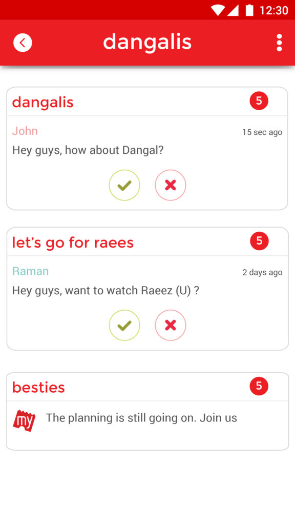
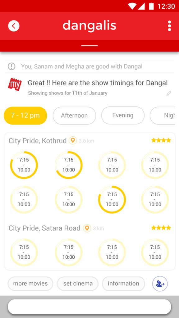
A chat bot would introduce available options to the user and guide initial decisions
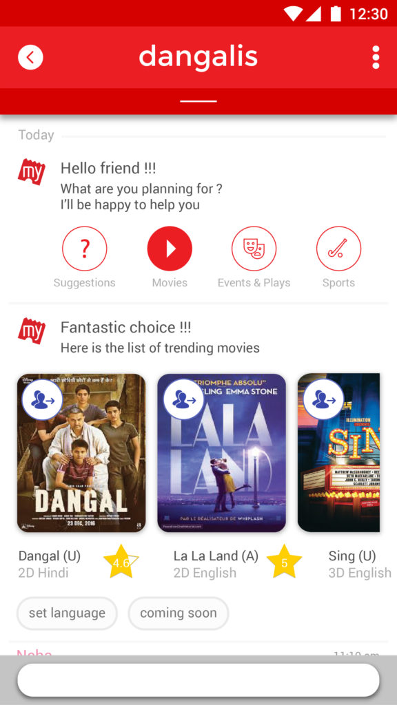
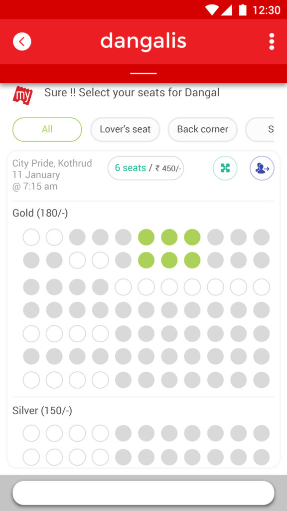
Users could perform all tasks in chat itself. This allowed them to discuss and make decisions.
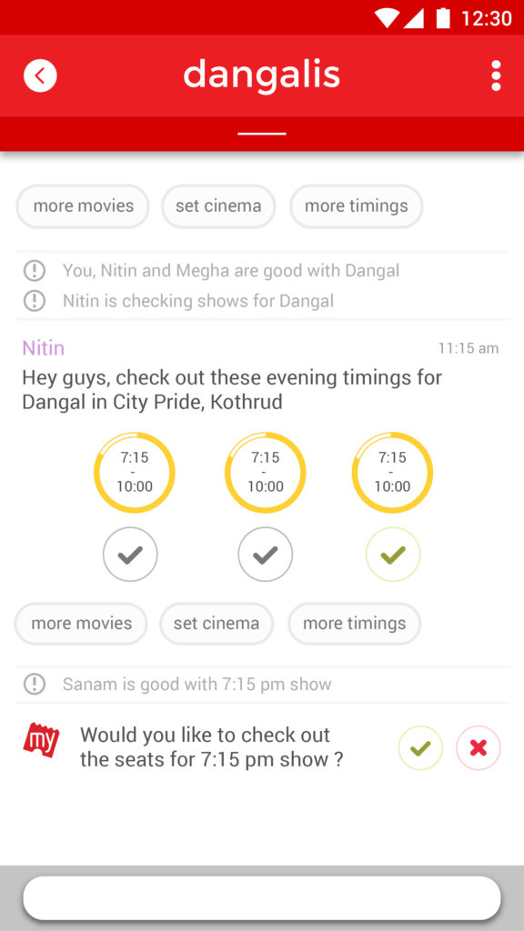
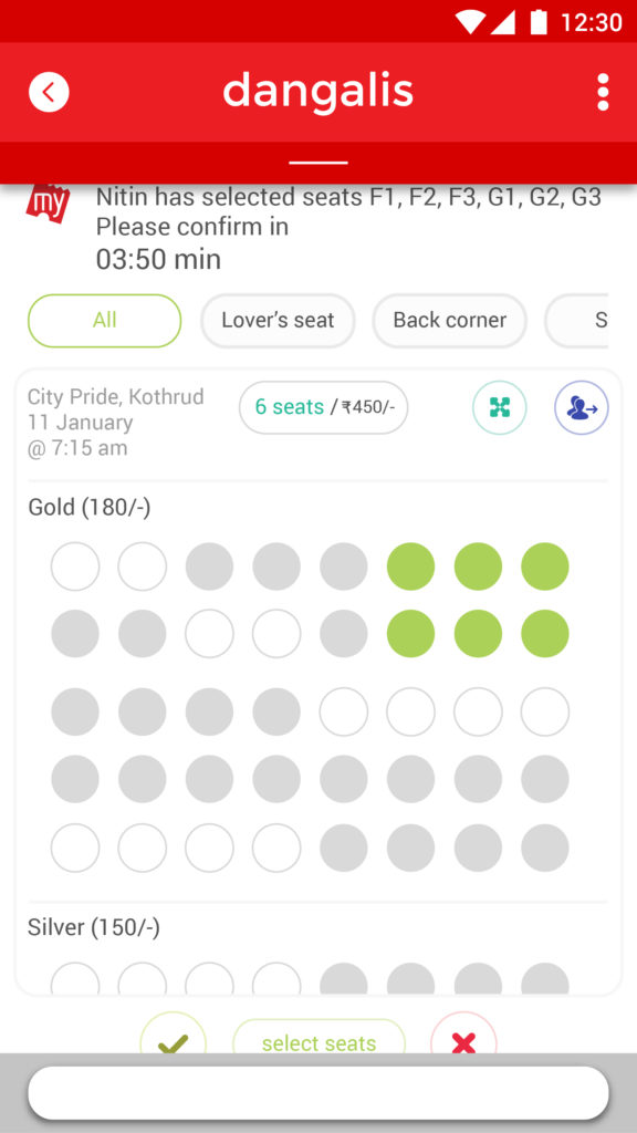
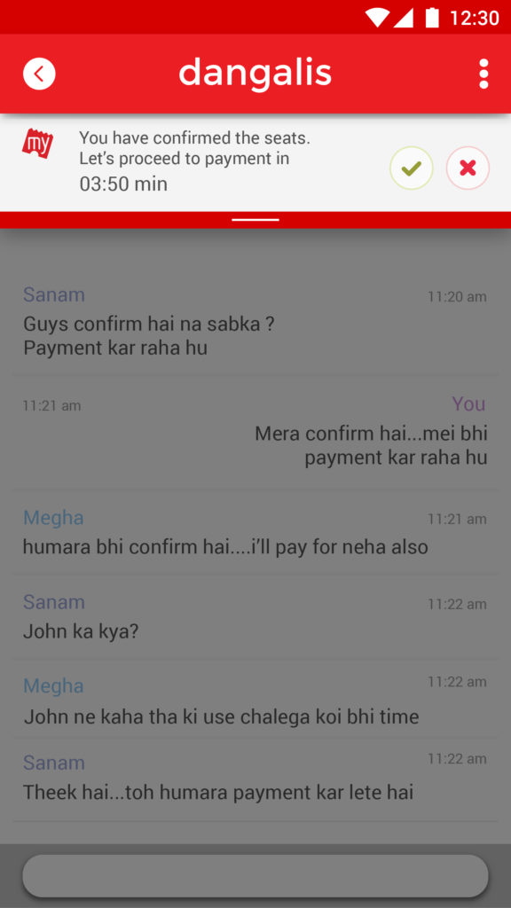
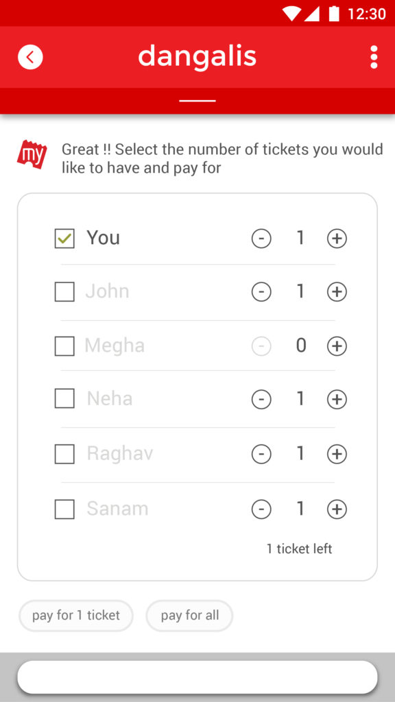
Decisions once made were shown clearly to the user. This allowed quick decision making with flows involving payments and splitting the tickets.
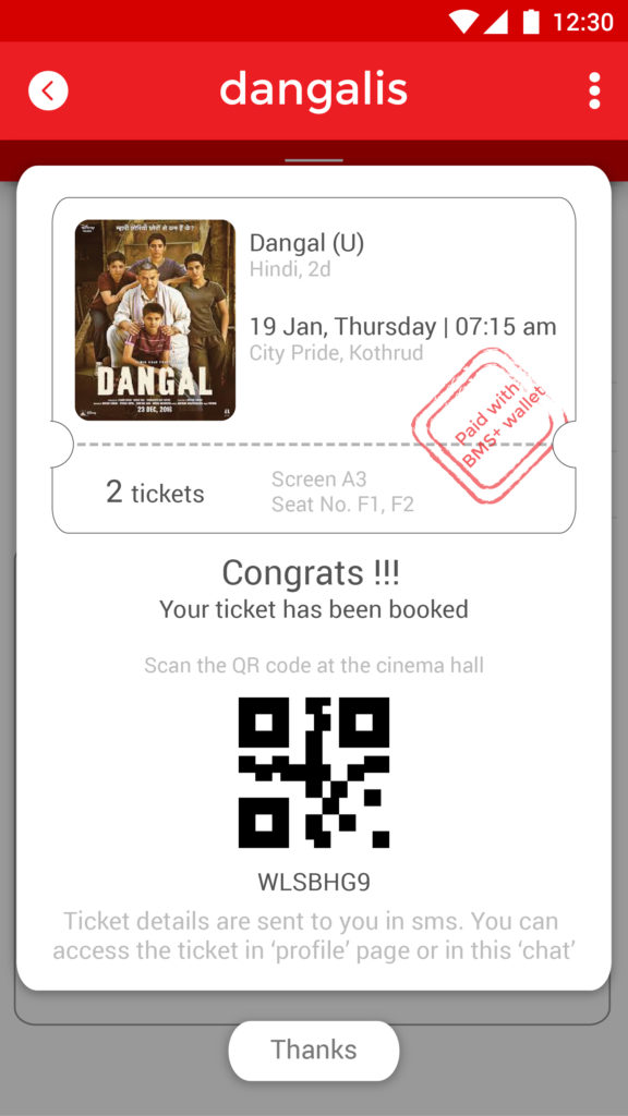
Confirmation of booking was shown in the chat it self. Users could save and share these tickets ahead.
Indicators of seats filling up, booked vs not booked were shown visually.
Concluding Thoughts
Concluding Thoughts
Book My Show actually launched chat-based decision making a week later ! We were happy that the industry validated our line of thought.
While testing users saw value in the efficiency this new feature brought to their planning. It gave clarity and an essence speed to everyone on the group.
CATEGORIES
