Medical & Healthcare
 Cybersecurity
 Travel & Hospitality
 Edtech
 Enterprise
 Non-Profit
 Fintech
 Agritech
 Retail & Real Estate
 Design for AI
UX Design for AiStrike: Simplifying Cyber Defense
AiStrike is a 0-to-1 cybersecurity startup building an AI-powered platform for automated workflows and real-time threat monitoring. Designed to help organizations protect their digital assets, AiStrike brings together multiple security operations into one intelligent system.


Objective of Design
Our design aimed to strengthen AiStrike’s product usability while keeping technical precision intact.
- Optimize Query Building: Simplify complex search and filter workflows to reduce investigation time.
- Enhance Analyst Efficiency: Enable quick navigation between alerts, threats, and device metrics.
- Improve Data Clarity: Organize key insights through structured visual hierarchies and widget-based layouts.
- Reduce Cognitive Load: Highlight the most relevant information and minimize unnecessary noise.
- Create Consistency: Unify the experience across dashboards for seamless navigation and faster onboarding.
Our Process

Pain Points
User Challenges
- Analysts struggled with cluttered dashboards that displayed too much information at once.
- Query creation required multiple manual steps, increasing response time.
- Limited visual hierarchy made it hard to identify which threats needed immediate action.
Systemic Challenges:
- Fragmented components caused inconsistency between dashboards and tools.
- High learning curve for new users due to scattered layout and terminology.
- Lack of prioritization created delays in alert resolution.

Discovery
Through collaboration with AiStrike’s core product team, we mapped out workflows and identified usability gaps.
- User Research: Conducted task-based analysis of how analysts query, filter, and act on alerts.
- Gap Analysis: Found overlaps and redundancies that slowed decision-making.
- Information Architecture: Reorganized dashboards into clear data clusters — Alerts, Threats, Devices, and Activity Logs.
- Design Benchmarking: Studied leading SOC platforms to benchmark visual clarity, prioritization, and cognitive ergonomics.

Implementation
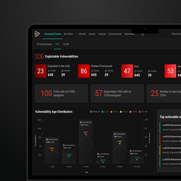
The redesign introduced an intuitive dashboard and enhanced query builder that transformed the experience from reactive to proactive.
- Unified Dashboard Structure: Consolidated multiple widgets to give users a complete system snapshot, from alerts to remediation trends.
- Visual Hierarchy for Priorities: Color-coded severity levels and clear segmentation helped analysts act faster on critical issues.
- Smarter Query Builder: Simplified query creation with filters for severity, source, and asset type, enabling quick drill-downs.
- Real-Time Activity Log: Continuous updates ensured analysts could monitor live threat events without losing context.
- Responsive Layout: Optimized for long operational hours with dark mode, consistent spacing, and low-glare contrast.
Outcomes

Outcomes
Team Monsoonfish worked with AiStrike to turn a powerful but busy product into an everyday workspace that analysts can rely on. The redesigned query builder and dashboards cut down on steps, made alert priorities obvious, and pulled key metrics into one place. Instead of piecing together context from multiple screens, analysts can now see what matters, drill in quickly, and move from “what is happening?” to “what should we do?” with far less effort.
Making Daily Monitoring Easier for Security Teams

Making Daily Monitoring Easier for Security Teams
- The redesigned AiStrike dashboards give security teams a clearer, calmer space to work in every day. The main view brings together alert volumes, risk levels, remediation status, and device health so analysts can understand “what’s going on” in a single glance. A cleaner layout, focused widgets, and a more direct query builder mean less hunting through menus and more time spent actually investigating issues. By cutting visual noise and tightening the flow, AiStrike now helps teams spot patterns sooner, act on urgent alerts quickly, and get through long shifts with less friction.
Impact
Business Impact
- Faster Investigations: Simplified dashboard and query workflows reduced average investigation time.
- Higher Analyst Productivity: Unified data views cut down on context-switching across tools.
- Scalable System Design: The modular dashboard allows AiStrike to expand features seamlessly.
User Impact
- Improved Clarity: Analysts can now prioritize and act on high-risk alerts within seconds.
- Reduced Fatigue: Simplified visual hierarchy reduces cognitive load during long monitoring sessions.
- Greater Trust in Automation: Transparent AI-driven prioritization builds analyst confidence and engagement.
Let’s explore your project.
Book a free slot or share your email.
Or just share your email
We’ll reach out.
Other CASE STUDIES