Medical & Healthcare
 Cybersecurity
 Travel & Hospitality
 Edtech
 Enterprise
 Non-Profit
 Fintech
 Agritech
 Retail & Real Estate
 Design for AI
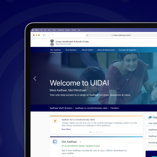
UI/UX Redesign for the World’s Largest Biometric System- Aadhaar
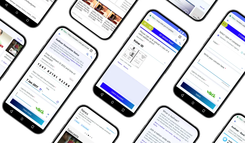
A user experience design, to make the website responsive, accessible to millions and to render itself well on mobile devices.


The Aadhaar project by the Indian Government is handled by Unique Identification Authority of India (UIDAI), under the Ministry of Electronics and Information Technology (MeitY). It operates on a massive scale, and has issued more than 120 crore Aadhaar numbers to the residents of India till date.
With the increasing penetration of the internet and smartphones, UIDAI realized that their website needed to be responsive, and render itself well on mobile devices.
Objective of Design
Aadhaar website is a utility and not a daily use product; where people visit the website to get their query resolved/work done and leave the website. Our redesign aimed to treat every user as a first-time user, and every use-case as the first use-case. Hence our re-design objective was:
- To reduce time taken to access key information.
- Ensure existing information is brought up at the right time.
- Enable smooth performance across all devices, for a diverse audience.
Our Process

Pain Points
- The diverse audience of India needed language support to use the website.
- Most users feared making updates, and there was a general sense of misinformation.
- Relevant user information was hidden deep in the website.
- Duplication of content where the same things were conveyed in different words.
- Users from the higher side of income value, questioned Aadhaar, its use and security around it.
- The old website had all links and information in bulk, and finding a particular query was extremely difficult, which led to users being frustrated and leaving the website.
- The user’s frustration put an additional toll on the Aadhar support centers, and also hampered the reputation of the system.

Discovery
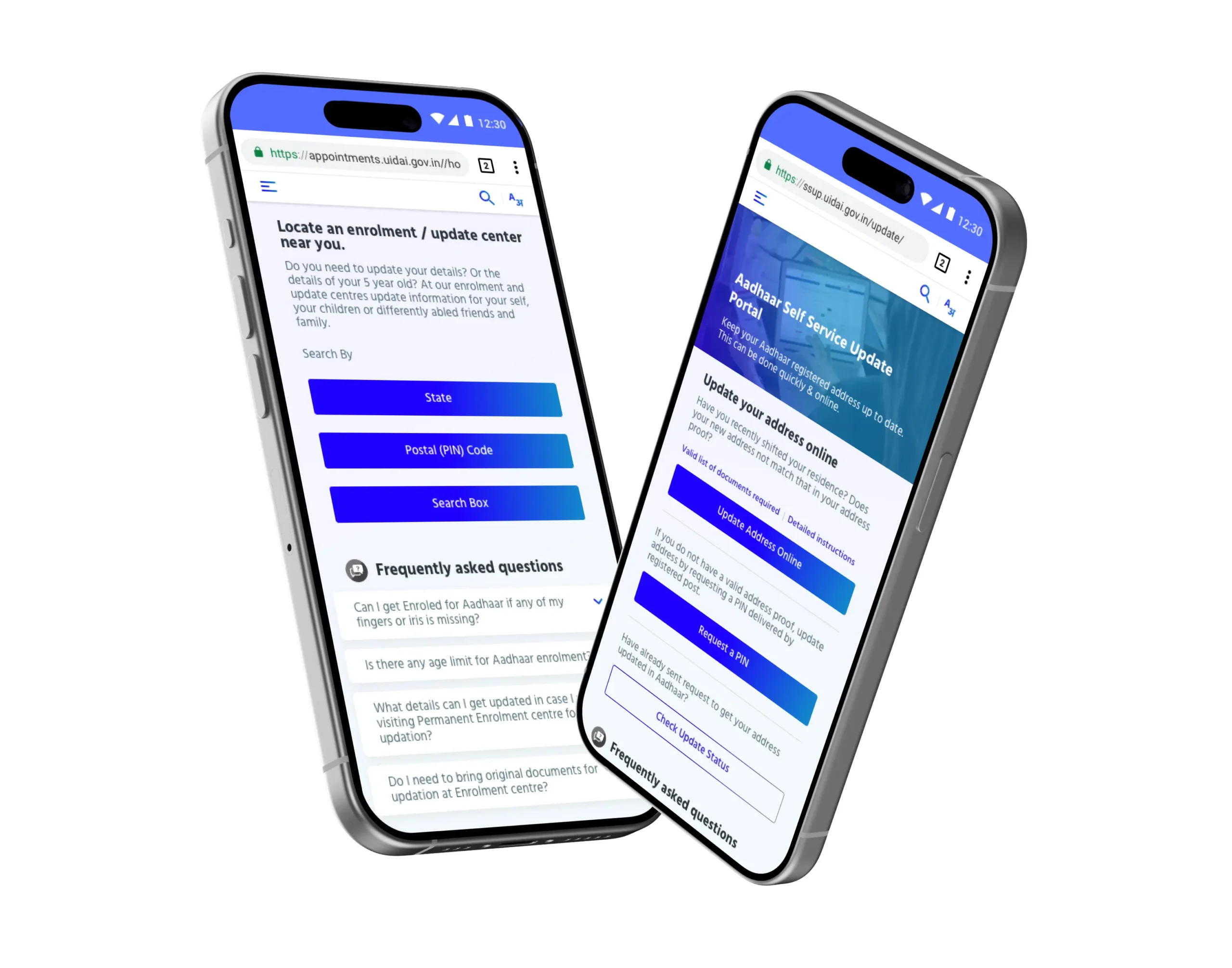
- Maximum share of users visited the website to access FAQs and Aadhaar update related information. Most of the support calls to the CRM team were around updates and service related; and since many services under these sections opened in different portals, users were redirected to a completely different site, with a different look and feel.
- Aadhaar had already managed a vast adoption across the nation, the next bunch of users were residents looking to make updates, or young parents, wanting to create cards for their children. The website was mostly accessed on Android devices.
- There were multiple stakeholders involved in UIDAI and the redesign was to be established considering their different usability and user goals.

Implementation
- For UX redesign, we prioritized only two sets of information — Aadhar services and updates, showing the right information at the right time — to the right users. Our design solution was to change the website to make it more relevant and useful for our desired sets of audience. We implemented the redesign considering two goals:
- Access to the right information at the right time: we added value by bringing the Aadhar update related information in the front and made it easily accessible to the users, rendering well on mobile devices.
- Access to the information in the right context: We channeled the information through an information flow/information architecture that renders well on mobile devices, enabling access to the information that users needed.
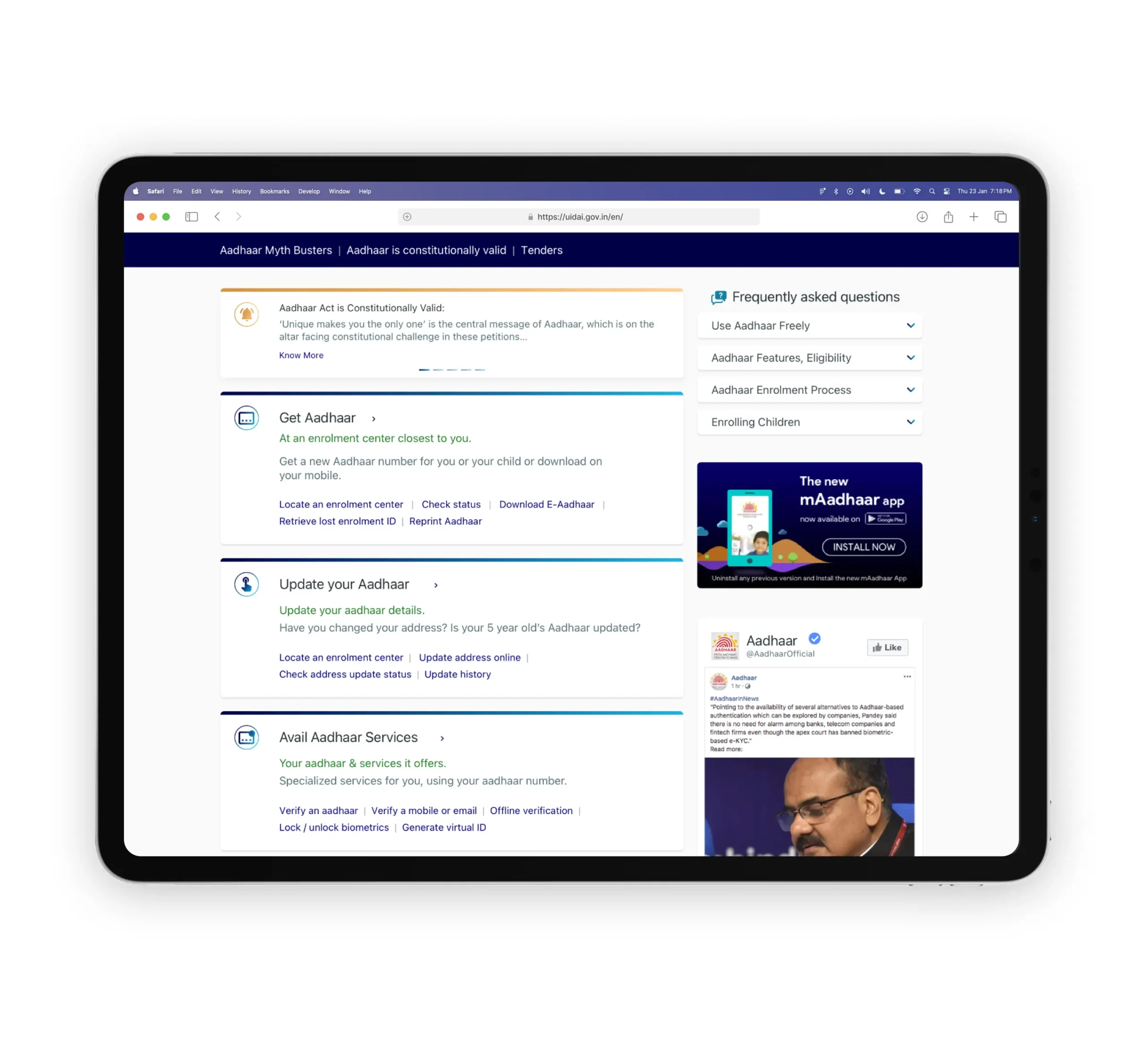
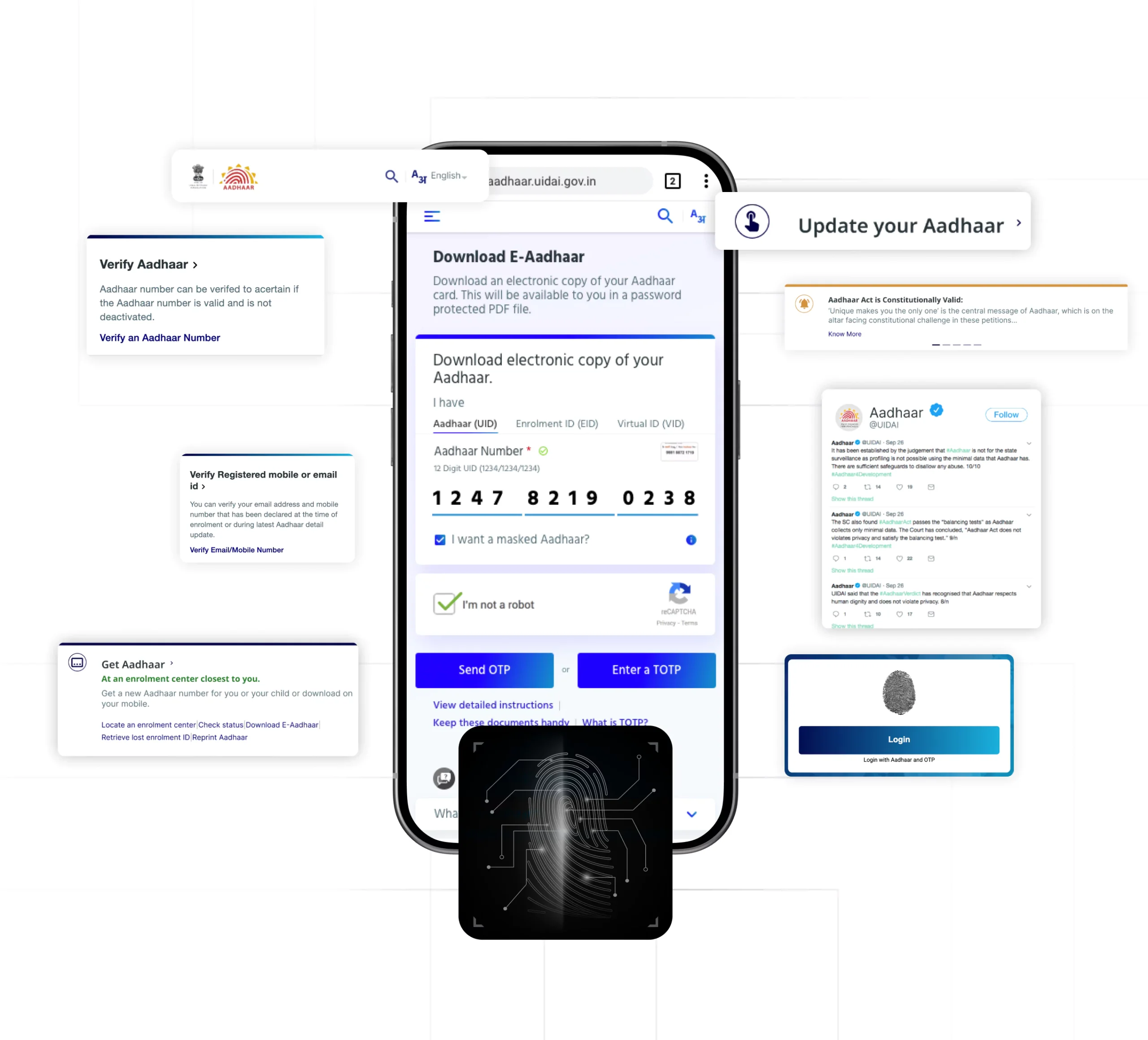
- For the visual aspect, we ensured to design an interface that imparts the sense of the government’s flagship project. Our UI goal was to aim for the website to feel trustworthy and ooze authority. We therefore created an interface that could be trusted by the users, where they are assured that the website will have what they need.
Outcomes
Outcomes
With a redesign brief the design solution was a complete design overhaul, a formidable design system, as well as a redesigned information architecture. Our UI/UX process around the above aspects led to the following outcomes:
- Aadhaar website rendered in English and 12 other Indian languages.
- The redesign works well not just on all devices, but also in all languages. (Eg. Arabic is written and read from right to left!)
- Seamless accessibility for a diverse audience- right from alt text to color contrasts.
- Made information readily available without having to hunt for it.
- The most important information from each section built the home page.
- Modular design system, scalable style guide and UI framework.
Aadhaar Re-design- Efficient Usability, & Building Trust for Users Across the Nation
Aadhaar Re-design- Efficient Usability, & Building Trust for Users Across the Nation
- The new website defined a unified Aadhaar portal — unified varied portals in user’s eyes, giving them access to one, unified Aadhaar website. Since our audience was so vast and diverse, we considered accessibility as the highest priority. The site was restructured to show only the most relevant, and timely information and was designed to suit any screen size, anywhere.
- The new website was made available and ready to any Indian, in the language of their choice. Approachability and authority was balances in The visual style and was compliant with GIGW and government web guidelines It aligned with the kind of interfaces users were used to seeing from an experience and visual perspective.
Impact
Business Impact
- UIDAI witnessed a 12.5% reduction in operating cost due to lightweight and modular design. 100+ videos cropped up overnight validating how easy to use the site was combined with a positive social media chatter. Moreover, there was a substantial drop in support calls.
User Impact
- Indians felt a sense of delight and trust with the new website design. Users could easily access the necessary information and complete their process without needing guidance from the support system. Diverse users could seamlessly access the website on their mobile devices.
Let’s explore your project.
Book a free slot or share your email.
Or just share your email
We’ll reach out.
Other CASE STUDIES