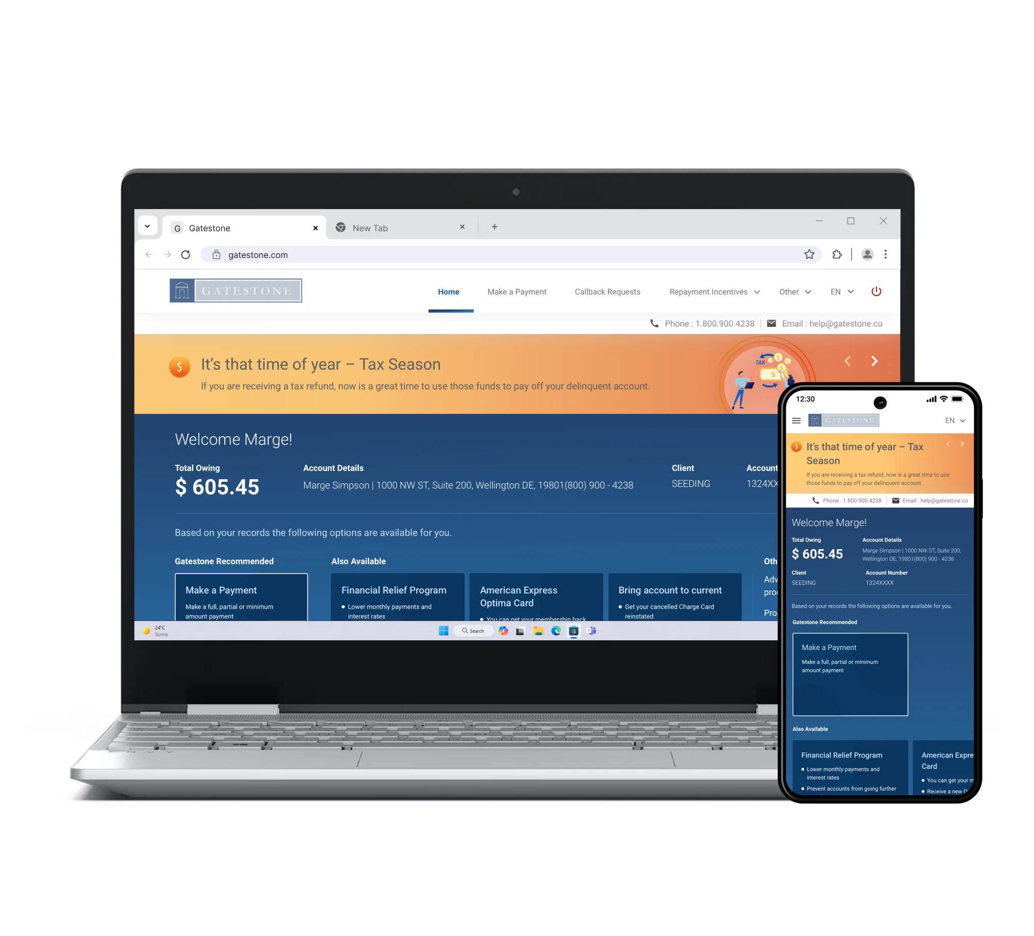
Structured Payment Flow Focusing on Mobile-First Experience
The redesign facilitated payment completion through a clear and seamless mobile-first experience.
The pandemic has led to economic crisis and loan default rates have tremendously increased in North-America; and this continues to be a growing concern. Gatestone portal is a website that helps users make settlements with their banks. Defaults usually take place due to genuine lack of cash flow, which may reflect into the user feeling burdened. Moreover, Gatestone had a legacy interface which worked but users found extremely difficult to use.
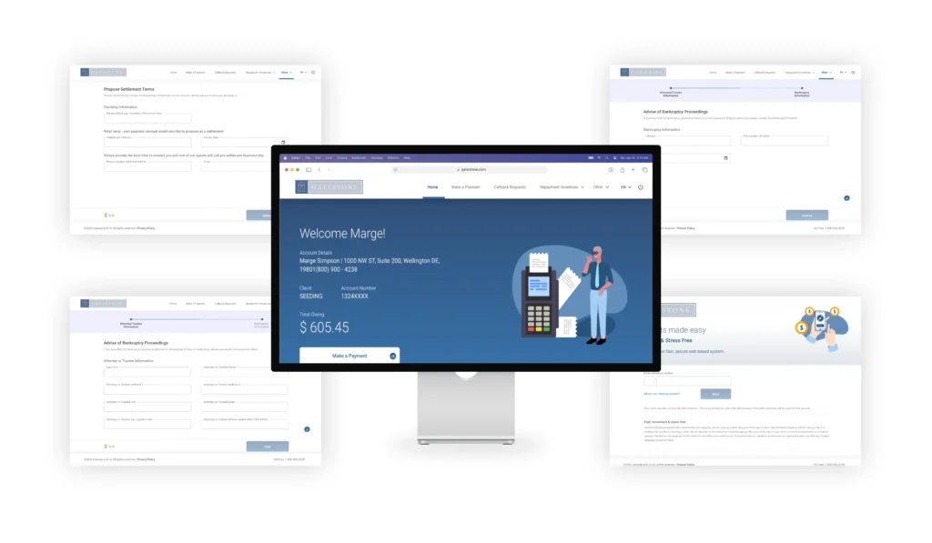
We offered a solution to Gatestone, which involved designing a mobile web interface with a format that users could relate to and trust upon.
Gatestone’s Objective
Gatestone’s aim was to ensure that the user could make the payment and complete the payment process with ease (as the current interface didn’t enable it). Hence it was important to understand the mindset of the user while redesigning the website which led us to establish the redesign objectives.
- To replace an old and cluttered website into a simple, clear and seamless interface.
- A user-friendly interface that could be rendered well on mobile devices.
- Presenting payment options in a format that users understood.
- Focus on mobile-first web experience.
- To classify the process into steps that users could understand and consume on their mobile devices.
User Understanding
Pain Points
- Current website reflects an old clunky interface.
- It was primarily designed and built for the desk, hence it rendered inefficiently on the mobile device.
- Inadequate flows, and information design resulted in low completion rates.
Goal
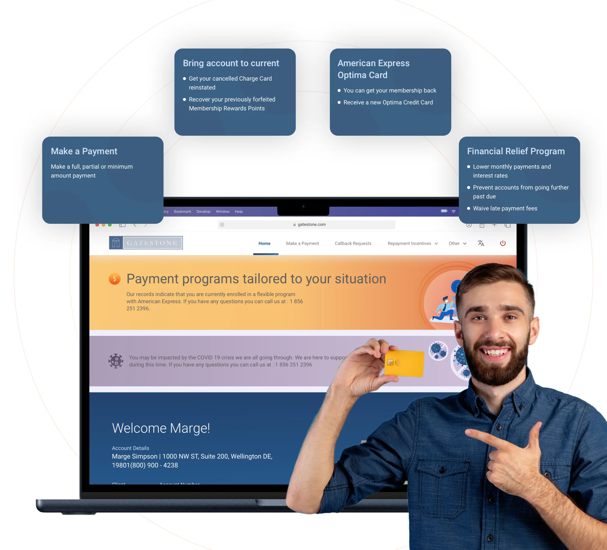
- The ability to easily make a payment and obtain a clear understanding of the current default and proceed ahead accordingly.
- Users should acquire a feeling of trust through the interface, to enable payment completion in a clear and understandable format.

Value
- Created an easily accessible interface on the user’s device. And a website experience that imparts a clear picture of the user’s default and the steps to proceed ahead accordingly.
- Our interface design enabled and facilitated prompt payments, thus creating a trustworthy guide, offering the best options to the user during a time of financial stress. The interface design, communication and motion design was based on what users associate with common mobile patterns.
Outcomes
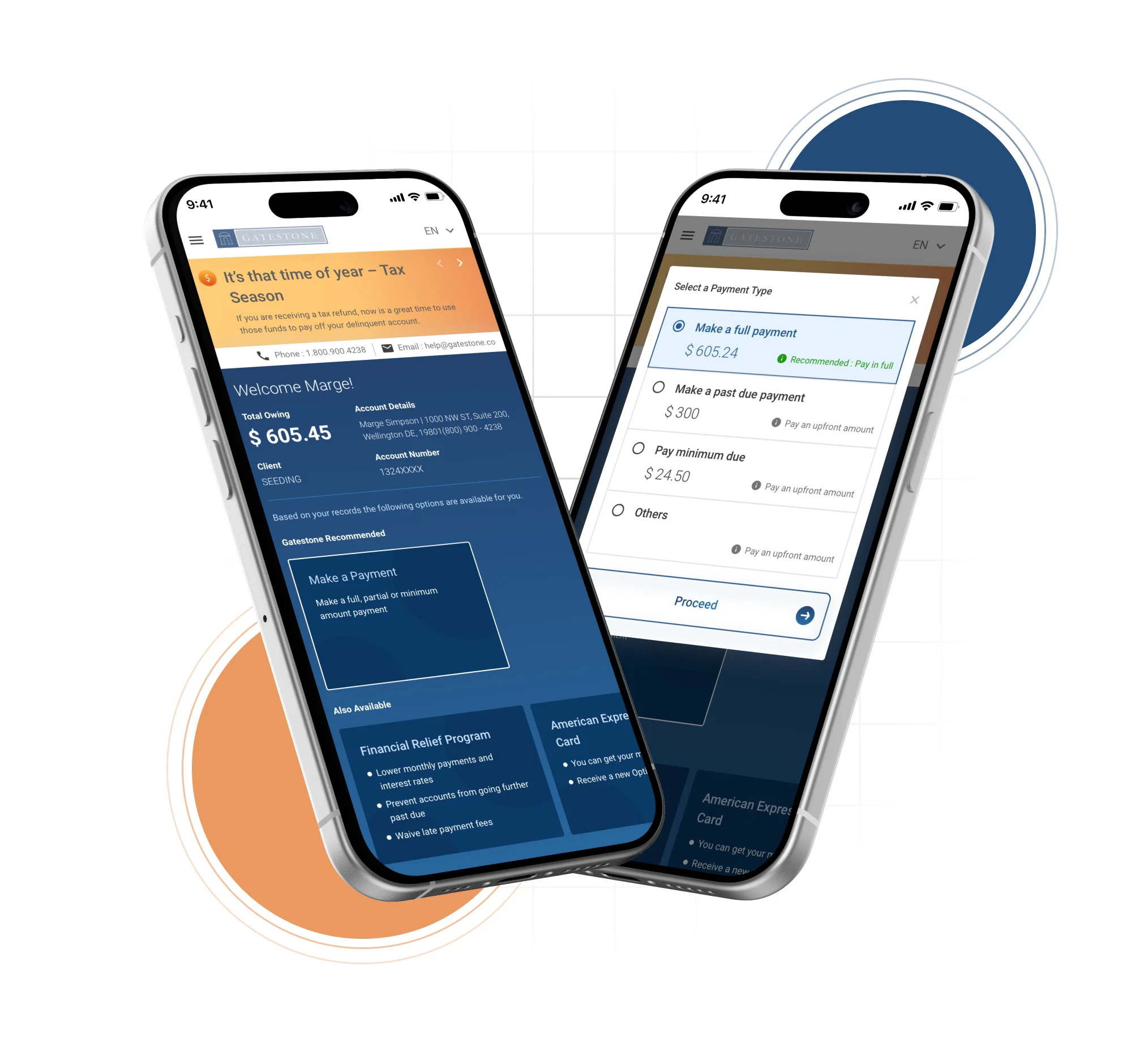

Outcomes
The goal was achieved through a deep observation at user attitude and behaviors; making sure that there are no glitches in the design experience:
- The design intervention helped make the user’s journey smooth and error free.
- The dark UX patterns were completely avoided and over corrected in the spirit of maintaining transparency and clarity.
- Addressing the right user emotion through design helped the brand and business grow better and faster.
- Rapid interaction with the customer team to arrive at the most workable solution.
New User-Friendly Website Interface
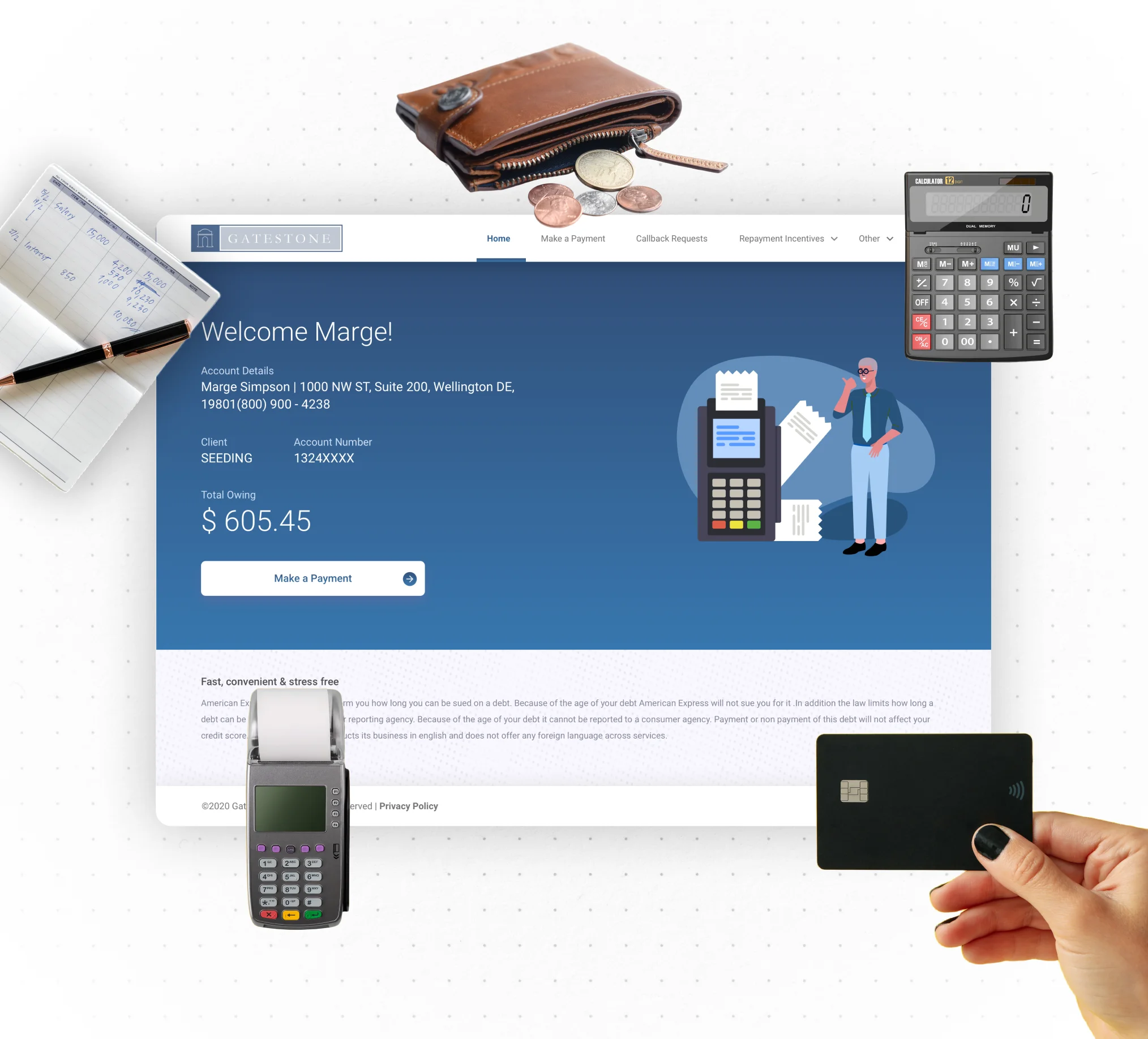

New User-Friendly Website Interface
- Visually clear call to actions and information helped users achieve their payment goals effortlessly. Integrating visuals and text made the user feel pleasant and cared for. White/neutral color palette using one main color for CTA buttons, made the process look simpler and clearer.
- Limited and only necessary content was displayed on every page, along with intuitive and system friendly form interactions that reduced the efforts of users.
Impact
Business Impact
- Insider analysis to understand stakeholder mindset and identifying mental models of users helped in evaluating the goals. Success rates of payments doubled.
- Settlements with their banks were hence made faster. Furthermore, the new and enhanced design experience revamped the brand value.
User Impact
- The tonality of the application was sensitive thus the user felt confident and assured while making the payment. Easy identification of CTA buttons displayed transparency and clarity.
- The design experience generated a feeling of trust and assurance amongst the users. And a seamless payment flow enabled users to complete the payment process easily.
Let’s explore your project.
Book a free slot or share your email.
Or just share your email
We’ll reach out.
Other CASE STUDIES
