Medical & Healthcare
 Cybersecurity
 Travel & Hospitality
 Edtech
 Enterprise
 Non-Profit
 Fintech
 Agritech
 Retail & Real Estate
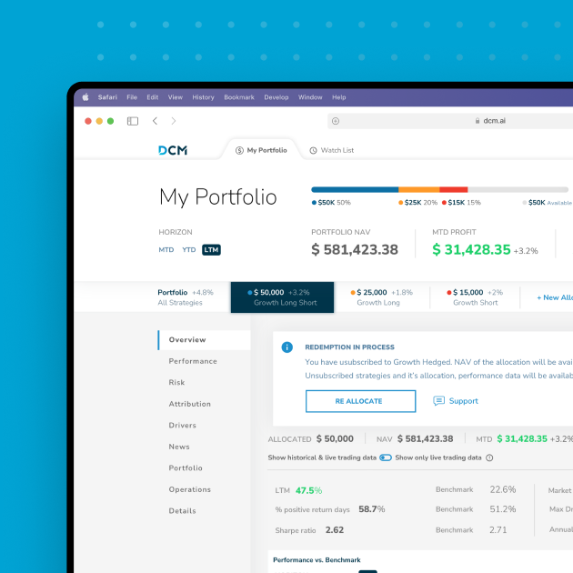
 Design for AI
Making Taxes Simple: How TaxBuddy Elevated Its User Experience with Our UI/UX Expertise
TaxBuddy is a comprehensive platform in India that enables users to file taxes independently or with expert guidance. Its redesign focused on making tax filing stress-free and engaging—simplifying compliance while helping users visualize and plan their financial future. With TaxBuddy already live, the challenge was to redesign the platform without disrupting operations.


Objective of Design
The redesign aimed to simplify the tax filing process, offering users an intuitive experience on both mobile and desktop. The primary goals were:
- Create a step-by-step guide for users filing independently.
- Help users visualize their long-term financial goals, making tax-related decisions more intuitive and empowering
- Enable quick access to expert support without disrupting the user’s self-paced experience.
- Ensure platform stability, responsiveness, and peak performance, especially during high-demand tax filing periods.
Our Process

Pain Points Identified
User Pain Points: Tax filing was seen as confusing, with users needing clearer guidance, intuitive navigation, and fast access to expert support. Traditional CA consultations didn’t allow for self-paced interactions, making the process feel rushed and inefficient.
Business Perspective: The redesign needed to balance major improvements with uninterrupted operations to maintain user trust and ongoing service.

Discovery
Conducted user interviews and competitive analysis to identify critical features and improvement areas.
Designed wireframes and prototypes focusing on:
1. Simplifying navigation for a seamless user experience.
2. Ensuring quick and easy access to tax experts.
3. Creating a stress-free and intuitive tax filing process.
Rigorously tested and refined prototypes based on user feedback to meet their needs effectively.

Implementation
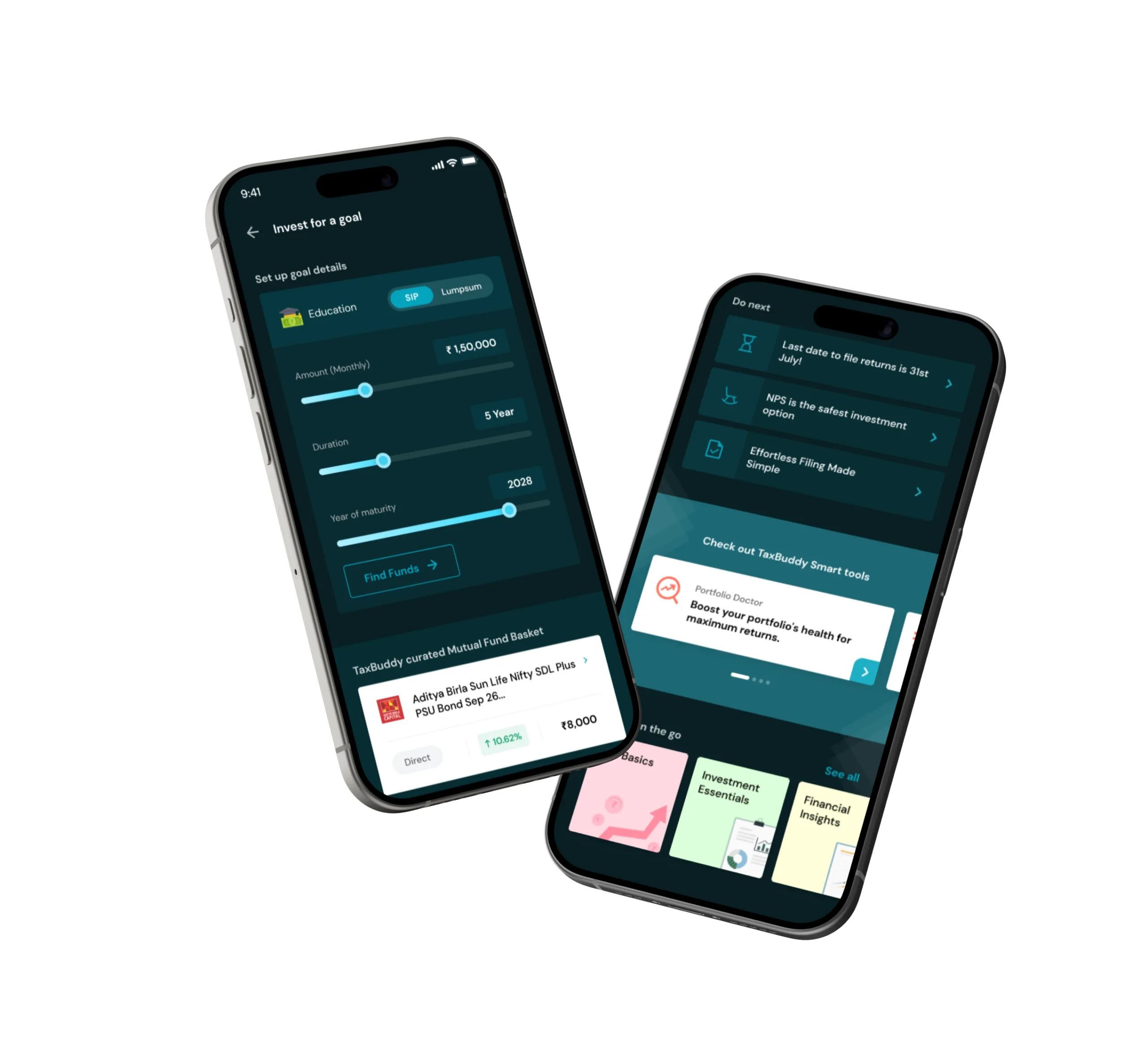
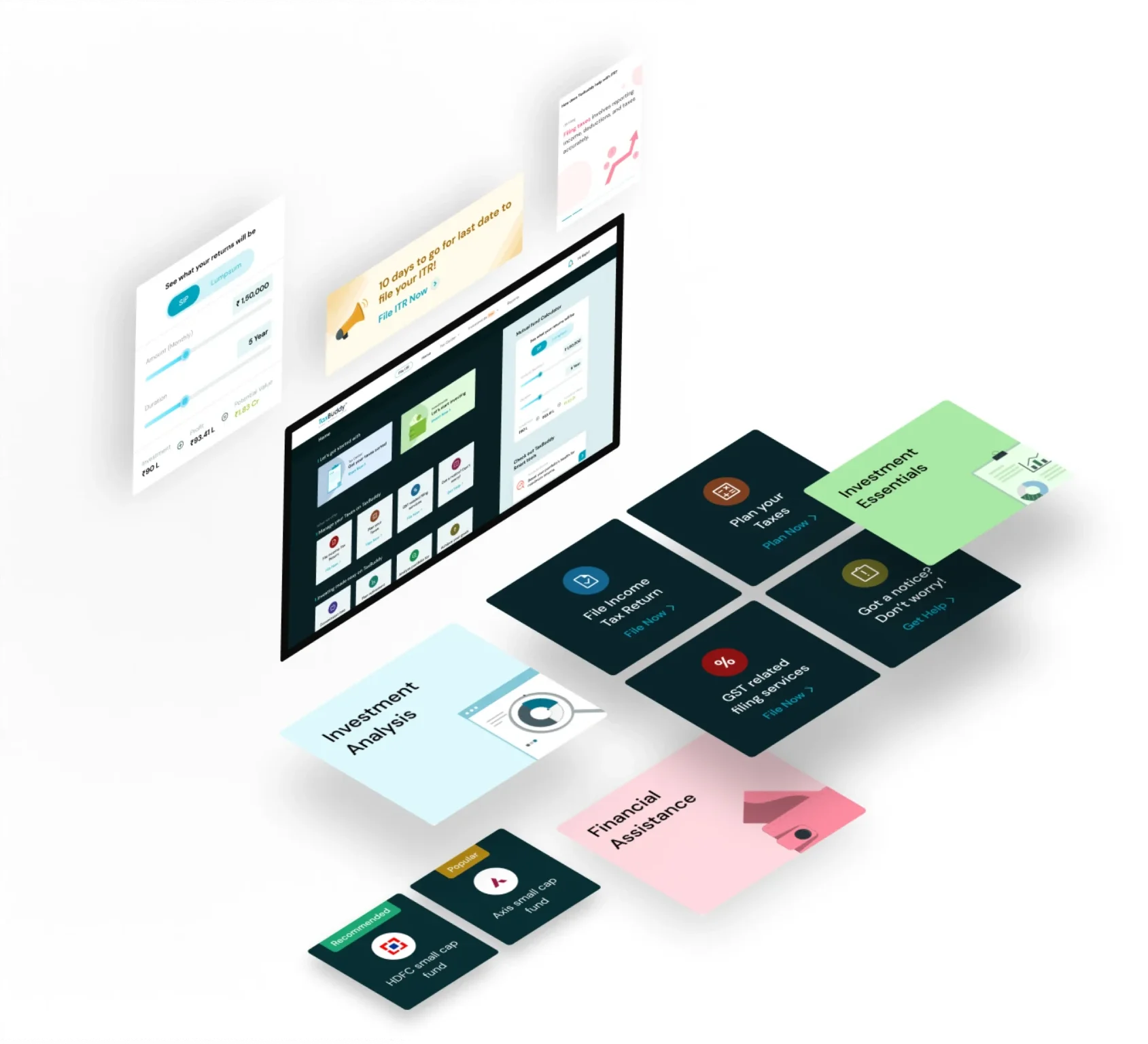
Simplified User Flow: Step-by-step guidance ensures users can complete tax filings with ease and confidence.
AI-Driven Expert Support: The bot handled 90% of inputs with accuracy, ensuring seamless tax expert access for minimal confusion and delays.
Device Consistency: The platform delivers a unified experience across mobile and desktop, enhancing accessibility.
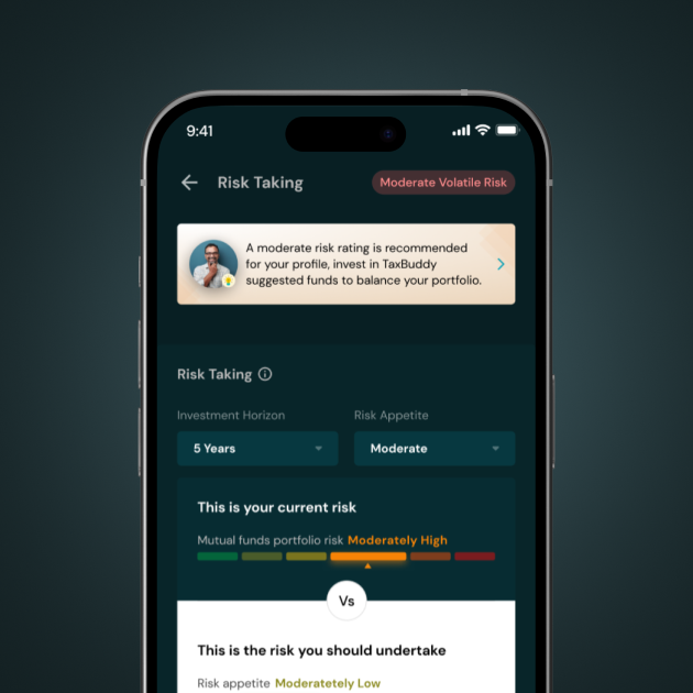
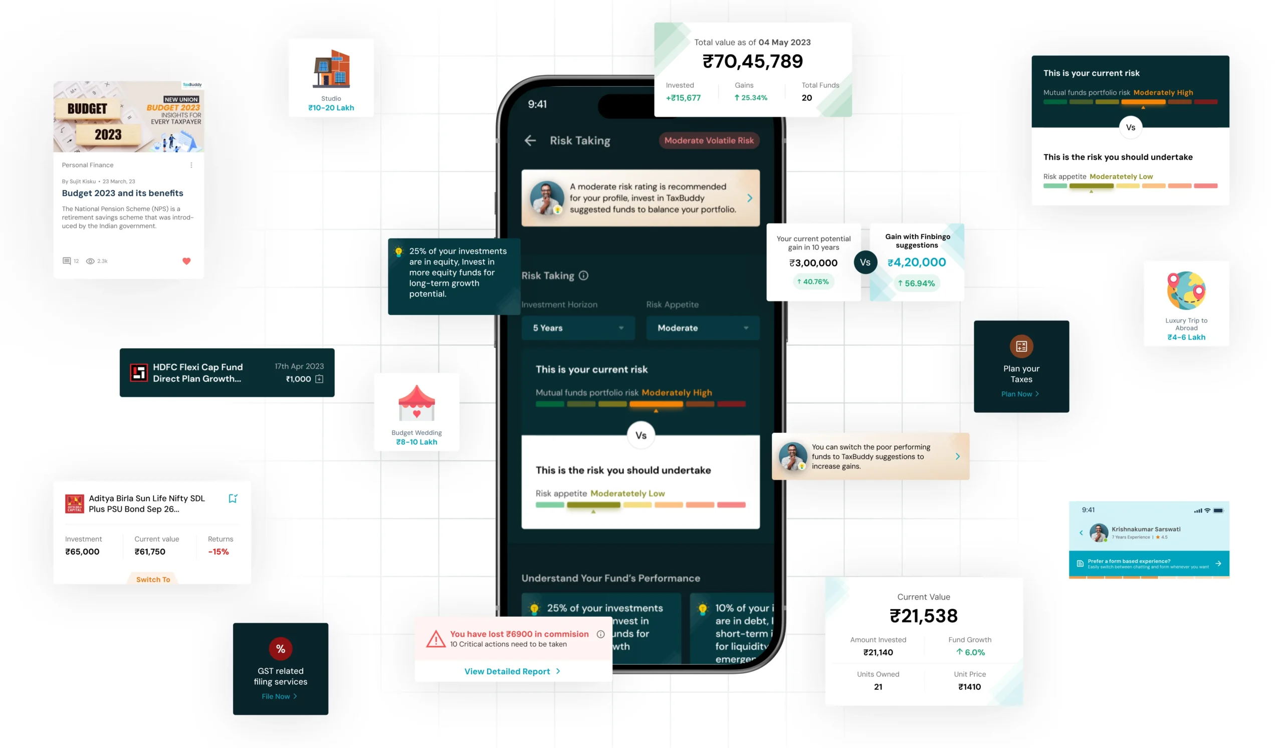
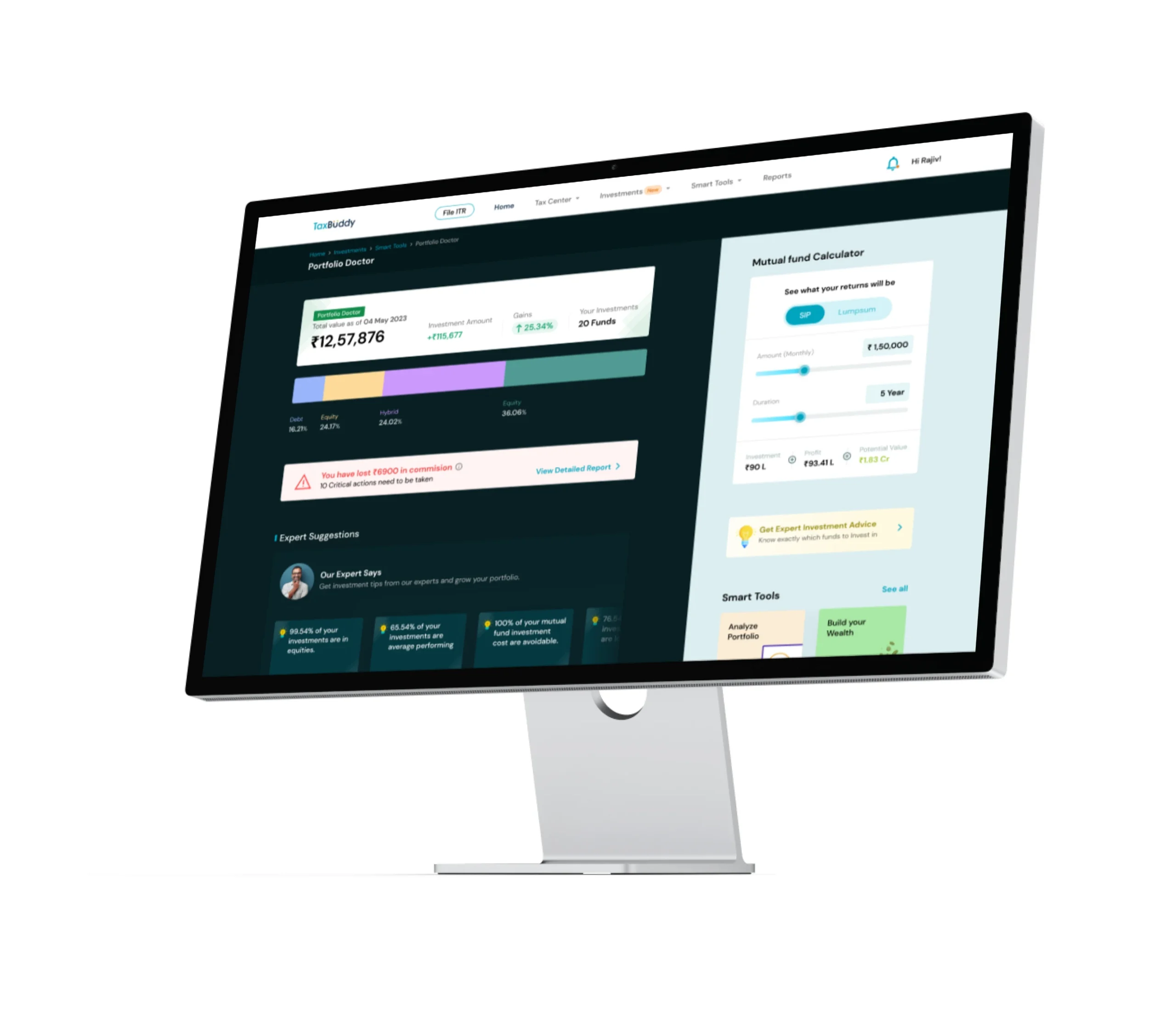
Visual Financial Planning: An interactive interface that lets users visualize their investment goals, helping them build a bigger picture beyond tax deductions.
Optimized Peak Performance: Engineered to handle surges efficiently, ensuring smooth operation during high-demand periods.
Outcomes
Outcomes
Team Monsoonfish approached TaxBuddy’s redesign by reimagining tax filing to align with users’ lifestyles and aspirations. By introducing guided flows, interactive financial planning, and AI-driven automation, we made the process intuitive, empowering, and stress-free positioning TaxBuddy as a trusted and reliable platform.
TaxBuddy’s Redesign: A New Standard in Tax Filing
Business Outcomes:
- Increased User Adoption: The redesign attracted more users to the platform, helping TaxBuddy grow its customer base.
- More Efficient Support: By simplifying the platform, more users were able to complete their tax filings without needing extra help, which reduced the load on customer support teams.
- Higher Engagement: The improvements in usability led to more frequent engagement, with users returning to the platform for future tax filings.
User Outcomes:
User Outcomes:
- Simplified Tax Filing Process: Users now find it easier to file their taxes, reducing stress and making the process more enjoyable.
- Faster Decision Making: The new design helps users complete tasks faster, thanks to clearer navigation and better guidance throughout the process.
- Empowered Financial Planning: A visual roadmap connected taxes with long-term financial goals.
Impact
Business Impact
- TaxBuddy experienced higher customer satisfaction, reduced support costs, and strengthened its market position. The platform’s enhanced reputation opened doors for partnerships and new opportunities.
User Impact
- A user-first approach made tax filing not just simpler but more meaningful, building long-term engagement and trust for future filings.
Let’s explore your project.
Book a free slot or share your email.
Or just share your email
We’ll reach out.
Other CASE STUDIES