Creating Access to Education for Million by Designing for Easy Usability for Both Teachers and Students - Ekstep
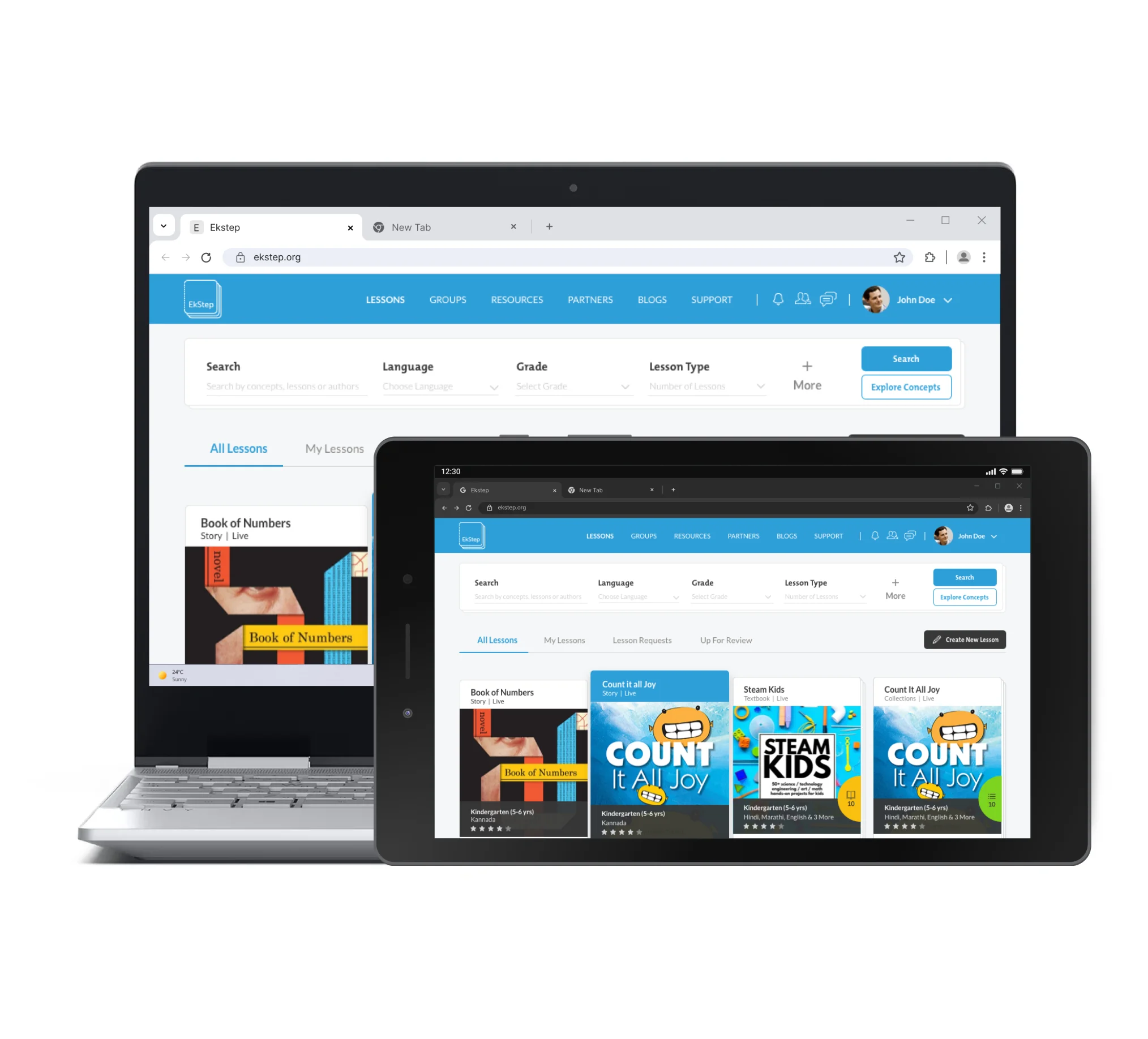
The redesign of the tool enabled an easy and effective way for teachers to create content that could be accessed on mobile devices.
The lack of access to learning opportunities is a complex and multidimensional problem. It impacts the lives of millions on a daily basis. Ekstep is a tool used by teachers to create educational content for students. Through a collaborative, universal platform that any person can use, Ekstep has led to reimagining the learning opportunities for every student by enabling easy creation of content that can be accessed on mobile devices.
However, the existing tool was too clunky and complex for the teachers to use it for creating content. The challenge for us was to simplify this tool for teachers, making it easy as well as engaging for students and thus increasing its adoption on various levels.
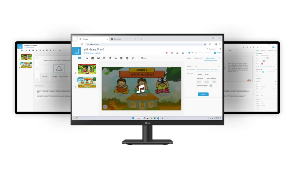
Objective of Design and Transformation
The existing Ekstep tool was a good tool but it wasn’t aligned to function as per the mental model of a teacher (which was the primary issue). Our redesign objective was:
- To simplify the tool to make content creation easier.
- Add UI design elements that users could relate to and find it user-friendly.
- Easy format that aligns to the mental model of a teacher while creating the content as well as the students while accessing the content using this tool.
- Facilitate adoption of this tool by users, and organizations.
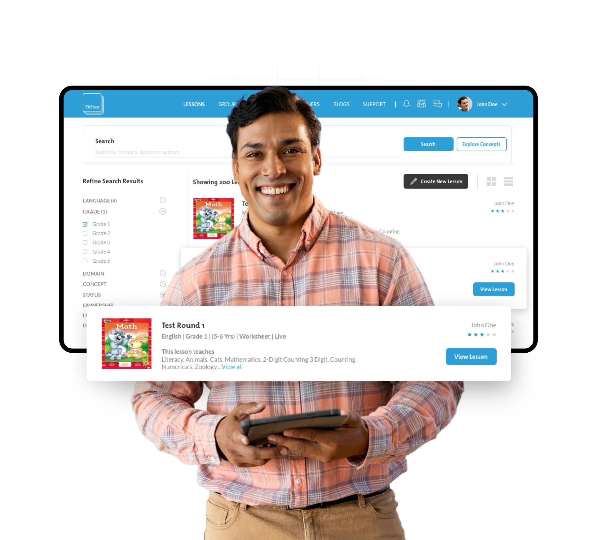
Our Process
Pain Points
- Rural users were facing issues using the existing interface.
- Usability issues were slowing adoption and implementation across states.
- Existing tool was very complex and difficult to use for content creation.
- Poor quality of content which was not engaging enough for students and teachers to use it.
Discovery
Over 50 users from Maharashtra, Andhra Pradesh and Tamil Nadu were interviewed and profiled to arrive at different users’ personas.
Users were profiled on the basis of their tech grasping capabilities to identify and understand their computer literacy and their web/software understanding. This led us to discover that most teachers could relate to the format of MS power-point and MS word.
The teachers had to spend long hours using the Ekstep tool to create content and the only time they spent in this activity was late evening, and the complexity of the tool led to frustration and losing interest in using this tool.

Implementation
Our team started proving the perks of redesign by taking small improvements through user testing. These small solutions were immediately validated by user feedback (received from teachers) which led to effective problem solving. The design process was then implemented as per the data received from the user testing.
Our design solution was hence aimed to facilitate easy content creation for teachers enhancing usability and functionality of the tool. We designed considering the modularity and scalability aspect for easy accessibility, user-friendliness, and wider adoption.
Outcomes
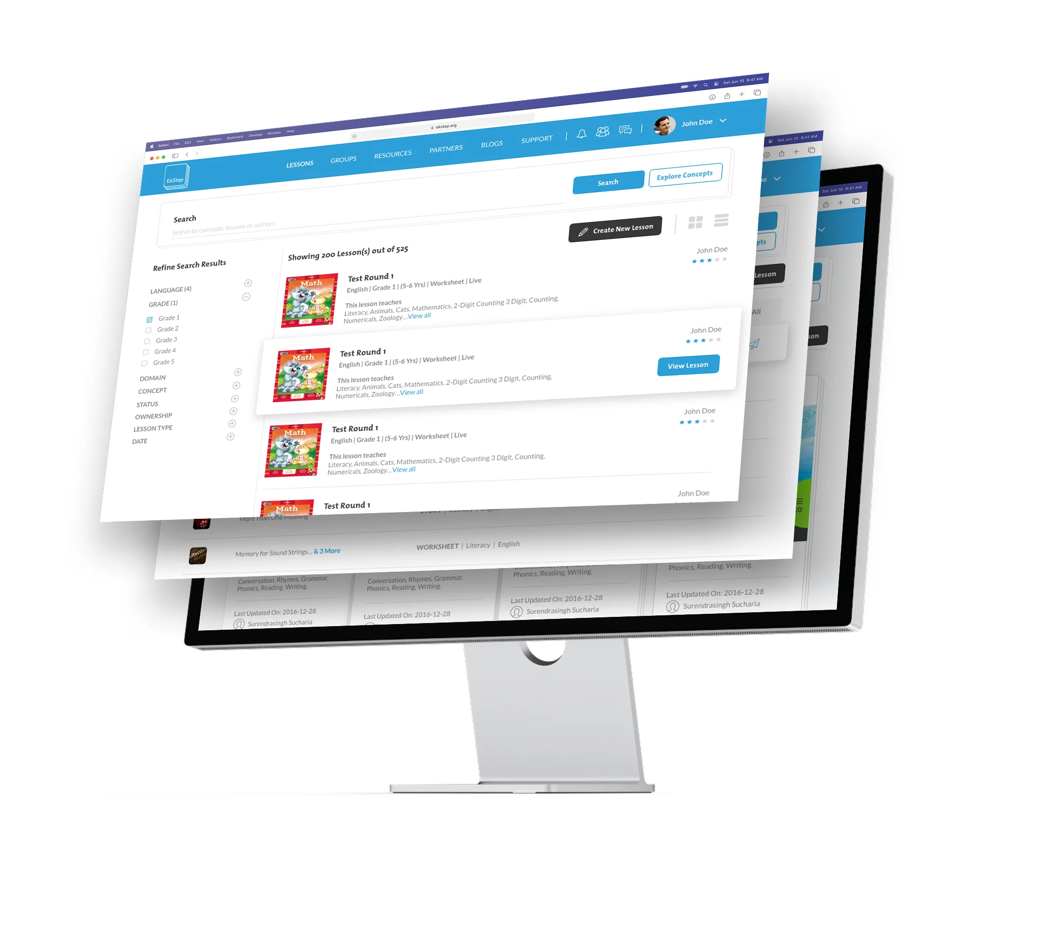

Outcomes
The goal of simplifying the complexity of the tool led to increased usage and engagement of this tool. The transformation included the following aspects:
- Designed for smaller screens, low bandwidth and low quality displays.
- Leveraged user understanding of Microsoft suite to afford slide based lesson creation.
- Designed for multilingual display.
- Performance driven and simple visual language to aid quick and quality content creation.
- Plugin based modular architecture, enabled democratization for the development of the tool.
- Added value in innovating new plugins and modules like image finder, word net, synonyms, match the following, assessment tools and various others which we designed, tested and pushed to implementation making it a data driven, co-created product.
Ekstep- An OpenSource & Infrastructure Provider
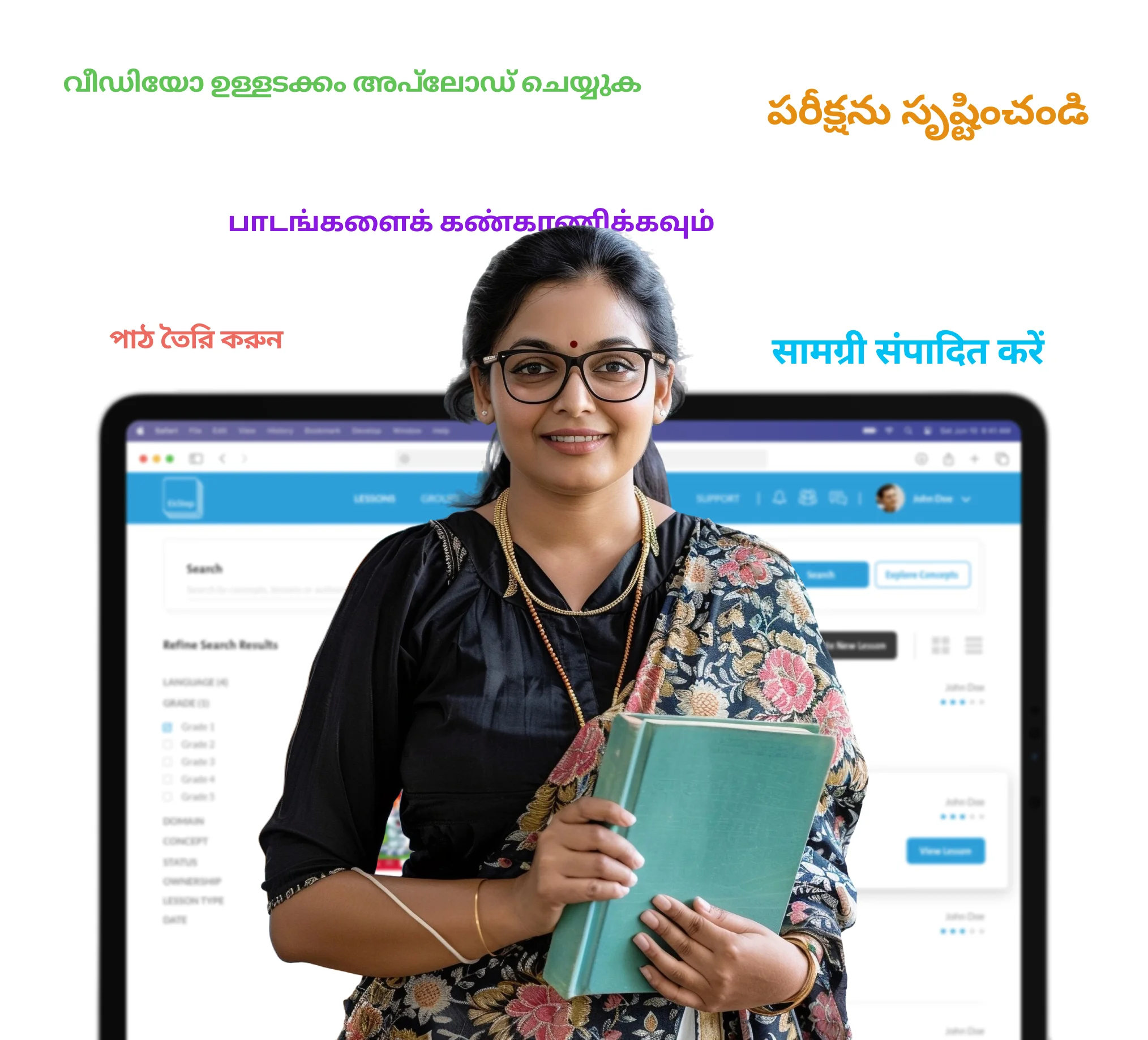

Ekstep- An OpenSource & Infrastructure Provider
- The redesign transformed the adoption of this tool on various levels. People found it delightful to use this tool and advocated its usage to others by creating various tutorial videos.
- The scalability and modularity of Ekstep led to its global adoption, having an OpenSource that could be consumed by other organizations as an infrastructure provider (building block). Moreover, implementation of this tool was witnessed in the education system of many African countries. It soon became an implementation solution for teachers’ content creation.
Impact
Social/Organizational Impact
- EkStep Foundation and Monsoonfish together addressed the challenge at scale- leading to Mission EkStep and the creation of Sunbird as open digital infrastructure, and the curation of Societal Platform thinking. This led to the creations of building blocks- Sunbird, Sunbird CoKreate to enhance access to learning opportunities at scale for millions of learners. Diksha by NCERT was one of the biggest adopters of CoKreate for their e-learning platform.
- Therefore, the redesign led to a steep increase in adoption at an organization level creating a positive social impact where teachers found it extremely user-friendly and engaging to use it and thus advocated its usability and functionality to others. This further facilitated a community formation that validated the efficiency and effectiveness of this tool.
User Impact
- Teachers' lives became easier as the time spent in content creation reduced drastically! 80% Of our users would repeatedly come back to the platform to create content
- The redesigned UI was relatable to teachers and students where they could easily identify the elements to use. The number of mistakes that used to occur during content creation reduced.
- Students were able to find information and access the content easily on mobile phones.
- 8/10 users were able to complete tasks, without breaks in flow or difficulty. Most importantly users were able to successfully create high quality content on the platform. Here are some statistics which show the massive user impact:
- DIKSHA current usage: 4,93,57,18,317 number of learning activities were undertaken using DIKSHA infrastructure by learners. 57,38,82,46,608 and total DIKSHA usage time in minutes.
- Sunbird: 3.6 billion+ digital learning sessions, 180 million+ student access energized textbooks.
Let’s explore your project.
Book a free slot or share your email.
Or just share your email
We’ll reach out.
Other CASE STUDIES
