UX Writing- Let Your User Interface Speak
This article states the importance of UX writing as a tool supporting UI design to improve user engagement and experience in web and mobile products.

The digital design community has been discussing the term UX writing. UX Writing, UX Copywriting, Content Design etc. are relatively recent terms but everyone isn’t clear about what these jobs mean or what they consist of. However, in this blog we’ll figure out the meaning of UX writing and why the tech world talks so much about it.
What is UX Writing?
UX writing is the practice of designing the words people see and hear when they interact with a digital product or software. Design is all about communication, irrespective of what product we design, we should always design a conversation between a product and its user. UX writers create or write the content we read when we use a website or an app.
“UX writing is like an art of designing with words!” – Rohan Baruah
Copy created by UX writers is also known as microcopy, it includes the small components of text which act as hints for users. Basically, microcopy includes buttons and menu copy, error messages, security notes, terms and conditions, etc. Similarly macro-copy consists of information messages and invitations, text on confirmation pages, etc.
As the apps and websites become more a part of our daily lives, we as users seek those products that give us a more seamless and fluid experience. This development in the way we interact with technology has led to the creation of UX writing.
Difference between UX Writing and Any Other Writing
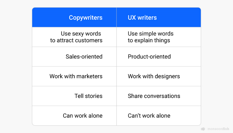
Content writers, copywriters, UX writers all need to be good with words, each role has a different focus. The focus of a copywriter is to be informative and convincing to sell a product or service.
Whereas, a UX writer’s job is to help the user solve a problem, encourage them to take actions and enjoy using a service or product.
https://www.youtube.com/watch?v=ErWyIvkCdv8&t=7s
Why is UX Writing Needed?
The copy content is a significant element influencing both UI and UX, and design specialists as well as marketers are well aware of it. Bad-written copy can spoil even a really good-looking user interface. Various user tests have shown that microcopy and information architecture affects user experience as well as the navigation system.

‘Work on the Content Early, Because Text Problems Often Reveal Design Problems.’
When a digital product is looked at from the users’ perspective, we realise how useful small copy hints are for them. When people start using a new software, short text tips make the process of understanding and adaptation fast and easy. Similarly, if a menu copy is written efficiently, the navigation system is much more clear to use.
Considering the positive impact of microcopy on user experience, the new direction emerged in copywriting which was then called as UX writing. Thus UX writing is needed and is essential because it aims at building microcopy elements that aim at improving the user experience of a website or an app.
What Makes Efficient UX Writing?
A good microcopy primarily can vary from one word or a few words to short sentences which should perform various functions.
‘If Users Don’t Notice they’ve been Guided, then UX Writing has been Done Well.’
Here are a few points to consider for effective and efficient UX writing:
- A UX copy should both help users to get engaged as well as encourage them to stick around.
- There is usually a business goal standing behind CTA buttons, which should be considered during UX writing.
- The UX copy needs to be clear and consistent so that users don’t have to think or figure out with difficulty about what your content means.
- Content should be simple so that people can interact with the product seamlessly and intuitively.
- UX writers need to make sure the content looks good and fits the design composition.

In addition, copy is also a design element hence its effectiveness highly depends on the visual presentation. Hence a UX writer needs to work in collaboration with the designers to deliver efficient UX content.
The Role of a UX Writer
-
Research
User research helps to learn the target audience, their behaviour with the digital product and thus gaining a fair idea of what hints people need. To create a useful copy, a UX writer needs to understand where users need help. UX writers deliver information and messages related to every aspect of the product, everything from product pages and emails, to button copy, push notifications, etc. To do this effectively, a writer must acquire a deep and thorough understanding of the user through UX research.
-
Content Strategy
A UX writer’s job is not to help sell a product, a UX writer must give value to users by crafting a satisfying digital experience. Softwares once used come with a manual, well today, that ‘manual’ is written right into the app itself.
Hence the content strategy of a UX writer revolves around guiding the user through the digital experience in an intuitive manner, and also building a bridge between the user’s needs and the company’s goals.
Their content strategy is implemented around making the digital interfaces easy to use. -
Collaboration
UX writers are a part of the entire design team, and are equally involved in designing and creating a website, or an app. They’re part of the team that decides which features to add to the digital product, to conduct user testing, and are a part of many other stages of the project.
-
Project-Specific Writing
UX writing cannot really be generic, UX writing is crafting a UI copy that guides users within a product and helps them interact with it. As mentioned earlier, the research is conducted to achieve an understanding of the brand and end-users so that this information can help deliver project-specific content.
Principles of UX Writing
-
Attention to Context and Audience
UX writers should first understand who they are writing for and what the user needs when they interact with a digital product. The text should be useful for the user, it should facilitate user action and lead them through the product.

-
Platform You’re Writing (and designing) for
Use language that’s suitable for the user’s platform. The terms we use when describing the interaction with a desktop app may not necessarily work on mobile devices. For example, if you design a mobile app, we can’t say ‘click’, we need to say ‘tap’ instead when referring to the interactive UI element.
-
Brief and Clear

Both the size of the screen and the way people comprehend the information on a digital space affect the copy. As a result, the copy should be brief and yet communicate the meaning effectively.
Brief content here regards to being efficient, that means when you look at your message, make sure every word on the screen has its job. For example:- Lengthy copy: Would you like to save your changes?
- Efficient copy: Save changes?
UX writers need to deliver content that is easily understandable to users so that everyone can have a great experience.
-
Prioritizing Information
Designers know that users’ eyes follow an F shaped pattern as they read over the screen. For this reason, it’s important to keep your text not only concise but also frontloaded- incorporating all the important information first. This will make the users scan through the important words or content first, as they scan through the page.
-
Easy to Understand
Avoiding long pieces of text is always preferable, hence dividing the content into easily scannable segments of text that focus on a limited number of aspects at a time should be considered.
Your copy can be broken up into bullet points or you can have each sentence into a specific number of characters. If you have to deliver a lot of content for your users then the ‘Read more’ link to the full content can be used. -
Tone and Voice
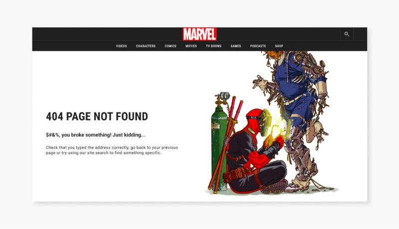
Good UX writing not only makes interfaces more usable but it also builds trust, hence the copy must reflect the voice and tone of the organization. UX writers need to consider the tone of the product and brand as a whole that is most likely to resonate with their user, while writing the content.
-
Consistency
It’s important to ensure that the copy is consistent across all products and interfaces. All parts of your products should give users a feeling that they were written by the same person/brand.
Furthermore, inconsistency creates confusion, a common example of inconsistency is replacing a word with a synonym in a different part of the UI. For example if you’ve used “Scheduling” in one part of the UI, then don’t call it “Booking” in other parts of your UI.
Conclusion
We all are aware that words are a powerful force, and thus copy is crucial in guiding the user and helping them complete their desired actions. The product design or the UI/UX design field emphasizes on polishing both pixels and copy.
With more and more brands wanting to involve UX writers in their design teams, it’s evident how it adds value to the overall design process. Writing copy for digital products evolved into its own specialty, which we all now know as UX writing.
CATEGORIES


