Labs

Offering Netflix’s Users with Features which they have been Missing Out On!

An attempt for Netflix’s UI/UX redesign to offer features that can enhance usability, accessibility and make the experience more user-friendly for the viewers.
1_main

2017

Netflix is an American subscription streaming service and production company that provides a film and television series library through distribution deals as well as its own productions- called as Netflix Originals. In India, it is one of the highest viewed OTT platforms with millions of subscribers.

Here’s a redesign of Netflix attempted by one of our interns, to add new and user-friendly features for delivering better usability and an even more efficient user experience for its viewers.


(This project was attempted in 2017 when Netflix’s UI/UX design was substantially different from the one we’re using today).

06

Creative Brains

11

Hours

50 +

Coffee Cups

100 %

Nonstop Music

Resume Playback

bullets

Out of thousands of shows and movies to watch from, Netflix lacks the ‘resume playback’ feature where the viewer can directly continue watching the movie/show that had left watching.

bullets

This would help in better user engagement and seamless watch experience without letting the user struggle through the show to find out where he/she had left watching.

Similar Choices

A user spends a lot of time scrolling through thousands of shows which he/she doesn’t engage in. We added a few shows or movies as suggestions to watch for the users (based on their watch history to push content similar to their favorite genre), saving the user’s time to find an interesting piece of content. This could lead to better engagement and a user-friendly experience by helping the user to watch content of their taste/type.
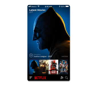
Similar Choices

Voice Assistance

With technological growth, voice assistance has been incorporated in many apps and websites to improve their usability. Hence introducing voice commands to Netflix can ease the usability and improve accessibility for a wider audience.
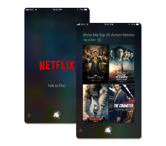
Voice Assistance

Invite a Friend

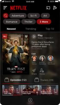
Watching your favorite movie is better and more entertaining when you watch it with your friends! Enjoy a watch party by inviting your friends to watch your favorite content and share your viewing experience together, through this feature.
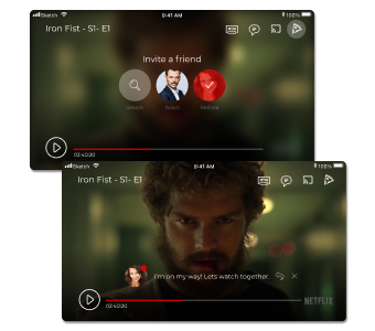
Invite a Friend

Better Content Access

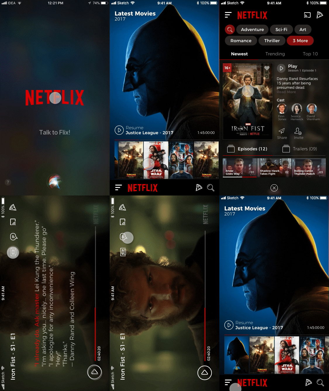
Tags were added to enable better search ability by functioning as a filter and thus avoiding the effort of infinite scrolling; to push the right content upfront.

Furthermore, there is an added feature for better accessibility- displaying the glimpse of the movie info in two ways- either by long press using an iOS device or by tapping on the movie cover which starts the playback of the content.

Tabs of Episodes and Trailers: Make it easy to switch between content of upcoming shows.
Audio Mode

If the user wants to entertain himself/herself during traveling or while being involved in another task, then they can opt for the ‘audio mode’ feature of a show/movie to enjoy listening to the content without viewing it.

We’re always ready to attempt redesigns for digital products by deep diving into its functionality, understanding user goals and crafting solutions to enhance its usability for better engagement.
Netflix app

Design Creates Experiences that Facilitate Product Goals.

With more than 20 years in the UI/UX sphere, we craft experiences that match user expectations, thus enabling brands to achieve their business vision.

20 +

Years in Design

200 +

Satisfied Clients

500 +

Successful Projects

40 +

Designers On-board

Take a Look at Our Journal
Image

You know the one, right?
In today’s UI world, even though Comic Sans has certainly earned its reputation as a font to avoid, it’s not inherently bad!

Image

Remember the era when animals such as horses, camels, donkeys, etc. were the widely used mode of transport? When a four wheeler vehicle was invented to replace this transport using animals, people in that era had contrasting judgements – one where they were agasted with the ease, convenience and support the four wheelers could provide. And the other opinion was that this innovation can be harmful to humans and animals through accidents being caused!

Image

Imagine a world where your smartphone could diagnose diseases before you even feel symptoms or personalized medicine is as routine as checking your email. With the convergence of technology and healthcare, these mere imaginations are shaping into realities.

There’s a Lot Happening Behind the Scenes in Our Lab!

This project attempted to identify the gaps in this food delivery app and propose UI/UX design ideas to expand Swiggy in different ways for the users to use it for more than just a food delivery app, in turn setting it apart from its competitors.

Image

Our team attempted to fill in the gaps, in terms of its interface and user experience design; for offering a more enhanced and assisted experience for the users throughout their journey.

Image

Exploring possibilities of turning an OTT platform into something more than just for entertainment purposes. Here’s our attempt of working out new sources of income benefiting the platform as well as the audience?

Image