Expanding Swiggy Beyond Just a Food Delivery App
This project attempted to identify the gaps in this food delivery app and propose UI/UX design ideas to expand Swiggy in different ways for the users to use it for more than just a food delivery app, in turn setting it apart from its competitors.
2018
06
Creative Brains
11
Hours
50 +
Coffee Cups
100 %
Nonstop Music
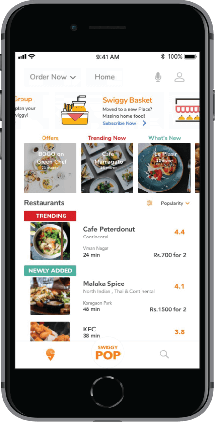
Proposed Additional UI/UX Features and Expansion Ideas
After conducting a user research, we discovered that there were users with different goals and frustrations, depending on their likes, dislikes, age, food preferences, eating habits, etc.
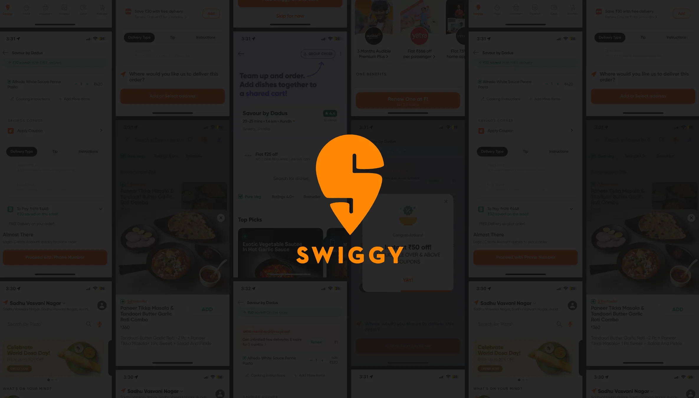
Hence, listed below are the additional features and expansion that we attempted:
1. Satisfying the User By Providing the Information Needed
Frustration: Users don’t get the right information about the restaurant’s location and the necessary details about the dish such as- taste and quantity.
Existing solution:
(a)Existing solutions are broken in case of the restaurant location as they only get to know about it in the ‘Cart Summary’ or after ordering.
(b)In case of taste and quantity, the user has to rely on past experience or wait for the food to be delivered.
The New Proposed Solution:
Our design solution includes- adding the location for every restaurant, mentioning dish ingredients, and showing quantity using AR.
Gap Addressed: Enables users to identify the restaurant location, dish ingredients (taste) & quantity.
Impact: Increase in user satisfaction leading to better customer reviews. The location visibility helps users to avoid ordering from the wrong restaurant. And, ordering a dish based on the ingredients, fulfills the user’s expectations leading to satisfaction and better reviews.
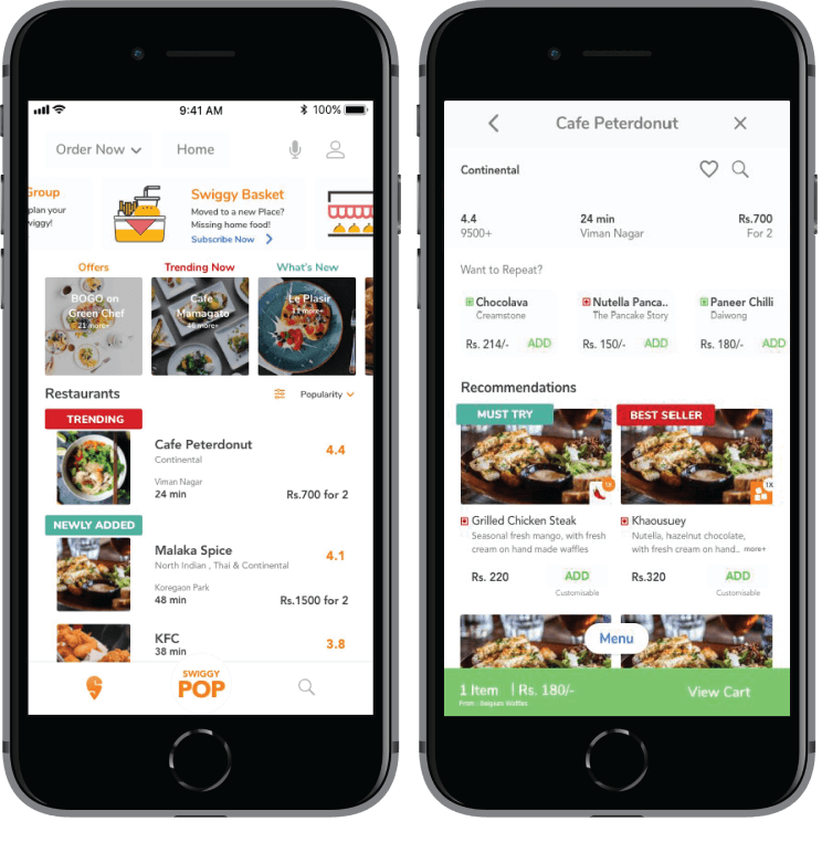
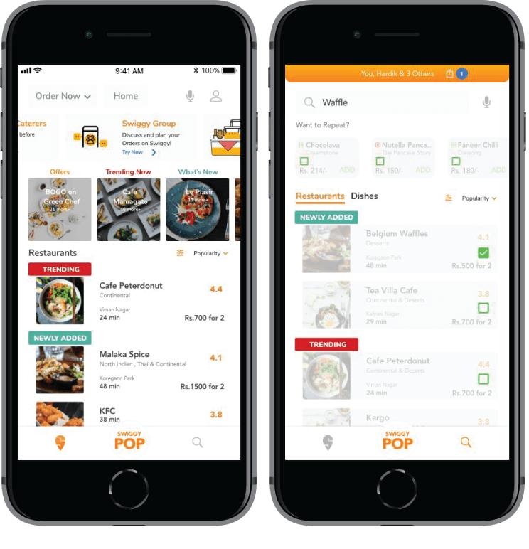
2. Helping Users Make Decisions Together, Yet Split Bills and Pay Separately
Frustration: Users get frustrated while deciding what to order with his/her friends, and paying as well as splitting the bill is a problem.
Existing solution: There isn’t any existing solution to this in the app. The order is placed by deciding the dishes on whatsapp & call, payment of the bill is done by an individual and split manually among others; making it difficult to keep a track of the balances.
The New Proposed Solution – Swiggy Group
Enabling users to decide and order on one platform, split the bill and select the person to pay.
Solution: The solution identified is Swiggy Group- where users can chat, suggest, decide and select an individual (user) to pay the bill and split the bill as well.
Gap addressed: It lets users suggest and decide restaurants &/or dishes and helps choose an individual (user) to who can pay and split the bill.
Impact: It saves user time by enabling easy access to chat, menu and avoiding manual calculations for splitting and paying the bill. This results in faster order placements, better engagement and easy usability.
3. Help the User to Order a Tiffin/Subscribe for Weekly or Even Monthly Meals
Frustration: Users get frustrated by the same food he gets everyday (no change in taste).
Existing solution: Users have to call the dabbawala (tiffin delivery person) to ask what is being made, decide if he wants it or not and then inform him if there’s a cancellation.
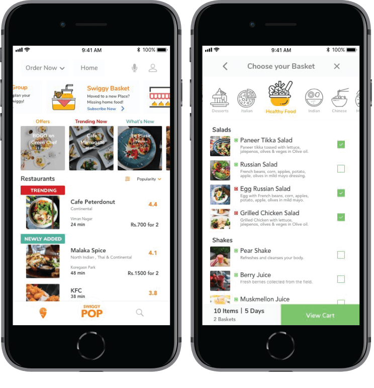
The New Added Solution – Swiggy Basket
Introducing Swiggy Basket- Offering the freedom to customize the meal delivery as per their choice, or edit it or even cancel it.
Gap Addressed: To enjoy different food daily, and receive the option of home-cooked food or outside food for a change.
Impact: Introduction of a new market segment- known as pre-paid subscriptions, which can increase orders. Users don’t like to call the tiffinwala everyday for changing or canceling an order. This new solution makes the user’s task simpler and enhances by giving him/her the liberty or freedom to cancel, edit and customize their meals.
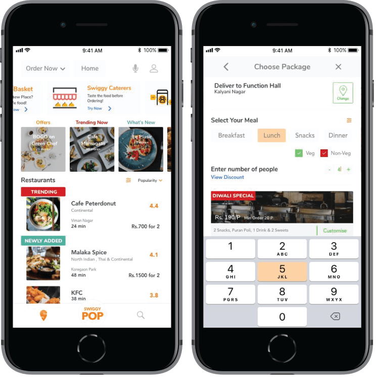
4. Giving an Option for Placing Bulk Orders
Frustration: Users have to wait for a long time to get the quotes, check the taste of food/build trust with the caterers to place bulk orders.
Existing solution: There is no such platform for catering, and when a new user deals with catering he/she takes time to build trust.
The New Proposed Solution- Swiggy Caterers
Option to get a sample for bulk orders. Getting a list of options and food samples to choose from.
Gap addressed: By helping the user to choose from a variety of options, enable customizing and thus build trust by getting a sample before placing the final order.
Impact: Substantial increase in bulk orders by gaining users’ trust. Users trust builds if the food is good This can be achieved by food tasting before placing a bulk order.
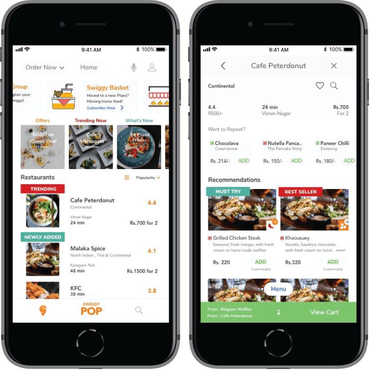
5. Helping the User to Choose Dishes from Multiple Restaurants and Pay at Once.
Frustration: User has to go through the same process twice/thrice based on the number of restaurants the user chooses to order from.
Existing solution: No existing solution to this as the steps are repeated.
The New Proposed Solution:
Adding dishes from 2 or more restaurants as per users choice and paying only once, to solve the problem of paying and going through the same process multiple times.
Gap addressed: Making the task flow simpler.
Impact: This solution is user-friendly and better in terms of efficiency while ordering from more than 1 restaurant. Users end up paying twice while ordering separately, so if the process is simplified, the user would be delighted to order from more than one place.
Take-Away: Beyond Food Delivery!
Our intent during this project was to understand a wider perspective of users, identify their various paint points and try to provide innovative UI/UX design solutions to fulfill their user goals and also enhance the app’s usability and functionality.
We conducted tests where we discovered that users were able to perform tasks efficiently, which they couldn’t perform earlier; thus reaching their user goals.
We at Monsoonfish go beyond design to attempt and work out design solutions, re-designs and user experience solutions, thinking about tech, trends, different approaches etc. on diverse products; because every digital product for us is a subject of experiment and analysis!
