Medical & Healthcare
 Cybersecurity
 Travel & Hospitality
 Edtech
 Enterprise
 Non-Profit
 Fintech
 Agritech
 Retail & Real Estate
 Design for AI
The case of deploying “inefficient” UX to make a better product
Client
UIDAI – Aadhaar
Industry
Government & Non-Profits
Deliverables
UX | UI | Information Architecture | User Research
The Challenge
1.23 + Lakh
Enrolment
Aadhaar generated
2.55 + Lakh
Updated
Aadhaar updated
2.66 + Lakh
Authentication
Aadhaar done
6.95 + Lakh
eKYC Done
Vericfication done
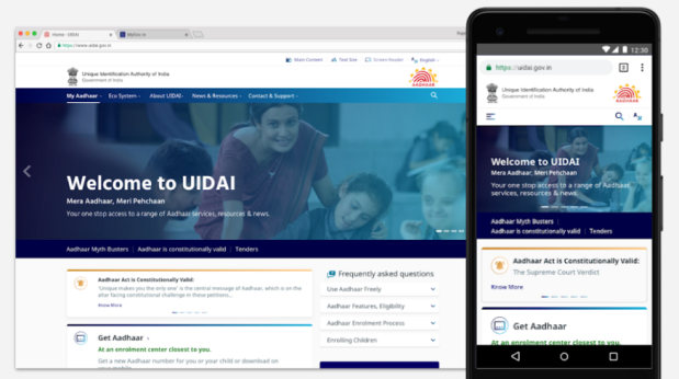
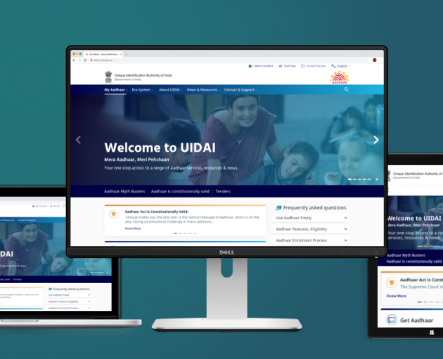
With the Digital India push of the government and increasing penetration of internet and smartphones, UIDAI realized that their website needed to be responsive, and render itself well on mobile devices.
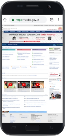
With the Digital India push of the government and increasing penetration of internet and smartphones, UIDAI realized that their website needed to be responsive, and render itself well on mobile devices.
When we met UIDAI, that was our brief. We at Monsoonfish, handled everything about user experience and design, while our friends at Tekdi Technologies took care of development.
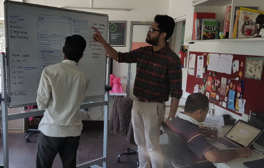
Getting to the root
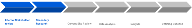
So, what did we find?
This intensive exercise led us to some key insights, and formed the basis of the project. Aadhaar of Aadhaar, if you will.
Maximum share of users came to access FAQs and Aadhaar update related information. Most of the support calls to the CRM team were around updates and Aadhaar related services as well.
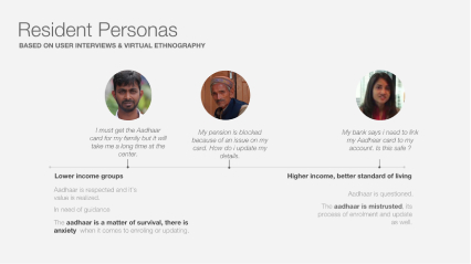
Aadhaar had already managed a vast adoption across the nation, the next bunch of users were residents looking to make updates, or young parents, wanting to create cards for their children
Across the income scale, on the lower side the Aadhaar represented utility value. These residents feared making updates, and there was a general sense of misinformation. On the higher side, residents questioned Aadhaar, its use and security around it
The website was mostly accessed on Android devices
Another key insight which influenced our visual design approach and even the type of font we chose
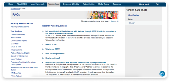
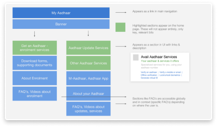
Relevant user information was hidden deep in the website Duplication of content — same thing was said in different words
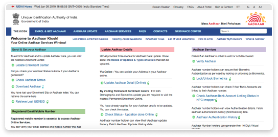
FAQs section of the earlier website and one of the sub-portals — Aadhaar Kiosk, with a different look and containing the most relevant info the users came to Aadhar website for!
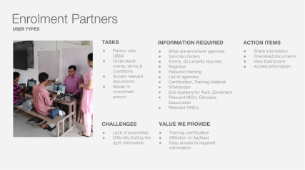
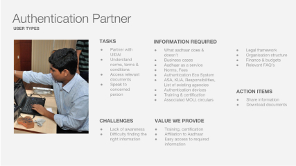
We also bucketed the stakeholders, i.e. the audience profiles of visitors: Residents with Aadhaar — bulk of our audience; Residents without Aadhaar; Authentication Partners; Enrolment Partners; Govt. Employees; UIDAI Internally
We also bucketed the stakeholders, i.e. the audience profiles of visitors: Residents with Aadhaar — bulk of our audience; Residents without Aadhaar; Authentication Partners; Enrolment Partners; Govt. Employees; UIDAI Internally
What would success look like?
We realized that this was not simply a rendering issue. The major share of audience — Residents with Aadhaar and Residents without Aadhaar, needed to be catered to in a much more seamless manner.
Aadhaar website is not a daily use product — it is a utility. People come to the website to get their query resolved/work done and leave the website. We needed to treat every user as a first-time user, and every use-case as the first use-case.
This led us to the most important consideration for the route that we would take for this design. Efficiency, in the traditional sense is to get user from A to B as fast as possible. The audience of Aadhar that we prioritized, were residents who came to create or update their Aadhar cards. The current website had all links and information in bulk, and finding your particular query was like looking for a needle in a haystack. This led to users being frustrated and leaving the website, which not only put an additional toll on the tertiary infrastructure like Aadhar support centres, but hampered reputation of the Aadhaar system. So while the existing design was ‘efficient’ literally, (all links in one page, so technically just two steps to get the users to info they needed) it did not make much sense for the website.
We prioritized only two sets of information — Aadhar services and updates. Since bulk of the users came for this, it made sense to show right information at the right time — to the right users. Updates and other services formed the backbone of most activity done on the website — and was the cornerstone of our information architecture. We changed the definition of efficiency for this project, in a bid to make it more relevant and useful for our desired sets of audience.
To make the process for residents smoother, we kept two goals in our mind:
This ambitious project of Aadhaar operated at a huge scale as we have already seen, so we had to make a few important considerations all along:
By now, the project had ballooned from its original brief. A complete design overhaul, a formidable design system, redesigned information architecture. What had not changed, however, was the timeline! We had three months to design and develop the website, and an additional month of testing.
The Path to Success: Pillars of design
Reduce time taken to access key information
Ensure existing information is brought up at the right time
Ensure smooth performance across all devices and for everyone
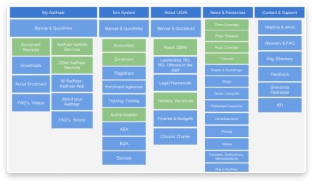
Information Architecture
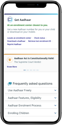
The first step was in getting the information in right order. Aadhaar website had everything the user wanted — our job was to make it readily available without having to hunt for it. We restructured the information keeping in mind mainly residents and then internal audience.
How this unfolded in the structure was by bringing updates and services related information upfront, followed by partner information & then media, news and downloads. The most important information from each section built the home page.
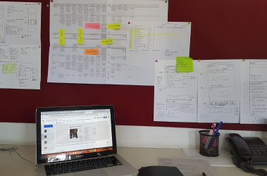
UX Strategy
Wireframes were iterated on and reviewed, while we worked in parallel on style options for the website. We put up low fidelity mockups for different workflows on how the experience will look and feel on a mobile device.
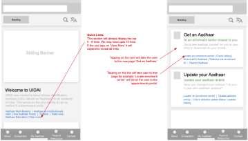

We also designed additional pages for the website. Rather than having simple links, we created link cards — which could give the users a preview of where they are headed.
To make sure that we were making an accessible design, we went through these steps:
- Extensive review of GIGW manual
- Checks in UX wireframes for size of information chunks
- Sentence lengths, and content simplification
- Maintaining basic contrast ratio in design
- Use of understandable iconography
- A custom set of guidelines for design and QA just for accessibility
- Use of automated testing for design and developed versions
Visual Design
The next step for us was to design the website. As the government’s flagship project, and Aadhaar being something that holds unique value and unlocks doors to different opportunities, the site needed to feel trustworthy and ooze authority. A user who lands on UIDAI.gov.in should rest assured that the website will have what he needs. We developed 3 design solutions, all communicating this. Collaborating with stakeholders, we finalized the below design.